SST®
A font for everywhere
A font for everywhere
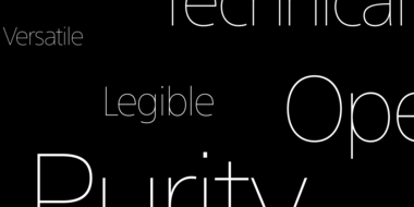
For international brands, SST brings harmony and personality to communications across cultures and touchpoints. The SST typeface was designed to be universal and timeless, with support for 93 languages and outstanding legibility at all sizes.
Monotype’s Akira Kobayashi and Sony Creative Center’s Hiroshige Fukuhara created a hybrid of two typographic styles, geometric and humanist. A sharp, solid, geometric edge is evident in uniform line widths – tempered here and there with just a few tiny optical adjustments – and balanced by softer, more organic qualities of humanist design to improve readability at all sizes.
A team of ten other type designers around the world helped to make sure the style demands and cultural nuances of specific languages were catered for, and ensure a consistent tone across the entire family of fonts. Today, any brand or designer can access SST’s blend of legibility, versatility and timelessness. ‘Carelessly embellish a typeface with trendy styling, and in two or three years it will look outdated,’ says Akira. ‘We avoided this when designing the SST fonts, which I hope will be used for decades.’


The SST® typeface is greater than the sum of its parts. It's an exceptionally powerful suite of designs that spans applications with grace, and imaging environments with ease. Advertising, brochures, documentation, packaging, short and long form text copy, even wayfinding, in hard copy or digital media, are all within the SST typeface family's range. Add to this, a character set supporting almost 100 languages, and you have a typographic juggernaut.
The SST Pan-European family has 17 fonts in total. It spans six weights from ultra light to heavy, each with an italic complement. In addition, three condensed designs and two monospaced (typewriter) typefaces were drawn to further expand the family’s vast range of uses.

With a background in art and calligraphy, Akira has designed several award-winning typefaces, typically Latin fonts, though he studied and began his type design career in his native Japan. He worked in Japan at Sha-ken, Jiyu-kobo, TypeBank and taught at Nihon Designer Gakuin before becoming Monotype’s Type Director in Germany. In addition to designing retail fonts, Akira has led important custom font projects for Sony and UBS.
We offer a number of ways for you to start working with our typefaces.
The SST font tackles a central challenge of branding – universality. The SST superfamily supports more than 90 languages including Japanese, Thai and Arabic.
Monotype’s Akira Kobayashi worked closely with Sony’s Chief Art Director Hiroshige Fukuhara to create an original typeface ready for nearly 100 languages.

