Creative Characters Ep. 18: Dave Addey.

Dave Addey.
On Creative Characters, we meet the people and personalities behind the brands, campaigns, and designs we love. You can listen to the podcast on Apple, Spotify, Google Podcasts, and wherever quality podcasts are available.
In our eighteenth episode, Terrance Weinzierl, Creative Type Director at Monotype, talks with Dave Addey, author of Typeset in the Future. Dave’s blog and the book that followed it explore type and design choices in sci-fi movies, a crossover that has drawn a remarkably big audience.
To quote his blog, “This blog isn’t really about typography at all. It’s about storytelling through design. I wasn’t aware of this when I started, but here we are.”
It all started for Dave when he noticed that the font Eurostile Bold Extended was used in many of his favorite sci-fi films.
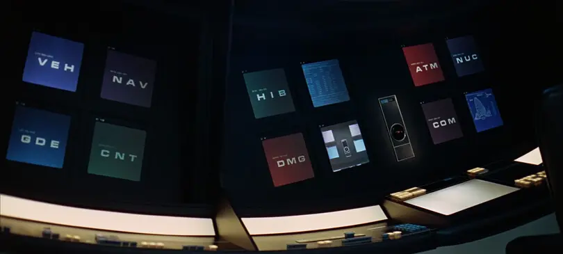
“If it doesn’t immediately come to mind, the moment you look at it, you will think ‘sci fi,’ you will think of the future.”
This realization inspired Dave to write a series of design studies analyzing how fonts are used in many classic sci-fi movies, starting with 2001: A Space Odyssey. Thinking this would be nothing more than a passion project, Dave was surprised when traffic to his first blog post, “took down my web server and led to about a $1,200 internet overage charge. So clearly I was doing something right.” After writing similar pieces on Alien, Moon and Blade Runner, a TV critic reached out to Dave, which eventually led to the opportunity to write a book about fonts in sci-fi.
“To my surprise and delight, it turns out people who are really, really interested in design, and people who are really, really interested in sci-fi, actually have a surprising overlap,” Dave says, “It turns out there’s a lot of commonalities between the two, and I’m sure it is that imagining the ‘what if’ is the common theme between them.”
Much of Dave and Terrance’s conversation circles around Eurostile Bold Extended, which Dave refers to as “the default [font] for pretty much every sci-fi movie ever made.” But while he has picked up on its use, he also notes the importance of it blending in with a film – not standing out. Like good design, text should most often be invisible in film and toe the line between realistic and legible, without inviting too much attention. Eurostile has found its way into countless sci-fi films, in patches on the Apollo space suit uniforms, and even car speedometers (read this article to learn more about our research testing Eurostile in car dashboards). Originally designed in 1952 by a young type designer, Aldo Novarese, in Italy, the font was not designed to be futuristic and was actually designed to be legible at small sizes.
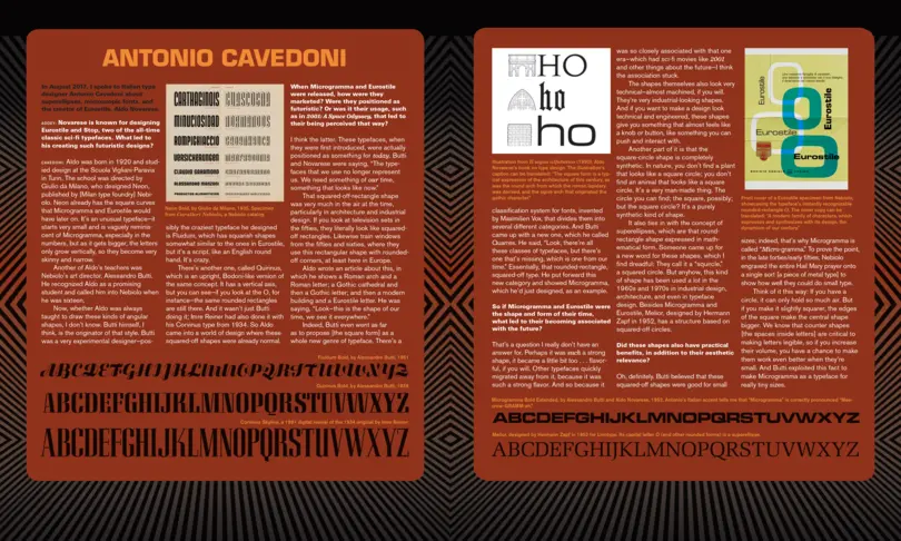
“It’s funny that we think of it of the typeface as the typeface of the future when it was very much designed to be a typeface of the now, exactly as you say,” Dave says.
Dave also points out how sci-fi Is a way of recording our predictions, and in many cases, fears for the future. For example, Star Trek and Alien both featured body scanning technology that was very similar to CRT scans, which were relatively new at the time. Blade Runner had drones and Moon had emoji-based language.
“Where I think we need to be a little wary as designers,” Dave points out, “is that the designs that we see in sci-fi movies, which can feel awesome and inspirational, are not necessarily always great real-world designs.”
Dave talks about the transparent screens seen in Minority Report and other movies, which look impressive but would be legibility nightmares in real life. To avoid getting lost in the “what if,” Dave discovered brainstorming prompts and tools when writing his book that can help jog the brain while staying rooted in reality.
“Extrapolation is definitely the recurring theme here,” Dave says, “Take things we know, mash them up in interesting new ways, and it will usually lead to an interesting creation. And if you’re lucky, it turns out other people might actually find it interesting too.”
