The Counterspaces – Typography in the Age of Black Swans
News
News
The Counterspaces – Typography in the Age of Black Swans
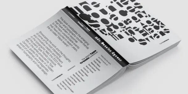
Zetafonts presents the new issue of the Type Trends lookbook series, titled The counterspaces (Typography in the Age of Black Swans). Curated by the Type Campus team, it is an exploration of the many contemporary counter-trends in the world of design and typography, that have arisen in response to the unpredictable events that have occurred in recent years.
Below we share an excerpt, featuring Ninan Chacko, Chief Executive Officer at Monotype.
Ninan Chacko is the Chief Executive Officer at Monotype, the largest provider of typography, technology, and expertise to creative professionals. In this role, he oversees a global organization of more than 750 employees, partnering with iconic brands and transforming the adoption and use of digital fonts industry wide. Prior to his tenure with Monotype, Chacko served as Senior Advisor to McKinsey, and was the Chief Executive Officer for Travel Leaders Group, one of the largest retail, corporate and entertainment travel companies in North America and the UK, with sales of over $20 billion and more than 4,000 employees. Before this, Chacko provided visionary leadership as Chief Executive Officer of PR Newswire. During his tenure, PR Newswire enjoyed significant organic growth from product innovation and international expansion. Chacko has also held the position of Chief Commercial Officer for Worldspan, the global travel information, e-commerce and technology service provider. He was a founding member of the buyout consortium management team that acquired Worldspan from Delta Air Lines, Northwest Airlines and American Airlines, and served as Chief Commercial Officer until its sale to Travelport.
Your 2021 Monotype Inaugural Address started with some great questions: “What will Monotype’s vision be? Where will the organization go from here? How will it get there?”. Now, more than a year after, what can you say to us about Monotype’s vision for the future? And how has this year changed your original ideas about that?
I have been at Monotype for a little over a year and a half, and this time for me has been dedicated to really understanding not just Monotype, but most importantly the industry and where it’s headed. And really, for me, probably the core vision that comes out of that from a Monotype standpoint is this notion that we want to establish ourselves as a “one-stop shop for all things typography” for everyone that values type, including our customers around the world, the foundries that partner with us, and also for creative people more broadly. So, when I say a one stop shop, that means we’re not just a foundry. I mean that we are thinking of ourselves as a community for type design, an ecosystem connecting foundries to customers not just through font software but also in creative and design services, and a platform to elevate and amplify the impact of typography all over the world. I think the key to all of this is being able to provide any product or service to our customers and any kind of support that our foundry partners and our customers need, to succeed. All of that is informed by a perspective where we think typography is undervalued broadly and where our whole goal is to raise the value of typography.
Digital culture keeps creating disruptive innovations. Artificial intelligence solutions and open source and subscription business models are forcing us to change our ideas on intellectual property. What are your ideas about that? Will our conception of typefaces as software with intellectual property change? Will subscription be the rule instead of ownership?
It’s a great question. Obviously, intellectual property ownership is a crucial part of typography and it’s an extremely important concept for us to protect. Without intellectual property rights, designers, creators and inventors lose the ability to monetize their work, and their ability to be compensated fairly for all the work that they’re doing to introduce type and design into the world. So, we think intellectual property protections are a crucial element and we strongly support the treatment of font software as intellectual property. We are continuing to advocate for it very strongly in different geographies around the world because we think it’s key to ensuring that all font designers essentially have appropriate monetization and are paid equitably for their work. In terms of how customers pay for it… I think that if you look at the music and video markets the evolution from paying for perpetual to streaming licenses has already taken place and consumers have embraced the fact that when you buy music today through Apple Music or Spotify, you don’t own that music. You get easy choice and easy access, and that has actually promoted the consumption of music. We think that this key change is underway today with respect to font software, and we believe subscription models and streaming are going to be essentially the consumption model of the future. Monotype is leading this change in the industry, and we don’t think this conflicts with the idea of intellectual property ownership that we just discussed, but rather it allows an even better way for creators to monetize their work. If we move away from one time licensing into an ongoing subscription model, it becomes a much better way to compensate the creator for the real value that they deliver on an ongoing basis in terms of intellectual property. That’s the core philosophy of our own business and we’re essentially moving in that direction where subscription will be the majority of what we do. We’re also innovating with a new way of paying foundries for their fonts in subscriptions, that appropriately and holistically reflects the font’s contributions to the customer experience and ensures that foundries can continue to grow their earnings while the customer’s needs evolve.
According to extensis.com, there are more than half a million typefaces available online, and over five hundred are published each month on myfonts.com. As a brand that owns an incredibly rich typeface catalog, do you think that there is still space for innovation?
Absolutely yes! I think the same question has always been asked in history. Do we have enough music, enough images, enough videos? I think it takes a different level of creativity, but there’s absolutely room for creativity in the generation of both new designs as well as updated designs of existing typefaces. And I think the emergence of artificial intelligence and machine learning is actually going to create even more opportunities for ideas to surface in type design, things that we didn’t naturally think of in our standard creative approach. The world is full of rich possibilities with respect to design, and we’ve seen that in every other industry when people said “oh there’s no more new music that’s going to come out, there’s no more new fashion that’s going to be needed, no more new automobiles”… they’ve been proven wrong over and over and over again. I think absolutely the same is true of fonts and if anything, we should celebrate and embrace this explosion in design thinking, that’s going to yield all these interesting variations in terms of typography going forward. There’s always room for creating new typefaces. As you know we have a number of famous designers who are at Monotype, including Akira Kobayashi who recently got a lifetime award from the Type Directors Club, and this year he finished the design of a brand new Japanese typeface called Shorai Sans. It’s inspired by some of the work he’d done with Asian brands in the past, but evolves traditional hand drawn brushstrokes with clean, geometric outlines, and it’s a terrific example of new design thinking opening new horizons in Japanese typography.
Still, there’s also the need to revisit and upgrade the existing typefaces - as you did with the Now versions of Helvetica and Futura…
There are naturally customers who love what you do and want a little change. And we think revivals, Helvetica Now, Futura Now, etc are all ways in which we give customers the familiarity of something they already know but with the added advantage of an updated version of it. And it’s almost the same as you know, the way Hollywood creates, with Superman 6 or Star Wars 9. There’s an audience for these products and they play an important role in meeting the consumer and commercial demands. Naturally it may not always be the thing that a designer wants to create, as we like to do something new, but I think we also have to balance that with the needs of the marketplace. I think absolutely there is room for both brand new as well as revivals or updates of what we have historically seen. Innovation and familiarity are catering to different kinds of demand.
In the past Monotype has been on the forefront of the research for internationalization, expanding hundreds of typefaces with non-latin glyphs. Has this changed, according to you, in the last years? Will the typographic center of the world shift to the new rising markets of China and India?
Well, I don’t believe it will fundamentally shift but I am sure we’ll grow new centers of typography. You must be aware that the markets for India and China are also quite fundamentally different. In China there was a standardization (to Mandarin and simplified Chinese), while India took a completely different approach that sees a national language coexisting with regional languages that are evolving and will continue to exist. This means that they will evolve in different ways, but surely these markets will grow, and this will bring growing GDP and corporations that will want to access those markets and obviously, the role of typography in those markets will become more important. Still, I don’t think that anything is going to change the dominance of English as the language of global commerce. We’ve already seen that with the proliferation of social media, you know… Take a teenager in Azerbaijan, a teenager in Australia and a teenager in Mexico: their tastes and interests are not so different today - especially if compared to 20 years ago. People from different places and cultures wear the same types of clothes and listen to the same types of music. And that’s because of the power of social media. And so I think we’re really in a world where, if anything, I think we’ve ended up having global commons in terms of tastes and in terms of culture and of course in terms of language. Just think about the same slang that’s been adopted in various languages.
The use of Gotham in the campaign for Barack Obama, showed us how important can be the role of type in making messages stronger and more effective. Their authors, Hoefler&Co, are now part of the Monotype family. Do you believe there’s space for typefaces to express new themes in our ever changing world?
Absolutely, and I think as we touched on earlier, there’s a big white space that exists to capture design intent both from designers but also from the input of AI machine generated typefaces. I think there are whole horizons in typography that have not been explored historically. We have this research project that Monotype has been doing with Neurons, to isolate and target, for example, the role of emotions that certain typefaces evoke. This study is fascinating: we are now starting to share some of its outputs, which show significant statistical differences. Of course, designers very well know that emotion plays a role in typefaces, but this is the first time we’ve had data to support that. And now we can start to say things like “let’s find the better typeface that expresses fidelity, trust, love, affection, or fun”. We have some means of tracking and measuring those things and incorporating them in typefaces. And this means there are far more dimensions to also explore in typography beyond serif, sans serif, weights, etc. And then there’s also the question of readability in new conditions. We are doing research with some of the major technology players to explore the notion of how type plays a role in the Metaverse in terms of legibility, in terms of the ability to stand out, the ability to process information rapidly. Seven or eight years ago we did a study with MIT, centered on the way different typefaces can make it easier and quicker for you to process the information when you glance at a dashboard. And when we think about those dimensions, you realize that you don’t see that represented much in today’s type offerings. So, I think we’re going to see this explosion of the role that type plays at different dimensions, at a subconscious level, at a processing level, at a security level. There’s a role that typefaces can play in conveying provenance and authenticity of content, and these are some of the horizons that exist out there that we’re more excited about. This, we think, opens up a whole set of possibilities for where type can go in the future.
To download the full report from Zetafonts click here.
