Type Faces: Meet Jay Loo.
Thought Leadership

Thought Leadership
Type Faces: Meet Jay Loo.
Welcome to our Type Faces series, where we’ll be sharing the stories of some of the fabulous people behind the type here at Monotype. From all around the globe and across the organization, our Monotype colleagues truly prove that, like Charles Nix, Senior Executive Creative Director at Monotype, always says, “We are ALL creative.”

Portrait of Jay Loo in the Lower East Side in NYC in front of a graffiti mural celebrating hip hop’s 50th anniversary.
Jay Loo, lover of hip hop and graffiti enthusiast, is a lifelong New Yorker. He grew up admiring the graffiti he saw everywhere around him in the city. That love of graffiti has helped Jay connect the dots between the creative and sales sides of typography, giving him a rich background to draw from as he educates and empathizes with the Monotype customers he works with every day in his work as Director of Pre-Sales & Market Research at Monotype. Read on to learn more about Jay.

“New York” – Created as part of the Marker Challenge.
You’ve lived in New York City all your life. What do you love most about it?
Our diversity. So many cultures are scattered throughout the five boroughs. We may all come from different backgrounds, but we are all New Yorkers.
What’s your favorite family recipe?
My father’s Cantonese-style salted fish and my mother’s Cuban-style white rice, black beans, and fried plantains.
We’re all inspired by different things in life. Who or what inspires you?
Bruce Lee! The cha-cha dancing champion of Hong Kong, he was pretty good at kung-fu, too. He was a passionate workaholic, and he was always open and willing to share and welcome new knowledge. He was very proud and felt it was his responsibility to share his heritage but also change any old traditions and try new things, no matter what others may think.

Jay Loo creating a commissioned graffiti mural.
You’re known at Monotype for your love of graffiti. How did you develop this interest?
Graffiti is one of my first passions from childhood. I always liked drawing and comic books, but I noticed that the storyboards based in New York City never included the graffiti on the walls. In real life, it was everywhere. And it’s one of the pillars of hip hop, which I also love.

Commissioned piece by Jay Loo, mixing tools, spray paint, and markers.
Who’s an artist you would recommend others check out?
Nas. Listen to Illmatic and then listen to Illmatic: Live from the Kennedy Center with the National Symphony Orchestra. The evolution of hip hop was captured so perfectly!

“Get up by any means.” Photos of Terrance Weinzierl’s contributions to the Marker Challenge.
Thinking back to your love of graffiti, what connections do you see between this form of artistic expression and typography?
It’s an artform that allows people to deliver messages to others; typography is, too. And graffiti is a place where the unsung writers of typography reside. I love the penmanship and the way the art form helps people feel connected across the city. I see the influence of graffiti in things like advertising on buses or trains — those wraps that cover the exterior — with expressive typography that catches the eye, just like classic graffiti does.
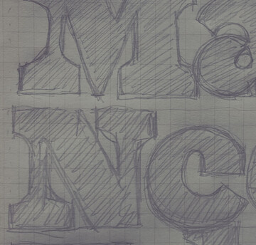
Eight years ago, I started the Marker Challenge at Monotype. I sent the type designers a set of traditional graffiti markers and asked them to write and draw whatever they wanted. It was really interesting to see how everybody’s background and aesthetics came through.

Spotted in Harlem, NYC: Helvetica Rounded.
What’s your favorite typeface and why?
My favorites are always changing, so I have to give you five. First, I’d have to say Helvetica, because it’s synonymous in my mind with New York City, where I was born and raised. And then there’s a newer font from House Industries called Neutraface. It’s a very classic, clean-looking font that should be the standard for house numbering because it’s so legible in every type of lighting. My third favorite is Positype’s Lush Script. It’s a fat-looking script that reminds me of a graffiti writer who wants to lean more classical. I’m also feeling Deni Dessastra’s Padjintan timoer; a typeface like this catches my eye without being too loud and has a high-end lifestyle apparel kind of vibe. And then there’s Futura. I originally heard of Futura in the context of the graffiti artist, Futura 2000. I found out later that he took his name from the font!

Jay Loo creates marker art pieces in preparation for his Brand Talk presentation in 2023.
Can you describe your role as Director of Pre-Sales & Market Research at Monotype, in a nutshell?
I’ve found a niche in explaining fonts to creatives, who typically don’t understand typography or licensing. I serve as a conduit between the sales team, our type designers, and the creatives who use our fonts, almost translating between these groups so that everybody understands what’s being bought and sold.

“Take the Risk” by Jay Loo.
What do you love about your job?
I love working with the studio team. You get to see how type is created from scratch, with an intention that the font is inclusive for all. It’s really incredible how fonts can invoke a mood and facilitate some of the most important interactions in our lives. I’m thinking right now of gamers, kids who play with other kids across the world and rely on type to provide the instant translations that keep communications flowing.
I also love that my job gives me the opportunity to help people feel seen, heard, and welcomed. I approach every conversation with empathy for the person I’m speaking to, using the language that resonates with them and makes them feel included.
Loved getting to know Jay? Check out more of his photography on his Instagram page
Interested in joining the Monotype team? See our list of open positions here.

Director, Global Pre-Sales & Market Research
Jay Loo.
Jay Loo is the Global Director of Pre-Sales and Market Research at Monotype, the largest provider of typography, technology, and expertise to the creative professionals. In this role, he overseas Monotype’s Market Research and Pre-Sales Teams, focusing on understanding our customer’s needs across their typographic landscape while providing a positive Monotype Fonts experience.