注目の記事
Shorai Sansは、幾何学的な形状が特徴のMonotypeの日本語書体です。Monotypeクリエイティブタイプディレクター小林章とタイプデザイナー土井遼太、そして書体デザインの第一人者、中村征宏氏を制作メンバーに迎え開発されました。

Find design inspiration in an age of information overload.

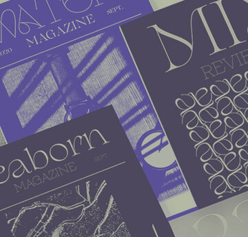
In this article, get a peek at recent and upcoming book releases in a variety of genres to get a sense of what typography styles are trending in publishing right now. This post is a guest piece from our friends at Reedsy, a website that connects authors with publishing professionals.

Today’s brands must keep up with a fast-paced digital world and navigate a “new normal” that’s still emerging from the worst of the pandemic. The last few years shifted everyone’s digital expectations, how brands operate, and in some cases, impacted their business models. Moreover, issues like biodiversity, sustainability, diversity and equity, and brand activism are all booming. So how does this all impact brand building? These macro shifts are greatly influencing how companies position themselves, the services they offer, and how they communicate with their customers.

たづがね角ゴシックは、Monotype初の日本語書体で、Neue Frutiger®に合うように設計されたヒューマニストサンセリフ体です。和文と欧文を混植する際に自然に見える書体の新基準を目指して開発がスタートしました。

初年度のType Champions Award受賞者を発表いたします。Type Champions Awardは、書体を創造的、革新的かつ深い印象を刻む手法でブランドアイデンティティの構築に活用しているブランド企業を表彰する、Monotype主催の新しいプログラムです。


