Type Mixtape: Paula Scher.
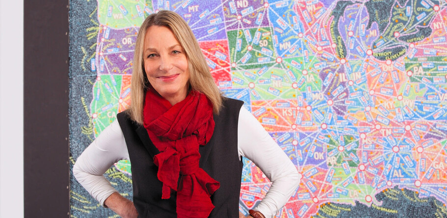
Paula Scher has been making and breaking rules in the world of graphic design for the last four decades. She’s collaborated with some of the world’s most influential companies – think Windows, Bloomberg and Coca Cola – but also played a key role in the music industry, at one point turning out 150 record sleeves a year. This feature is extracted from The Recorder Issue 5 and highlights ten of her favourite typographic projects from her career.
Known for her illustrative use of type, Scher has picked up an armful of design industry awards, taught countless numbers of eager students at some of the most well-respected design schools out there, and became the first female principal at Pentagram, where she’s been working since 1991.
In honour of her many achievements, we invited her to put together a slightly different Type Mixtape than usual, celebrating her contribution to design by looking back at some of her favourite projects to date. Scher spent five years between 1979 and 1984 working independently, during which time she worked extensively on alternate typographic vocabularies within her work, before joining former classmate Terry Koppel in founding Koppel & Scher. Her work there, including the iconic Swatch poster, re-affirmed her name and talent so that when Koppel dissolved their partnership in 1991, Paula Scher went on to become a partner at the New York office of Pentagram, the world’s biggest design partnership.
Scher’s work has included corporate identity and branding for major Wall Street clients including Citibank, Coca Cola and Bausch + Lomb, but it is for her work in the arts that she has become most recognised. Her cultural clients read like a “who’s who” of the American theatre and arts scene, with the Museum of Modern Art, New York Ballet, Metropolitan Opera and New York Philharmonic among them. Here she chooses ten favourite typographic projects from her career.
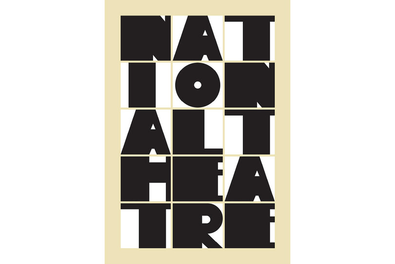
National Theatre poster, 2013.
“I enjoy this simple construction of boxes. The font was created for this project.”
Several designers created limited edition posters for London’s The National Theatre’s 50th anniversary – including David Carson and Graphic Thought Facility – with Scher’s blocky design perhaps a reference the architecture of the building itself.

Bloomberg Signage, environmental graphics and media installations, 2005
“Bloomberg represents my favourite use of type in space and with different materials (Avenir was Bloomberg’s corporate font).”
Scher designed wayfinding for Bloomberg’s New York headquarters, developing new font Bloomberg which merged Avenir’s letters with the numbers of Avant Garde. Floors were marked with colour-coded numbers, and giant scrolling news and data screens showcased information from the company’s own live feeds.

Bring In Da Noise, Bring in Da Funk poster for The Public Theater, 1995.
“This version of the poster best represents the spirit of the musical and is emblematic of my work for the Public Theater in the 90s. It uses American Woodtype from the Morgan foundry.”
Included in MoMA’s collection, Scher’s Bring In Da Noise, Bring In Da Funk posters were created in 1995 for an original off-Broadway production, and are among the designer’s best known work – particularly for their ‘noisy’ use of typography.
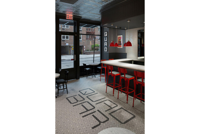
Quad Cinema identity, 2017.
“My favourite signage for theatre, using bespoke type created for the Quad Cinema.”
To mark the reopening of New York’s Quad Cinema, Scher created a “stark, modern logo” – as AdWeek described it – alongside signage, graphics and installations all informed by cinema’s visual language.
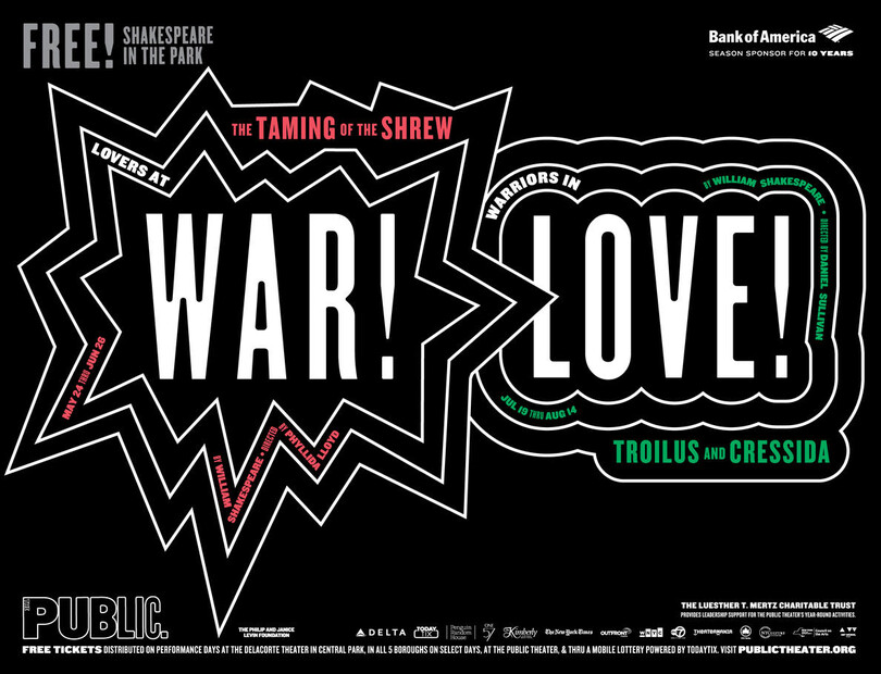
War/Love Poster, The Public Theater 2016-17 season campaign, 2016.
“The 2016 Public Theater poster continues the series of wood type based communication (Knock Out).”
Scher created this poster as part of a campaign for New York’s 2016 Shakespeare in the Park series, presented by the Public Theater. The designer has been creating posters for the series since 1994.
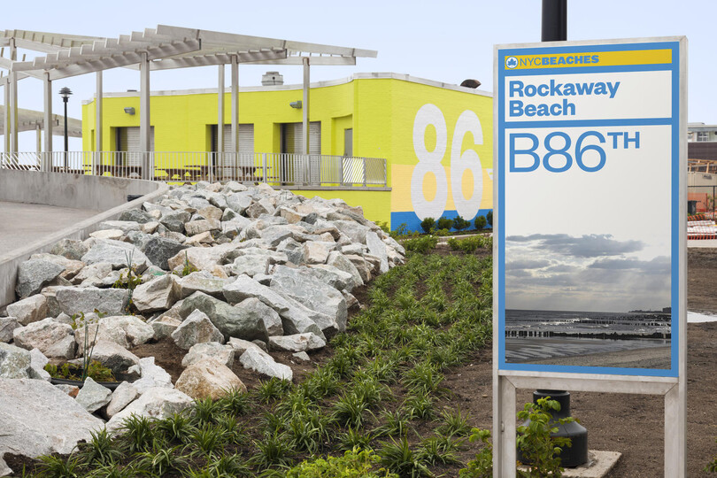
Rockaway Beach/NYC Beaches environmental graphics, 2001.
“Created for the boardwalk, Rockaway Wide is the largest pixel in the history of type.”
Tackling New York’s beachfronts, Scher created a hybrid landmark and sign system, as well as giant boardwalk graphics with 50-foot tall letters spelling out Rockaway – only seen in full by jets flying overhead.
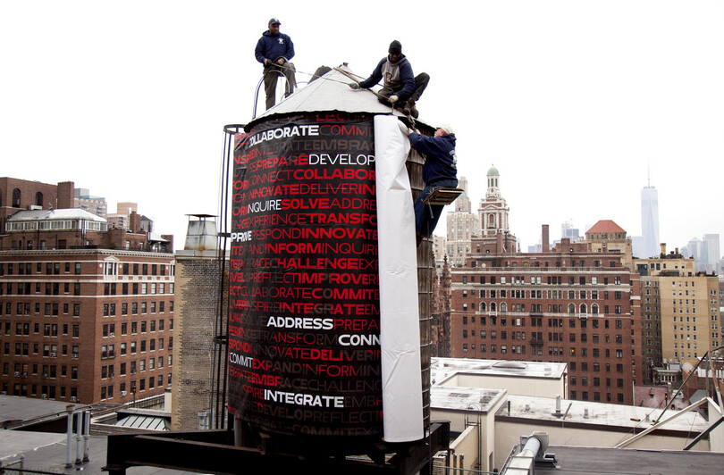
The New School identity, 2015.
“Three widths of a font – Irma – programmed for the New School and renamed Neue.”
Pentagram’s 2015 rebrand of The New School relied on an algorithmicall generated typeface, which offered up what Fast Co Design called a “wild variety of permutations”.
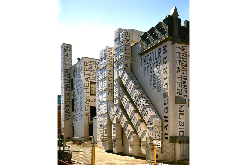
New Jersey Performing Arts Center environmental graphics, 2001.
“Best use of typography on air-conditioning ducts. The typeface is Agency Gothic.”
Scher took type big for the exterior of the New Jersey Performing Arts Centre in 2001 covering is walls in oversized letterforms.
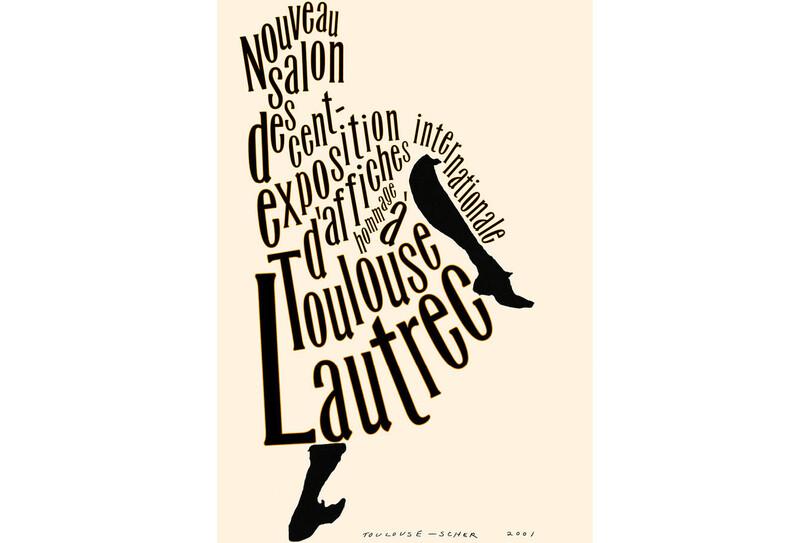
Poster exhibition honouring the centenary of Henri de Toulouse-Lautrec’s death, 2001.
“Avril font made from Miehle.”
Created as part of an exhibition marking the artist’s 100th anniversary, Scher’s typographic poster offered a new take on Toulouse-Lautrec’s well-known Jane Avril can-can dancer.
This feature is extracted from The Recorder Issue 5. You can pre-order a copy here.
Imagery is courtesy of Pentagram; Paula Scher’s portrait is by Ian Roberts


