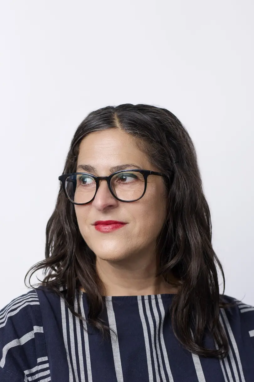
Sara Soskolne.
Creative Type Director.
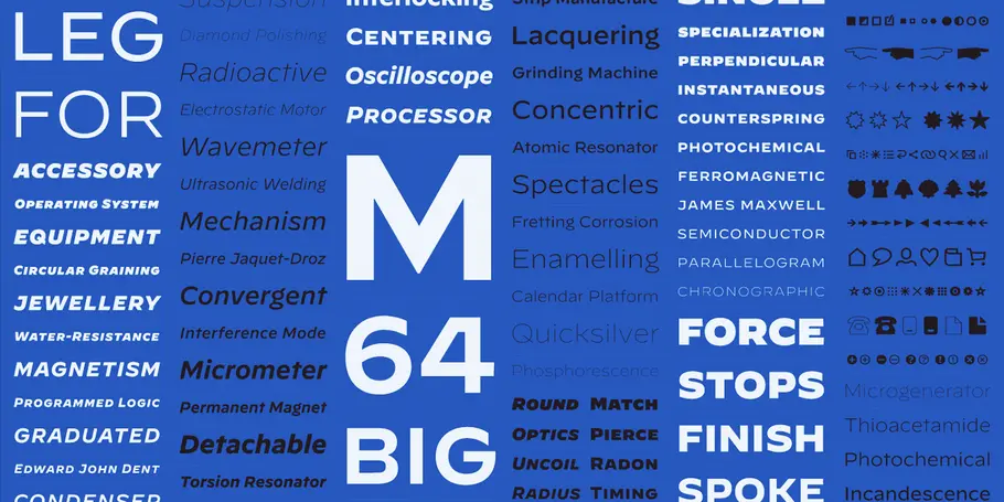
Initially inspired by the markings on watch dials, Decimal not only evokes the confident lettering of classic timepieces, but uses design strategies that help it master information-dense environments.
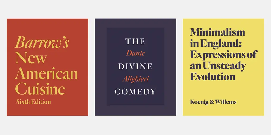
Quarto is a seriffed display family marked by controlled contrast. Its fluid motions are checked by a steadfast rhythm, its density invigorated by sudden geometric turns and sharp corners.
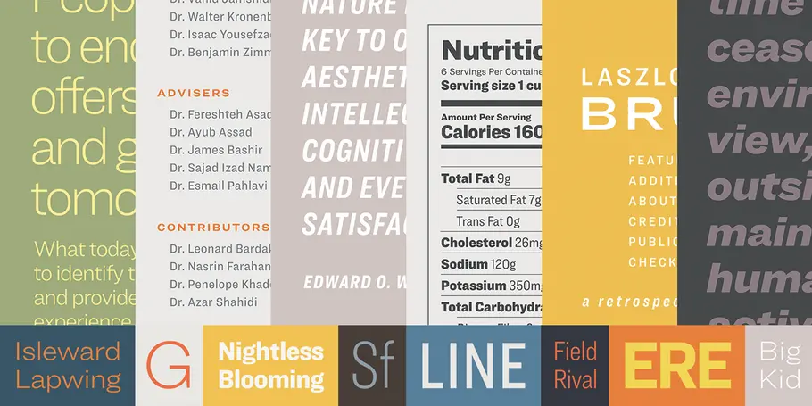
Designed as a text-size complement to our Knockout family, Ringside is a powerhouse sans serif in six widths, each in eight weights, with both romans and italics.
In her words.
Sara Soskolne is a Creative Type Director and designer. As a reformed bookworm, her deepest inspiration as a typeface designer is the experience of reading, and her abiding interest is in creating typefaces which not only serve but enrich that experience. Originally a graphic designer, Sara’s increasing fascination with type eventually drew her to study typeface design at the University of Reading in the UK, and then to practice it at Hoefler&Co.
Prior to joining Monotype, Sara played a part in nearly every H&Co typeface after her arrival there in 2005 — as a designer, and later also through her oversight of the type design team. Among those, she contributed to the development of the Verlag, Chronicle, Gotham, Tungsten, Idlewild, Numbers, Sentinel, and Whitney families, and played a formative role in the design of Quarto, Ringside, and Decimal.
Her master’s dissertation research sparked an ongoing project exploring the evolution of the sans serif in the types of the 19th century, and she was one of the founding instructors of the Type@Cooper Condensed certificate program. As an only partially reformed Torontonian living in New York, Sara still spells like a Canadian and can’t really think in Fahrenheit.
