Ambiguity™
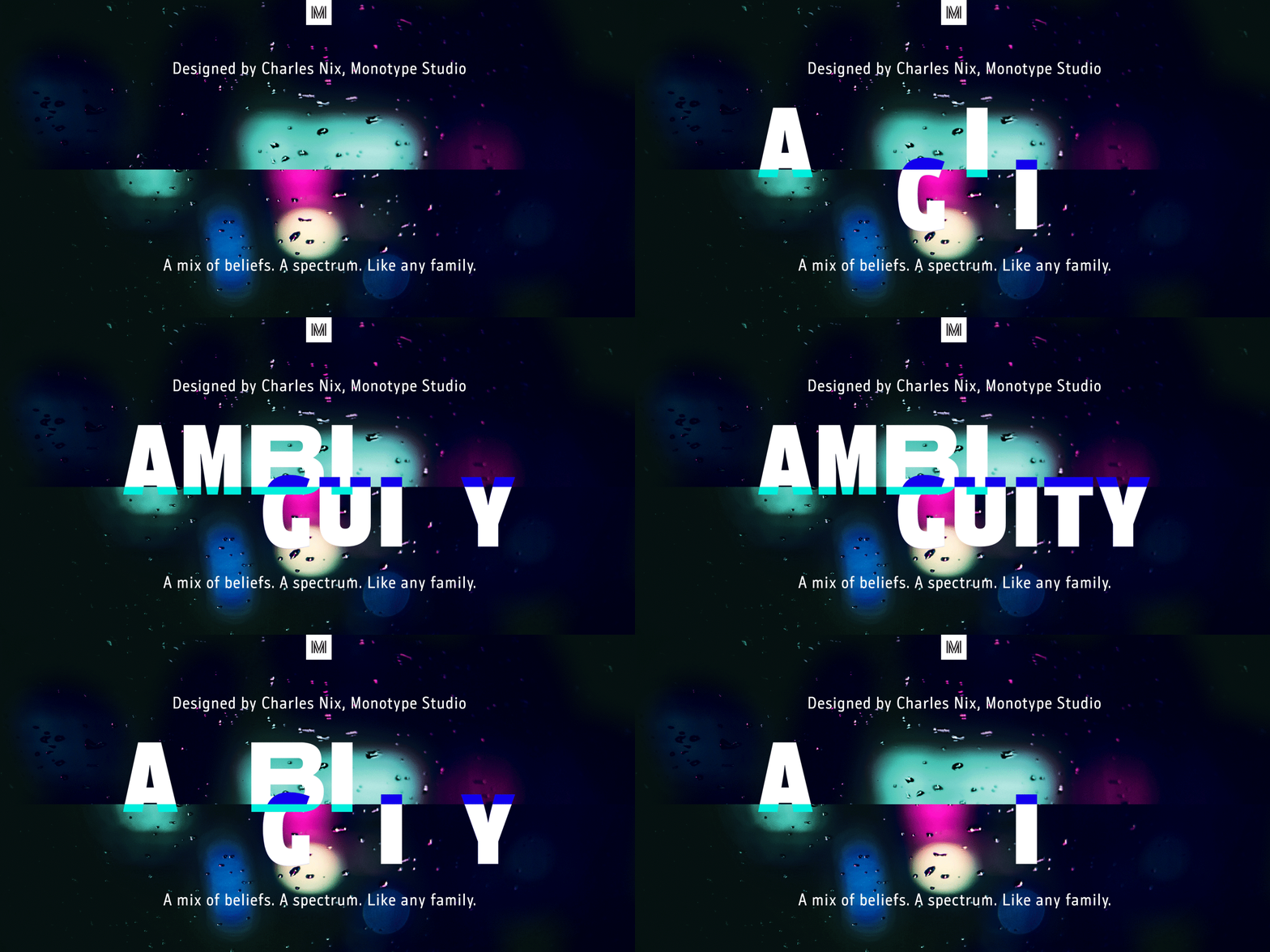
A mix of beliefs. A spectrum. Like any family.

A mix of beliefs. A spectrum. Like any family.
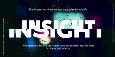
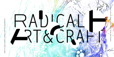
Ambiguity embraces both tradition and radicality, as well as generosity and thrift, encouraging us to question our beliefs about the intersection of style and meaning. With five distinct states of being—Tradition, Radical, Thrift, Generous and Normate—Ambiguity merges established concepts with inverse proportions, creating an exciting tool for tweaking text and expressing a range of attitudes and beliefs—from conventional to unorthodox and frugal to extravagant.
Escape normality. Celebrate difference. Embrace the spectrum. Ambiguity, from Monotype.


Ambiguity was inspired by the idea that utopia is within reach if we embrace ambiguity and fluidity as states of perfection. Nix challenged his own notions of traditional proportions, contemplating the sources and consciously contradicting them. The output is Ambiguity, a typeface with five “states” of letterforms, providing a diverse palette of fonts for designers and brands wanting to both challenge and express their typographic voice.

Charles Nix is a designer, typographer and educator. He has designed hundreds of books and typefaces. Charles taught for over 20 years at the Parsons School of Design, where he served as Chairman of Communication Design.
We offer a number of ways for you to start working with our typefaces.
Monotype introduces Ambiguity, a typeface designed to effectively express a range of attitudes and beliefs.
Ambiguity, from Charles Nix, offers a chance to pause for thought, question the state of affairs, and indulge in a little bit of enjoyable discomfort.

