How to make clients care about fonts (and why you should try).

Heard this before? “We don’t care about fonts or where you get them.” How about this: “We don’t have budget for fonts, just make it work with something free.”
Maybe you nodded in agreement. Maybe you rolled your eyes, even if you dutifully went off and scoured the web for something free and attractive. Maybe you wanted to push back, but didn’t know what to say or didn’t think it was worth it.
Guess what: It is, and the benefits to your clients and your business are significant.
Type is like clothing: What you wear is a reflection of who you are
First off, the purpose of this article is not to bash free or system fonts. Many free fonts are quality fonts, and system fonts are as reliable as a Toyota Camry. They have their place in a designer’s repertoire, which we’ll touch on later.

However, when it comes to branding, these options can leave a lot to be desired. Free fonts are very hit and miss: many lack full glyph sets, which makes translations difficult or impossible, while others have limited weights, sizes and styles.
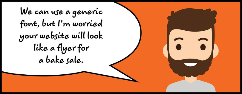
System fonts are reliable, but that comes at the price of being overexposed. The same is becoming true for many free fonts, especially the good ones. Since anyone can use them, everyone will, whether it’s you designing your client’s website or the local PTA advertising a bake sale.
As a designer, your job is to deliver a quality design that, most importantly, the client likes. But designers can also help steer clients toward choices that better fit the project. Clients may not understand how important type is to making a good first impression. Choosing a quality design that complements the project, and brings excellent legibility and versatility across platforms, says a lot about a brand’s personality, credibility, and attention to detail.

Put differently, is a less appropriate typeface that performs adequately the first impression your clients want to make? Probably not. Paying for quality type may not seem worthwhile to a client, but it’s important to spell out the implications of that choice.
Secure licensing
We hear it all the time from clients and freelance designers alike: Licensing is confusing.
No argument there. Licensing terms vary a great deal, leaving you wondering where a font can be placed, how much it can be used, whether it is licensed for digital applications, and what, if anything, your client must do to maintain that license down the road. This all assumes the font is licensed at all, and what if it isn’t?
No designer wants to hand off a project with a shrug and a “good luck.” It puts the client at risk of legal issues around its font usage. Being able to recommend fonts with clear and broad licensing can pay off in the form of future work, recommendations, and general client happiness.
Purchasing fonts from a reputable marketplace or foundry takes the guesswork out of licensing. Licenses are clearly spelled out, and multiple options are usually available. This allows you to present clear options to your client for both digital and print usage. Clients don’t need to purchase fonts to get this degree of assurance, but finding distinctive fonts with clear, inclusive licenses on the free marketplace can be more time-consuming.
Give your portfolio a boost
Being well-versed in type and the mechanics of font licensing makes you more valuable to your clients. It’s a level of expertise that can differentiate you from other designers competing for work, and can lead to stronger word-of-mouth recommendations.
It also allows you to market yourself in different ways. In addition to your talents as a designer, you can approach brands with ideas and solutions that go beyond the execution of the project. Clients may be grateful for a designer who can educate them about the aesthetic and branding benefits of type while heading off potential legal headaches down the road.

This adds a lot of value to your pitch and can lead to more work down the line. Your portfolio will tell the story of a talented designer who thinks big and solves problems for brands. That’s something potential clients love to see.
And sometimes, just let it go
Let’s be honest: Paying for type will not make sense for some clients. That’s fine. There are very good free fonts available. Tried-and-true system fonts will get the job done. Sometimes you need to pick your battles and just do what the client wants.
Still, the point is to have the conversation. Many clients don’t know what they don’t know. A little education on fonts, perhaps accompanied by some gentle prodding, can go a long way even if the clients still insists on a free font. You come away looking like a type whiz either way, which only helps build your reputation and expertise.


