Typography Dilemma: Choosing Custom, Modified, or Library Type.

Choosing the right typeface can be a daunting task for any brand. At this year’s Adobe MAX conference in Los Angeles, California, we explored this topic in greater detail.
Brands that are considering a typeface solution have three distinct options from which to choose:
- Commission the design of a custom typeface
- Take an existing typeface and modify it for the brand’s purposes and identity
- Select an existing typeface from a type library
So, which is the right approach? Well, as you can imagine, the answer is: it depends. After all, a typeface is an essential component of a brand’s identity, delivering its tone, messaging, and personality all in one. During a session entitled, “Typography Dilemma: Choosing Between Custom, Modified, and Library Type,” moderated by Charles Nix, Type Director at Monotype, a talented panel of creative leaders discussed the benefits and considerations that led them to pursue various typographic directions.
Custom Typeface
First up, the panel focused on custom type. The primary benefit to a custom typeface is that you have ownership of it. You own the intellectual property and nobody else can use it (without permission), so the design becomes synonymous with your brand. You don’t need to compromise on design, and you can build something that directly services your current and future technical needs. Custom typefaces often make sense for companies embarking on a rebrand, because they can help define and energize a new visual identity.
Such was the case for Toyota, which worked with Monotype and Saatchi & Saatchi on a new custom typeface. During our session, Monotype Creative Type Director Steve Matteson and Jason Schragger, Chief Creative Officer for Saatchi & Saatchi, shared the steps they took to develop the typeface together. Schragger, who oversees Toyota’s 2018 Global Olympics and Paralympics creative, including the launch of the recent “Mobility for All” campaign, noted the importance of taking chances creatively when you are embarking on a custom type project. Toyota approved of this approach, viewing it as part of the process of building a typeface that would ultimately serve its complete needs.
Matteson, who is the designer behind Open Sans, a typeface used on more than 17 million websites, discussed the similarities between designing an automobile and designing a font, namely the idea that in both cases, designers begin with a static product and alter the proportions to determine the style and personality of the end result. The static nature of type made it more difficult to convey motion, of course, but to Toyota, it was important that the typeface aligned with the brand mission as a company that believed in moving people. As such, the team approached the design by making the characters lead into one another, almost like a brush stroke, to give a feeling of “motion” to them.
Modified Typeface
Next up, the panel discussed the benefits of choosing a modified typeface to fit a particular need or aesthetic. Of course, there are limits to how much a design can be altered, but type experts like the Monotype Studio can explain those limits, then work with you to select the right initial typeface and modify it to your liking. Modified typefaces are a good fit for a brand that wants something unique but doesn’t have the time to invest in a custom design, perhaps due to a pressing product launch or rebrand.
Andrew Johnson, Design Manager for Thumbtack, shared how his brand decided to modify eight characters of the typeface FF Mark for its rebrand. Johnson leads the Brand Design team at Thumbtack, a company that allows millions of customers to find and hire small businesses across the country. Over the past year, his team has executed a complete rethinking of the brand’s strategy, visual identity, and brand campaigns in order to address increased competition and shifting customer demands. As he put it, “we wanted to change everything but the name.”
Johnson and his team loved the blended approach of a modified typeface. “We could build something that was our own but collaboratively developed with designers based on their brilliance.” FF Mark had just the right amount of quirkiness for the brand while giving them access to a wide character set. There is a glyph for anything they might want to convey. An interesting part of the modification was reducing the file size of the font by 40%, which allowed for faster load times on-site and within the brand’s app, translating to real business value.
Library Typeface
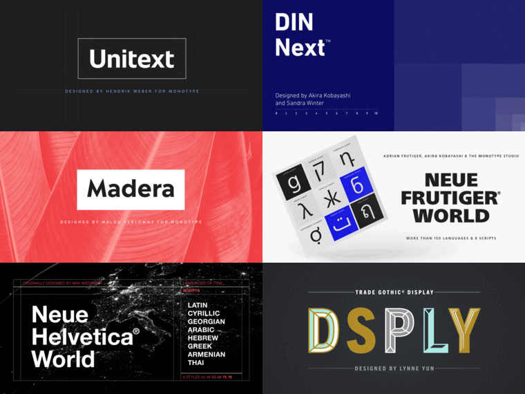
Finally, the panel explored considerations that would lead to the use of a library typeface. As Charles put it, “there are tens of thousands of timeless, distinctive typefaces in the world, all ready and waiting to be licensed and put into your creative.” Choosing a library typeface is a simple and quick solution. There is a large palette of designs from which to choose, and a type studio can help you identify options that align with your visual identity and brand values.
Theresa Mershon, Creative Director for UX and Product Design at Hearst Magazines Digital Media, explained how her team uses an array of fonts from the Monotype library to achieve creative freedom and digital flexibility. Mershon has been designing digital experiences for publishers for over 15 years, and now oversees global design and user experience for an international platform powering dozens of publishing’s most well-known titles, including Cosmopolitan, ELLE, and Esquire.
With so many distinct outlets and channels to address, maintaining a consistent brand identity is both critically challenging and important. On Snapchat alone, for instance, 1.9 million women consume content without going to the website itself, so Cosmopolitan’s fonts act as a vehicle for consistency in brand identity. As Mershon noted, “We let typography drive branding across all of our brands.”
Mershon also shared an interesting heat map that demonstrated the way in which various consumers of content scan sites based on whether they are casually browsing, or doing more focused reading.
“When I work with editors, I tell them to focus on the first sentence because it is the only part that people will 100% read,” she said.
If you are undertaking a complete rebrand, or adding new channels or campaigns to the mix, having the right type is an important decision. At Monotype, we’re excited to help guide brands on the direction of their brand identity now and into the future.


