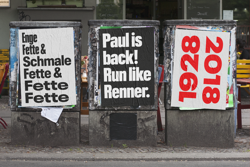
Meet Neue Plak: A revived version of a hidden gem by Paul Renner.

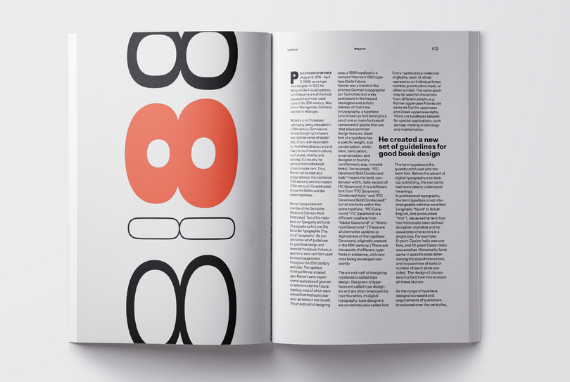
German designer Paul Renner is best known for his Futura design, but Plak, his ‘other’ typeface, is long overdue a rediscovery. Monotype designers Linda Hintz and Toshi Omagari have restored this under-appreciated design, creating a versatile set of 60 weights that draw on the forms of the original wood type.
Unbeknownst to each other the pair had separately started working on proposals for a renewal of the 1928 typeface – which is perhaps one of the oldest mechanically designed grotesques – and ended up combining their work for a much bigger font project. Although Renner’s Futura is a firm favourite of designers everywhere, Plak, his second typeface, is less well known.

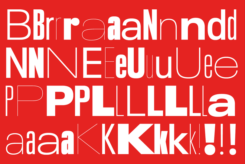
Neue Plak has loads of quirky design elements, staying true to the original family.
Originally published by German foundry Stempel, the design was created as a poster companion for another sans serif. Although much of its cultural history hasn’t been documented – perhaps because Plak was mainly chosen for cheap, fast printing – German tabloid Bild used the design quite extensively in the 1970s and 80s. Its lack of contemporary usage is perhaps because the typeface had only been available in three basic cuts up until now, and was lacking a full digital revival that would bring the typeface up to date for the demands of modern use.
“It felt like we should pay Plak more tribute,” says Hintz, who spent some time researching the typeface in Hamburg’s Museum der Arbeit. “The forms themselves are partly quirky, partly really fun, but with a German stiffness that makes for a strange mix. It was interesting to see how old and dusty the original wooden forms are, and how much work was needed after the initial carving.”

This huge family includes six widths and eight weights totalling 48 display weights
“If you look at it in a contemporary way, the three styles are almost independent of one another, so the challenge was to make that into a family without losing the original quirk,” Omagari adds. “I had those three weights side-by-side with our designs, and tried to make sure we didn’t clean the forms up too much.”
Hintz and Omagari added versions for all of the original wood type alternates they discovered during their research, giving designers the choice between open or slashed counters (a detail which also adds to the elegance of the hairline versions). They also added forms they thought fitted the design as contemporary alternates. Its features like this that counter Neue Plak’s outwardly serious appearance which, nonetheless, offers some subtle hints to a more playful side – for example in its lowercase r, and the sizeable dots over the i.

As well as an entire set of new widths and weights – from compressed hairline to wide extra black – Omagari and Hintz have also designed a new text version, creating a full range of possibilities for designers. Its more ‘extreme’ weights are an obvious choice for editorial, branding and logos, and become much more versatile when combined with the text weight of Neue Plak. The design would also be well-suited to digital interfaces, and ties into the current trend of using mechanical grotesques for UI.
“It looks nothing like Futura, but it comes from a similar mindset – they’re both very geometric and mechanical,” says Omagari. “The outcomes are different, but I see a kind of resemblance in that sense.”
Get the Neue Plak fonts
Neue Plak by Linda Hintz and Toshi Omagari is included in Monotype Fonts.


