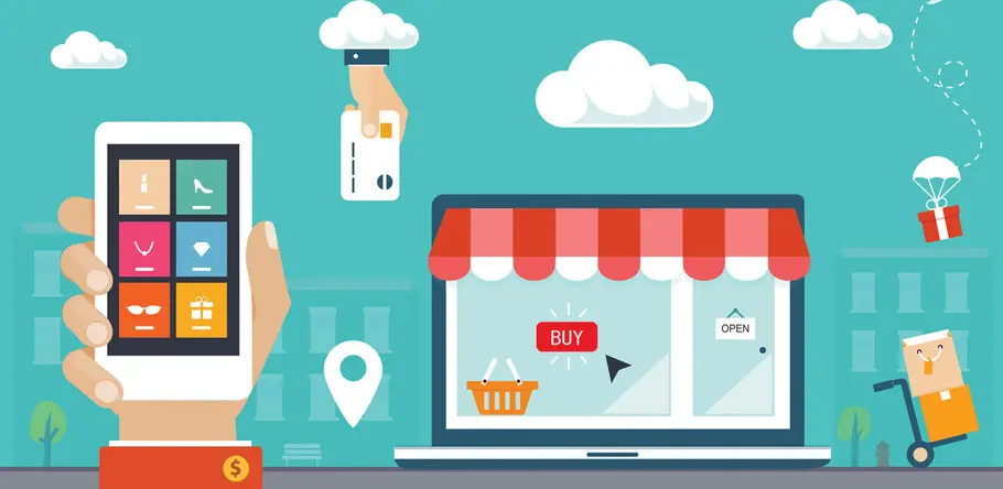
Mobile or bust: Why forward-thinking retailers are prioritizing the mobile experience.

“Meet your customers where they are.” It sounds so simple, but retail customers are scattered across a wide range of touchpoints—your mobile site, app, social media, desktop site, and brick and mortar location (if one exists)—and interact with each platform interchangeably. So where should retailers focus most? The total mobile experience: both the mobile website and mobile app.
According to eMarketer, “retail (mobile) commerce sales will reach $268.78 billion in 2019, up nearly 30% year over year (207.15 billion in 2018). By 2020, that figure will increase to $338.02 billion and account for nearly half of total US retail ecommerce sales.” For retailers to stay relevant, grow brand engagement, and drive sales, they must prioritize the mobile experience.
Mobile app Vs. mobile site usage
Customers use mobile web and apps fairly equally, but in different ways. Amazon has more unique visitors to its mobile site than to its app—152 million compared to 112 million, respectively—but its customers spend far more time in the app than on the mobile site. Of the total time customers spent engaging with Amazon on mobile, 85 percent of that time was spent on the app, and only 15 percent on the mobile site.
Consider the difference between a customer completing a Google search of “white kitchen table” and clicking on a link to Target over Overstock or Ikea versus deliberately navigating to the Target app. A spontaneous Google search is quicker to complete and delivers users to the retailer’s mobile site. But because mobile sites are more commonly used for quick consults, comparisons, or high-level research, users are prone to lower engagement.
App users, on the other hand, are generally more intent to interact with the brand and are open to higher engagement. Once a customer is in the app, they can more easily navigate through Target’s kitchen table product options, allowing them to stay in one place, rather than navigating from retailer to retailer in a traditional web search.
Additionally, there is more commitment involved for a consumer to download a retail app, so it makes sense that fewer customers use retail apps than the mobile site. However, repeat customers also tend to come through the app, rather than through the mobile site.
Data from a report by app commerce company Poq, showed that in 2018, total worldwide app revenues grew 63% year over year, and actually overtook desktop revenue share of ecommerce during Q4 2018. App analytics platform App Annie also reported a strong correlation between time spent by US consumers in shopping apps and increasing digital sales between Q1 2014 and Q3 2018. In all likelihood, this correlation exists because these shoppers start the process further down the funnel, having already chosen the retailer and, possibly, the product before opening the app.
When building the mobile experience, retailers must factor in both traffic and engagement. Though more revenue may be coming through the apps, equal attention must be paid to the mobile site because of a higher volume of users.
Expanding the app beyond the point of purchase
The convenience of mobile shopping is obvious, but the experience is not always frictionless. A study from Yes Marketing revealed that only 33 percent of shoppers prefer to make purchases via mobile, compared to 49 percent who would rather use a tablet or a desktop. Why? Because it’s still faster to make a purchase or easier to comparison shop through a desktop site.
However, apps can add more value than a desktop, or even mobile site. Rather than simply facilitating the buying experience—apps can improve it. For example, in 2017 Wayfair was the first to release an augmented reality function that allowed shoppers to virtually place furniture and décor in their home before purchasing. Ulta Beauty’s app allows users to “try on” over 2,000 makeup products using a selfie or a model. Target’s app bridges the in-store experience and the digital experience by allowing users to browse deals, scan product barcodes, cash in on coupons, pay with a digital wallet, create a list and check items off, see a store map that shows where items on the list are located, check if items are in stock, and more. Fashion retailers like Macy’s and Nordstrom allow customers to build style boards and create outfits as well as offer style inspiration and product recommendations from images users scan or pieces they save as favorites.
Simpler features are also necessary for a good user experience and form the baseline functionality users now expect, such as searching by voice, seeing similar/related products, checking rewards programs, locating stores, making and saving wish lists, and checking shipping.
A seamless and unified cross-platform brand experience
As retailers build their digital strategies, these trends illustrate the need for a unified and user-friendly experience across all mobile properties, and broadly, all digital properties. Each brand touchpoint plays an equal role in the customer experience. Individually, they should allow the customer to seamlessly interact with the brand and make a purchase with ease. Together, they should be unified under a thoughtful and cohesive design umbrella that adapts to a range of channels.
Type is a major factor in ensuring cohesion and ease of use across platforms. Especially when designing for a small on-screen experience, type may be the only way to establish a brand connection in the absence of space for icons, photography, and graphic elements. Designers can optimize type for on-screen legibility using optical sized fonts as well as accessible color contrast.
It’s increasingly crucial for ecommerce channels to prioritize the mobile experience—not only will they see it in revenue, but in customer engagement, satisfaction, and loyalty.


