Adrian Shaughnessy talks music, vinyl and graphic design for Letterform Live.
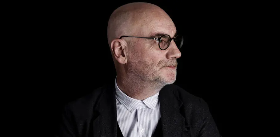
Ahead of his talk at the next Grafik and Monotype Letterform Live event, we caught up with Adrian Shaughnessy at the Royal College of Art in South Kensington London, where he is a Senior Tutor on the Visual Communication course.
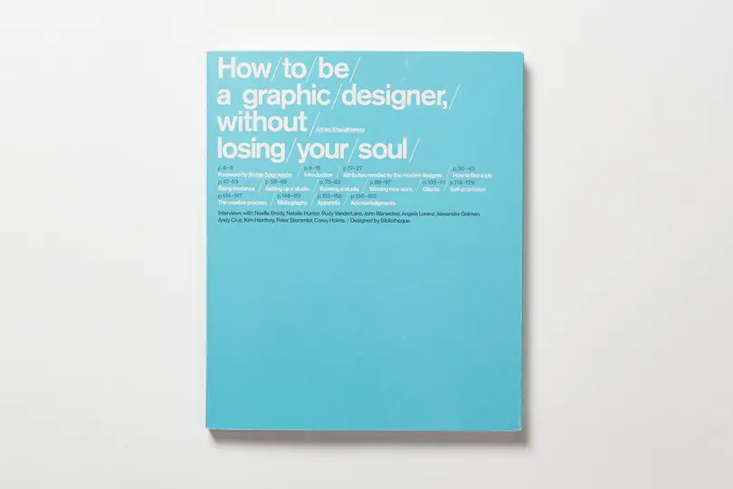
Adrian Shaughnessy is a graphic designer, writer, lecturer, editor and publisher. From 1988 onward he was creative lead at the design agency Intro, with various clients including many in the music industry. In 2004 he left to pursue his interest in writing and teaching, one year later his book How to be a Graphic Designer Without Losing Your Soul was an instant success, selling over 80,000 copies. In 2010 Adrian co-founded the design publishers Unit Editions, with Tony Brook and Patricia Finegan from the design agency Spin. They have published over twenty books to date, with many selling out.
Theo Inglis: Hi Adrian. Can you give us a hint about what you might be discussing during your talk at Grafik’s Vinyl-themed Letterform Live event?
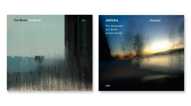
Adrian Shaughnessy: I was planning to do something around ECM sleeves. They tend to use Univers, so I was going to talk about how a record label can utilize a single typeface. The record sleeves are really austere and were done by a fantastic Polish designer, starting in the nineteen-seventies and all the way up to the two-thousands. They would just be a piece of sans serif type and very strong photography.
Do you have an all time favorite album cover? Or designer if that is too difficult!
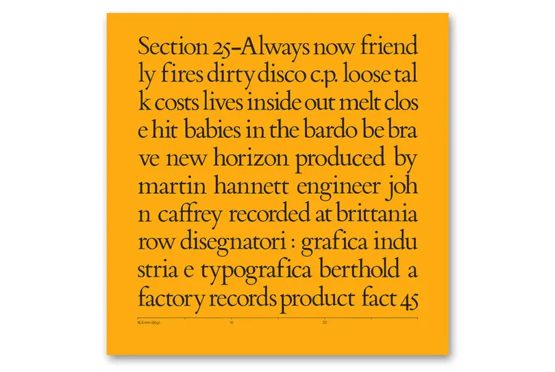
There is a Peter Saville cover for a band called Section 25, released on Factory records, which had a huge impact on me. I remember looking at this Saville cover and how he fills the twelve inch square with type, but breaks the lines just wherever they end. There is no word logic, it just flows, and that was like a little window opening up. I was aware of radical design before, like psychedelic or avant-garde stuff, but there was something about that sleeve that was a little trigger point for me.
Was it through record covers that you first became aware of graphic design as a career option?
Yes, definitely. Like everybody else I thought I wanted to be in a band, but discovered I didn’t have any musical talent! Not that lack of talent put some people off… but it was enough for me, and I realized that I often liked the covers of the records as much as the music itself. I was really obsessed with music so it was a very easy thing to think – if I can’t make records maybe I could make the covers.
You also write about music, as you do with design too, did you always know you wanted to take your interest further through writing?
Well actually that came before writing about design. I thought I’d become a music writer. I actually came quite close. I got offered a job in the late seventies, but it never quite came to fruition. I had to rethink everything, but then I got a job in a design studio, and I trained that way. But I’ve always liked music writing. It is in a funny state at the moment – I mean who pays for music writing anymore? But music writers are amongst some of the most influential people for me, someone like Ian Penman or some of the American music writers such as Greil Marcus. They were very formative influences for eventually wanting to write myself. I saw someone said on Twitter the other day that they were educated by the NME, that’s true for me too. It was like the internet is today, that one place which you could go to get all this amazing stuff.
What do you think about the resurgence of vinyl over recent years? Do you think there are parallels at all with your work at Unit Editions in creating really beautiful high quality objects?
Definitely, I think it is part of the same saturation point with digital media, we drown in this stuff. At some point you realize that so much of it has an innate ephemeralness, because you read something and then later on you think where did I even read that? It’s just gone and forgotten. I think it is forcing people into a re-evaluation of the physical. You see that very much in music and in books as well. There was an interesting statistic recently that digital e-book sales are tailing off, and physical book sales are resurgent with new bookshops opening up too. The sales of vinyl recently out valued the sale of digital downloads as well. I think there is definitely an underlying resurgence in the physical.
I know you wrote a couple of books on album cover design in the late 90s and mid 2000s, how do you see things now? Has it become less of a creative output for contemporary designers?
I think the world has changed, but I see the most fantastic album cover designs right now none the less. If you look somewhere like Boomkat, some of the covers are utterly fantastic. So I don’t think that has gone away, I just think it has become a micro-industry, there is so little money in it.
In the past I co-founded a studio called Intro, and at one point we employed twenty-five people while our main source of work was the record industry. You couldn’t even dream of that now! But the quality is still absolutely amazing. It hasn’t got any poorer for becoming so small.
At Intro we did three books called Sampler, when we started to sense that something was changing; budgets were being cut and record companies weren’t so keen to have great artwork, it was becoming a much speedier and rushed process. So we decided to catalogue some of the great work being done. We were looking at people doing hand-made sleeves or tiny limited-run records. But that book series lasted for three titles, then I did one more called Cover Art By: New Music Graphics, which was more looking at how labels work. Weirdly I wouldn’t mind doing one again, looking at the contemporary avant-garde in record cover design. There is still enough out there to do it.
Do you have a favorite project from your years working as a designer with record industry clients?
We used to do work for Primal Scream, some of the sleeves that came out of that were well-executed and really good. But it was actually working with them that was fantastic, because they were just amazing – the most generous and respectful clients I’ve ever had. On the day that they took delivery of new records they would come in to the studio and personally thank us, I mean no client does that! It was extraordinary, good old-fashioned manners. It was interesting the way they worked too, they always had reference points for us and would bring in something they had seen – but it was usually something interesting. Something from the Black Panthers say, or a cult film from the sixties. That was a really nice way to work, you would have something good to start from. Generally, we always wanted to make covers that were commensurate with the quality of the music and did it justice. But we did big commercial stuff as well, we used to do the covers for Simply Red…
What made you decide to co-found a publishing company?
I gave up the studio because I hit that point where I could be my own client. And the area that interested me most was book publishing. I realized that, after working with a few publishers, that I had a lot of the skills that were needed. Then Tony Brook my partner at Unit Editions is a supremely skilled book designer, we just realized that we could do it. I’d had some experience editing by that time, I’d given up the studio and it was just a kind of lurch for freedom. I was talking to Tony about it the other day actually, he is a little bit younger than me and has hit that same point. Feeling that I can’t go on dancing to clients tunes forever, I just want to own my own output. A classic case of design-authorship.
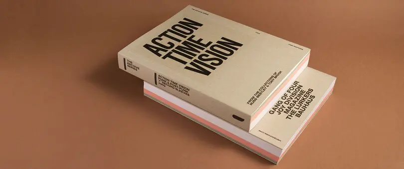
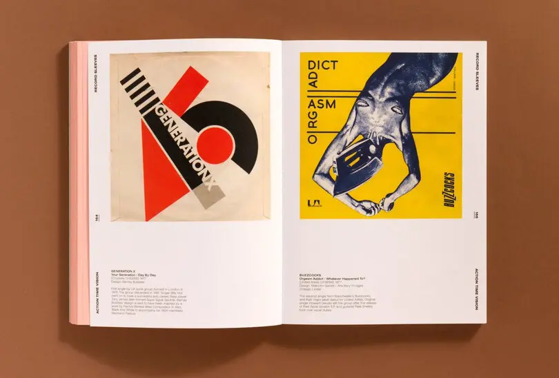
Last year you published Action Time Vision which was about music and design, any plans for more on the subject in the future?
Definitely, there is nothing signed up or confirmed yet but I’d like to do something about ‘Krautrock’, that is a personal interest of mine. I also have an idea, there is one book about it already out there, but I have a big passion for what is often called “Cosmic Jazz”, people like Sun Ra. There is a huge amount of that interesting stuff out there, and the covers are just amazing. Soul Jazz records have actually done a book on the subject with Gilles Peterson I think, the material is very rich. But yes, definitely we will do more books on music and design.
I know you have a strict numbering system for all of your books at Unit Editions, were Factory Records an influence here?
An homage definitely. Factory for me are a huge influence, we aren’t quite as reckless as they were but I’ve always been a fan. I knew Tony Wilson, not very well but a little bit, he was a client at one point, and was a really inspirational figure. So yes it is definitely an homage to Factory and a little nod to what they did.
In general image seems to be used more to represent music, with typography often playing a supporting role, or sometimes not there at all. Would you say typography is less important in music than in other fields of design?
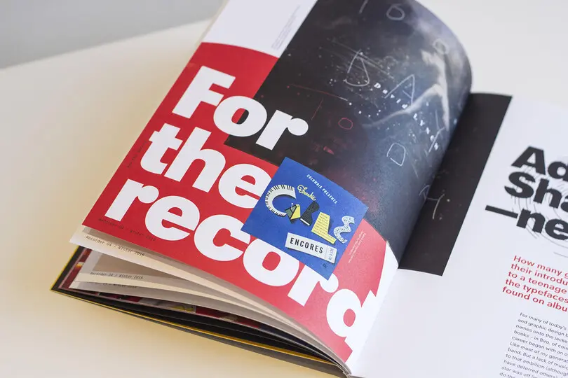
No, I think would turn that on its head, I think typography is absolutely fundamental to it. There are some iconic covers that famously had no type on, Led Zeppelin did it for instance, and that’s great if you can do it. But I think typography, because you often don’t have the same commercial constraints, can be much more expressive for music. I think again of stuff we did as a studio for bands like Stereolab, Tim from the band would bring in fragments of typography that he had seen. I actually just wrote about this very subject for the Monotype Recorder, about typography and record covers.
I traced band logos in my school exercise books and stuff like that. I think for a lot of people, it was where typography first became apparent as a creative field. Back when I had a studio there was a point when everybody who came in for an interview said oh I got into design through Factory Records or seeing Malcolm Garrett sleeves or something like that. So I think that typography is vitally important to this area of design.
Do you think then something is lost with young people not focusing on the album covers so much these days, a potential way into an interest in graphic design disappearing almost?
Well with my son it never bothered him, he would have piles of CD-Rs actually, but he would just write on them and they would lay all over the floor. I think it is too easy for someone of my generation to say “oh young people don’t value it”. I think that the visual world now is so rich, in a way back then, album covers were the only outlet for that, but not anymore. You can go to art galleries so easily, or anywhere and see so much stuff. So I think personally people not looking at album covers are missing out, but if you are a teenager it has no doubt been replaced by something else.
I think it’s obligatory to ask – do you have a favorite album from last year?
One funny thing is that in this new streaming world, I listen to so much great music, but often I barely register what it is. I used to know all the new releases and what the cover was and so on. I was even really interested in all the production credits on the records, but Spotify gives you almost nothing.
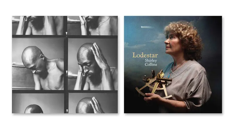
There was a reissue album by a composer called Julius Eastman, that was fantastic. It’s not new, an archive issue of a long piece called ‘Femenine’. I also really liked Shirley Collins’ new album, that was an amazing record. That records like these can still come out in this day and age is just fantastic.
Did the shift from designer to writer impact the kind of music you listen to?
I like music when I’m writing, but it has to be quite minimal. I can’t write, even the boring things like emails, if there are words in the music. It has to be pure sound. I mean I like instrumental music anyway so it is not a hardship as such. One thing I’ve stopped doing is listening to music on the train, I’m not quite sure why actually. So rarely now, which is really bad, do I just indulge in pure listening with no distractions.
I think that must be the case with a lot of people now.
Yes, and that is a real pity, I used to do it and enjoy it. A while back I went –ok I’m going to get the best stereo setup I can and fix this – but I sold it after a few years and that’s not good.
You also once hosted a radio show about graphic design and music, was it hard to work on a purely audio medium with such visual people and subject matter?
Well no, because I don’t think I had anybody who wasn’t a good speaker. I always made sure I asked people who had something to say. To talk for an hour and ask questions for that long is quite a lot of work, so the music was a good way of mixing it up. I never found a designer who didn’t like selecting the music. I’d always let them do this, some of them would agonize over it and would send me emails really late on the night before the show asking to make changes and panicking about their choices. But it was good fun and people chose surprising music, sometimes I didn’t expect their choices.
Did you have a sort of set idea of what sort of music a designer would like based on their work or style?
Often it was someone I knew, and I knew roughly what their taste was already, but there would usually be something unexpected. Ken Garland is a good example, he was fantastic and brought in a cassette of a friend of his, who was a really good singer, but he just sang at parties and stuff like that. But Ken had a tape of him, you couldn’t have expected that! People would often drop something strange in there. Daniel Eatock was interesting too, there was space for six or seven songs in the hour, and he chose to just play different renderings and covers of one specific Nirvana song, all off YouTube. Just people singing it in their bedrooms or whatever, painful, but interesting. Entirely in character with him of course, and his completely art-conceptual view of the world and way of thinking.
Thank you for the interesting discussion, Adrian!
Adrian Shaughnessy has written about typography and record sleeves for issue 4 of The Recorder.
Adrian Shaughnessy will be speaking at the ‘Vinyl’ themed Letterform Live event presented by Grafik, the ISTD and Monotype. This takes place on Wednesday 8th February, 7pm at Protein Studios, New Inn Yard, London EC2A 3EY. There will be a bag full of Monotype prizes up for grabs for one lucky audience member. Other speakers include Jonny Trunk (Trunk Records), Lucy Bourton (It’s Nice That and Rough Trade), Craig Burston (London College of Communication) and Alan Dye (NB:Studio).
