


Fonts behaving badly: Why you don’t always get the result you expect.

When you choose a font for your brand, you assume it will just … work. A font is a font no matter where you use it, right? But the truth is more complicated, and misunderstanding this fact can significantly damage your brand’s visual identity.
Fonts are software specifically built for different use cases. Desktop fonts, also called system fonts, come already installed on computers. These work in print projects and as JPEGs, GIFs, and other image types. They work on websites too, but only to a certain extent (as we’ll see).
Web fonts, on the other hand, are downloaded on demand from a server and work in websites and digital ads (with a digital ad license). They are especially well-adapted for responsive design and mobile environments.
How this affects your brand
For brands, it’s important to use the right font type in the right place to ensure a consistent look and feel across all customer touchpoints. Customers, especially younger, tech-savvy customers, expect your brand to be available on multiple platforms so they can seamlessly interact with it at their convenience. According to Google, 65 percent of consumers begin online activities on one device and then continue on a separate device.
Failing to use the right font in the right place can result in a fractured, inconsistent visual identity across those platforms. This risks eroding your customers’ trust and confidence in your brand, not to mention creating headaches for your team. Let’s examine a few ways this can happen.
Defaulting to system fonts
The problem with using a system font is that you’re relying on each customer’s system to have it, and not every system—whether it’s a Mac, a Windows machine, or a mobile phone—has the same fonts.
So, what happens if a customer’s device doesn’t have your system font? You get a default, like this:
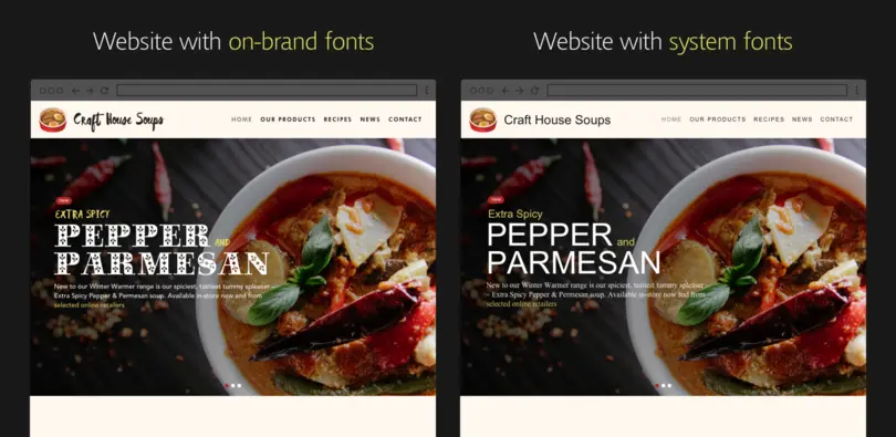
Sometimes you can specify a default in the code, but sometimes you can’t. The bottom line is that your customer might get an experience that isn’t up to your standards and, in turn, makes your brand look bad. Plus, mobile devices tend to have smaller system font libraries, meaning your users are more likely to see a default. With mobile now comprising 65 percent of all digital media time, per ComScore, and continuing to grow, a lot of customers would be getting a mediocre experience.
Fuzzy digital ads
When licensed for digital ads, web fonts deliver your copy in crisp, clean, on-brand type. Web fonts can also enable dynamic content, which allows brands to personalize and otherwise customize copy at will. Web fonts guarantee your ad—and therefore your brand—will appear the same regardless of device.
The alternative is to embed the text (as pixels) in a JPEG, PNG, or GIF file along with any other imagery the design uses. But pixels that look like text are not as crisp or clear as web fonts, especially on high-resolution screens, and they lack web fonts’ ability to be customized and resized for different screens.

Off-brand HTML email
Typically, emails are built with some combination of images and text, the latter of which may or may not be your brand font. If it isn’t, the body text is usually rendered with a generic font or embedded into an image, which customers might not download.
Using web fonts in email messages heads off such dilemmas and offers opportunities to serve up personalized content. Not all email clients support web fonts, but many do, notably Apple’s Mail program and the proprietary program on several iterations of Android. For now, brands can at least specify fallback fonts for cases where web fonts are not supported.

The growth of mobile and the overall trajectory of the space suggest web fonts will become more commonly used in email. Marketers can get ahead of the curve by incorporating web fonts now, which also delivers a better experience to customers whose email clients support them.
Who’s got the font? Anyone?
Sharing your brand font with third parties—a design or marketing agency, a freelancer, or a vendor such as a printmaker—can be a tricky process.
If a brand hasn’t licensed its font to be installed on a large enough number of computers, it may be prevented from sharing the font. In this case, an agency, for example, will usually license the font itself. But if the agency hires a vendor and can’t share the font due to licensing restrictions, the vendor is forced to buy it and run those costs back up to the brand. Or choose an off-brand font. Or use the font illegally. Exhausted yet?
Don’t cry, simplify
A brand can avoid all these headaches by simplifying its licensing situation. Start by identifying use cases and determining what kinds of fonts are needed. Tally up the number of impressions websites and digital ads receive and consider long-term plans and preparations for future projects, such as a mobile app.
Then figure out how widely those fonts will be shared. Ten workstations? Fifty? More? Will they be shared with freelancers outside the organization? Is the company growing, meaning those 10 workstations today will be 50 next year? Are the fonts being shared internationally?
At this point, decide whether it makes more sense to license fonts individually or through a comprehensive agreement.
Each brand has different needs. Licensing each font and use case individually can work for small companies, but many of the scenarios described in this article rear their heads as companies grow and the ability to maintain consistent font usage degrades. And even small companies likely need multiple types of fonts—no company works on paper alone, after all.
Packaging your licenses together eliminates these headaches. Comprehensive licenses ensure your fonts are used and distributed properly, with minimal risk of the wrong type showing up in the wrong place or hands. In short, the fonts work the way they should, which allows your teams to focus on their jobs and keeps your brand cohesive.


