Fonts: The underrated political campaign staffer.

There’s so much more to political campaigns than ideology. Sure, there’s the political party (or lack thereof), core beliefs and issues, debate performance, and events. But a silent, less obvious contributor to a campaign is the design behind it—the nonverbal communication conveyed through font choices, design elements, and color palette—that impacts our perception of a candidate.
Design brings depth to the candidates’ story; reflecting their personality, hinting at their ability to lead their jurisdiction, delegate decisions and listen to their constituents. Politicians are increasingly embracing design and are taking sophisticated approaches to their branding; understanding it is a tool that can be used for problem solving and connecting with their audiences. Because one thing most politicians can agree on is that appearance matters.
A decade of change and a whole lotta Gotham
In 2008, then-candidate Barack Obama’s iconic campaign broke from using traditional political typography. Considered a bold choice at the time, contemporary geometric sans serif Gotham brought forth the positive connotations of a sans (i.e. forward-thinking and modern) with a maturity and credibility that echoed Obama’s platform of change. John McCain also used a stylized sans serif, Optima®, which despite a comparably dated look, aimed to fuse tradition with progressiveness to appeal to a wider voter base. Emerging victorious, Obama sparked an onslaught of Gotham-inspired typographic choices for politicians on both sides in years that followed.
The 2012 presidential race skewed in favor of the sans serif. Obama evolved his brand to a custom slab serif version of Gotham, evoking the boldness of the 2008 campaign as well as a seriousness and sense of experience. Other candidates followed with more traditional (old-style and transitional) serif designs .
After four years of serifs, sans returned to the spotlight . Donald Trump opted for the Akzidenz Grotesk® Bold Extended font and the FF Meta Bold® font in his primary signage and Montserrat, a free Gotham-inspired font, for his website. However, his campaign materials display vast typographic inconsistencies that reflect his non-traditional approach to politics and policies.
Most other candidates also employed a geometric sans across their branding—Ted Cruz mismatched Gotham on rally signage with the serif Electra® on other materials; Marco Rubio paired Avant Garde Gothic® with Futura®—a mediocre choice according to some design experts; and Hillary Clinton commissioned a custom geometric-humanist san serif with friendly details. John Kasich used the grotesque Neuzeit® S Book Heavy font. a generic choice compared to his peers. Only Jeb Bush and Bernie Sanders differed with serifs—Jeb with the classic and optimistic Baskerville™ font and Bernie choosing approachable and knowledgeable Jubilat™.
Starkly influential in 2016 and still a popular choice across all levels of political races, Obama’s bold use of Gotham helped usher in a greater trend: breaking tradition and convention.
Big shifts for the 2018 midterms and what’s coming in 2020
We’ve seen a change in the kinds of individuals running for office. There are more first-time candidates, a more diverse set of candidates including and those from backgrounds not historically represented in office. Many seek to distance themselves from the traditional two parties, whether their issues skew liberal or conservative. Their motivations for running are personal and connect with the people they seek to represent.
As a result, each politician’s campaign feels more personal than the traditional and safe looks produced in the past. A broader, even unexpected range of typographic choices, design details, and colors highlight their individual allegiances and perspectives, and speak to the electorate’s dissatisfaction with government. Their platforms are more visible than ever and are intentionally using design to tell their unique stories, such as congresswomen Ayanna Presley, Rashida Tlaib and Sharice Davids.
Trend 1: Campaigning in color
Fonts aside, the biggest game-changer seen in recent months has been the departure from a traditionally patriotic color scheme. Political campaigns have been dominated by red, white, and blue, particularly since WWII and then 9/11. But new candidates are bringing diversity to their brand identities which better communicate who they are and their visions for the future.
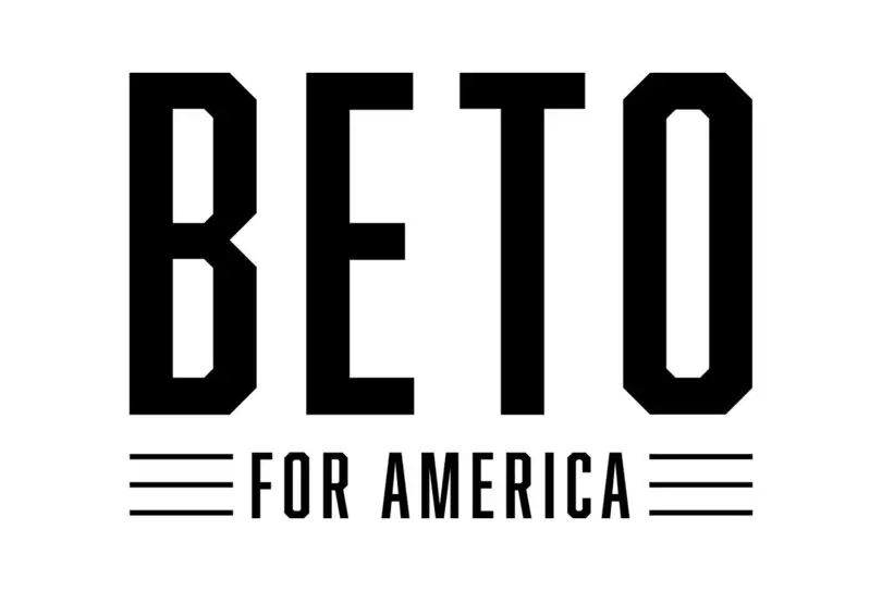
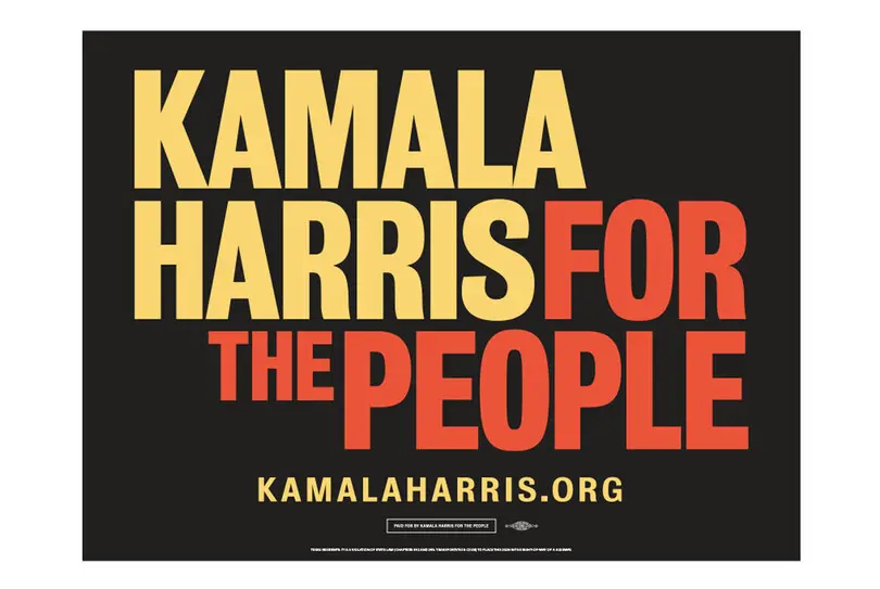
Historically, candidates wanted to put their patriotism front and center but new leaders are searching for more authentic designs that better resonate with voters. Beto O’Rourke’s presidential campaign palette consists of black and white to highlight non-partisanship, while Kamala Harris also leans on a non-traditional color scheme. Amy Vilela’s congressional campaign in Nevada used colors that nodded to the Nevada landscape, emphasizing her grassroots approach. Pete Buttigieg actually made his design assets public so individual supporters could create their own campaign designs.

Though color might be the design hero of coming elections, it’s equally important for candidates to find a matching font that reflects who they are and the position they are seeking.
Trend 2: Making it personal
More candidates are opting for script lettering and fonts to convey friendliness and humanness. Involving a script reminiscent of a signature enables candidates to communicate honesty, trust, integrity, and responsibility. For example, Elizabeth Warren of Massachusetts and Bill Lee of Tennessee used scripts that felt handwritten on their signage. By adding this personal touch (as long as it feels authentic and not canned), candidates hope to connect on a more human level with their constituents.
Scripts aside, candidates are skewing toward sans serifs for both primary and secondary fonts. By design, sans (specifically humanist/geometric) are more approachable than serifs. They symbolize progressiveness and feelings of equality. The Gotham legacy is alive and well.
Trend 3: Higher quality design
Because politicians now understand the value of branding, their campaigns feel more polished and cohesive than those of races past. Their websites employ optimized UX design and their posters appear on design websites as examples of “good design.”
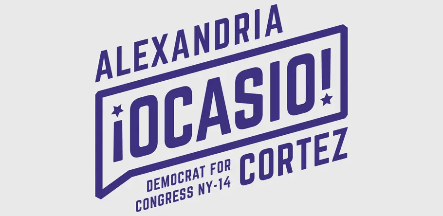
Alexandra Ocasio Cortez’s campaign mirrored her approach to politics with a rebellious, disruptive, and grassroots-driven design. Her boldness in color, determined Rosie the Riveter-inspired imagery, bilingual copy, and narrow all-caps sans serif, evoke not only propaganda posters, but also advertisements for the hottest musician or tech fad. Other notable contemporary design-heavy candidates include Suraj Patel for Congress and Gavin Newsom for Governor of California .

However, there could be some backlash here by alienating voters who are skeptical of overly branded politicians, so it’s important to strike a balance of good visuals and action.
Rewriting the rules
New leaders are branding themselves in ways this country has never seen. By rejecting convention, these politicians are not only visually separating themselves from the past, they’re using design to further their ideological shifts. An evolution is happening in political design to better represent the diversity of the voices in leadership and better capture the votes of citizens seeking change.


