


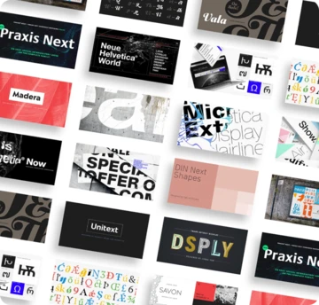


Terry Junior™


Terrance Weinzierl’s Terry Junior typeface is a perfectly imperfect design – one that retains the marks of the brush used to create it and harks back to the craft required to hand make letterforms. Originally drawn during a Monotype Font Marathon, Weinzierl later refined the typeface digitally – adding an Inline version and designing alternates that replicate the irregularity of real-life brush scripts.
Hope Sans


Hope Sans™ takes the jaunty style of 1950s and 60s lettering and melds it with the jubilant 1970s swashes of Bookman. The result is a sans serif family that is lively, inviting and deeply customizable. Its basic sans serif forms create engaging text, while a roaring collection of swash designs, alternate characters and ligatures make it a natural for attention-grabbing display typography.
Madera


Introducing Madera by Malou Verlomme – a straight-talking typeface that’s created with graphic designers in mind. Efficient and adaptable, Madera works across print and online, and has pleasingly crisp apexes that add some extra bite to the design.
Unitext


Created with the needs of branding design in mind, Jan Hendrik Weber’s Unitext is a crisp, clean typeface that functions well across print and online use. It blends humanist and grotesque qualities, adopting a style that the designer describes as “neo grotesque”. Narrow spacing is what sets this typeface apart, however it also uses open counters and angled details to boost readability.
Albertus Nova


In the Albertus Nova typeface, Toshi Omagari has revived a number of alternate capital letters created by Berthold Wolpe that have been unavailable in the existing digital version. This includes the uppercase M, W, J, E, R and Q. He designed five weights - light, thin, regular, bold and black- as well as Greek and Cyrillic characters.
Wolpe Fanfare


Initially designed for Fanfare Press, the Fanfare typeface packed more into a small space than most typefaces. It was a natural for book and movie titles, and more general branding. Albertus is serious, classical and monumental, while Fanfare is modern, light and playful.
Sachsenwald


When he discovered the Sachsenwald typeface, Toshi Omagari saw the opportunity to revive and preserve a beautiful blackletter design. Toshi adding an alternate X character, and created light and regular weights to accommodate a whole new set of uses.
SST


Designed for global branding and supporting 93 languages, the SST® typefaces blend the organic readability and controlled structure of modern sans serif designs. In combining these attributes, the SST family is understated, versatile – and sure to be a timeless design.
SST’s subtle design traits provide a quietly handsome and consistently friendly typographic presence that can be used for just about any typographic application. Broad range branding applicability combined with coverage for almost a hundred languages, makes SST one of the most widely accessible and usable typefaces available.