Posterama™
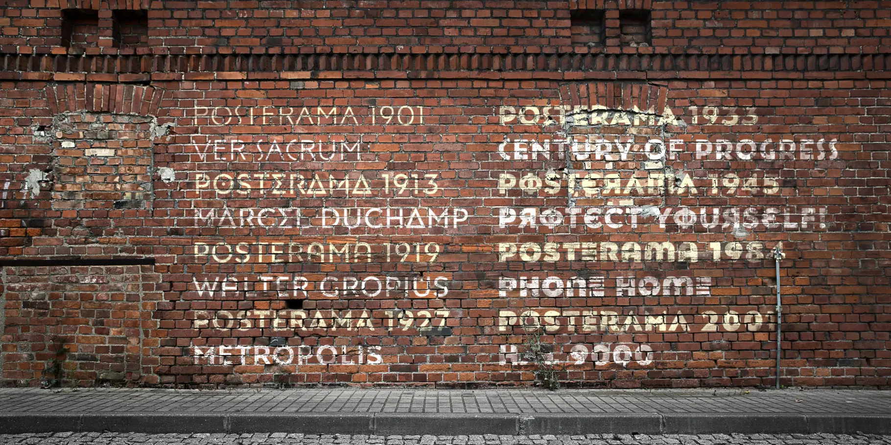
A journey through space and type.
A journey through space and type.
Posterama™ is a modular series of geometric sans serif families, inspired by events, movements and typography of the 20th century. The original design had notes of Futura and Gill Sans, with a softness reminiscent of letterpress, phototype and other forms of printing. Corners are manually rounded to achieve this effect.
Posterama™ is the ultimate retro-futurist type kit; a typographic time machine reflecting a monumental century of growth. A typeface out of time and into the future. Posterama™ provides a wide palette that encourages typographic play. It has the familiar charm of iconic 20th century design, and can transform seamlessly to accommodate different moods and themes.
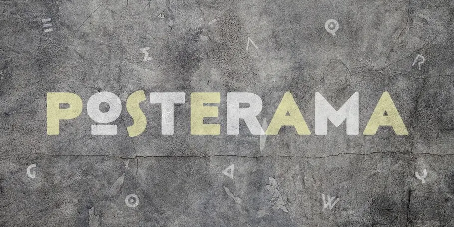
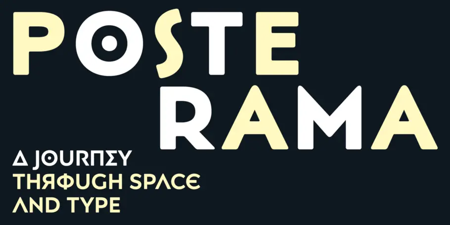
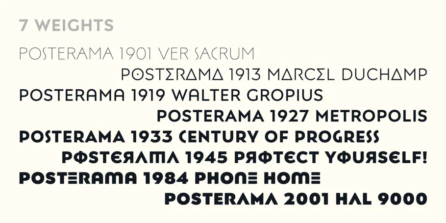

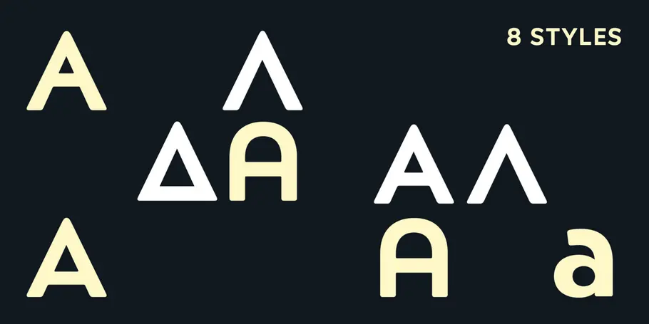
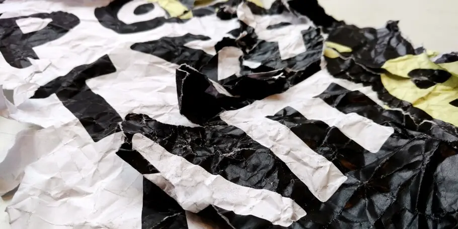
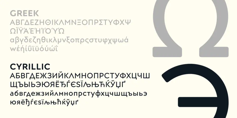
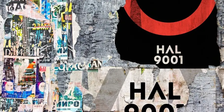
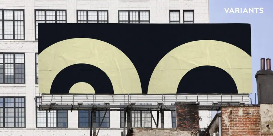
The Posterama™ typeface family contains 63 fonts and is a true journey through space and time. Designed by Jim Ford, each Posterama family contains 7 weights from Thin to Ultra Black, in 9 distinct families. What makes Posterama so unique and versatile are the eight alternative display families. By making use of a collection of alternative glyphs, Posterama sets an evocative flavor to visualize an entire century of futuristic reference points from art, architecture, poster design and science fiction into one family.
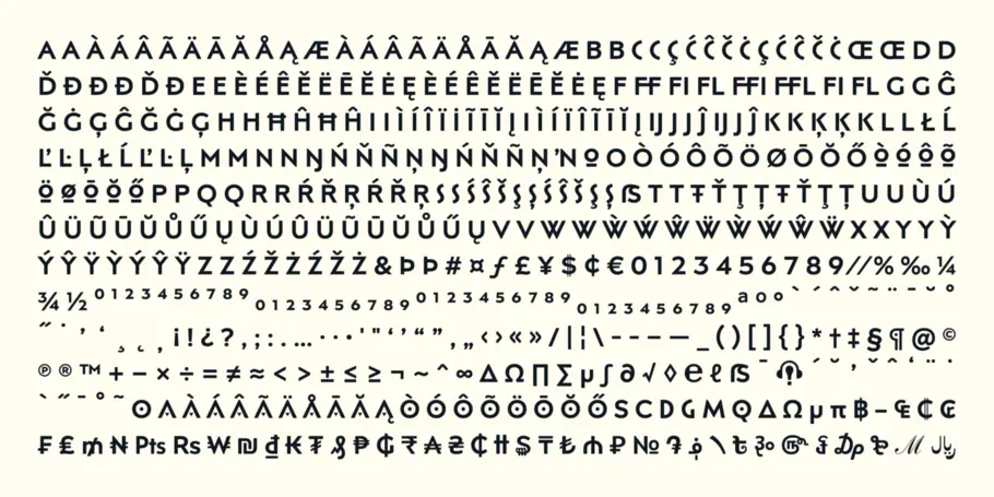
Posterama Text is the base family. It has the most robust character set including upper and lowercase glyphs and pan-European language support (including Greek and Cyrillic). Note: all the other Posterama variants described below do not have lowercase letters or Greek and Cyrillic support.
Posterama 1901 recalls the decoratively geometric style of Art Nouveau from the turn of the 20th century. Letterforms such as the slender, snaking 'S', the high-waisted 'E' and the underlined 'O' revive the spirit of Charles Rennie Mackintosh and the designers of the Viennese Secession.
Posterama 1913 pays homage to the Armory Show, or 1913 Exhibition of Modern Art, which brought the revolutionary work of European artists such as Picasso, Duchamp and Kandinsky to the US for the first time to the shock and astonishment of press and public. Near-abstract, angular characters such as the 'A', 'E' and 'N' hint at cubism's jagged and clashing planes.
Posterama 1919 uses a small, but important, variation to set a tone when the Bauhaus was founded, and the surge in radical European typography that followed. The straight-sided, roundheaded 'A' adds a flavor of 1919 - this style of 'A' can still be seen in the Braun logo, designed in 1934.
Posterama 1927 captures the year of Metropolis, The Jazz Singer and Paul Renner's pioneering, geometric Futura typeface from 1927, which had a profound influence on design in the US and Europe.
Posterama 1933 - With its low-waisted, sinuous designs, the Posterama 1933 typeface family echoes lettering of the Art Deco period, which in turn had its roots in Art Nouveau, the key influence on Posterama 1901. The two fonts make a great team and can be used interchangeably.
Posterama 1945 features a few Cyrillic characters to conjure up an era when Russian art and political posters made their mark in cold war propaganda, espionage and also giant aliens and monsters.
Posterama 1984 takes its typographic influences from George Orwell's classic novel, publicity for the dystopian action and sci-fi movies (Blade Runner, Videodrome and Terminator) and games like Space Invaders and Pac-Man that made an impact at that time.
Posterama 2001 was inspired by Stanley Kubrick's science fiction masterpiece, which made extensive use of the Futura typeface. Posterama 2001 finds its cosmic orbit with its nosecone-style 'A' from NASA's much-missed 'worm' logotype. There's an echo, too, in Bauhaus designs from as early as 1920, whose minimalist, geometric lettering also featured a crossbar-less 'A'.

Jim Ford is a visual artist and designer from Chicago. Jim works predominantly in type design, but includes custom lettering, art and illustration in his growing portfolio. He has designed custom typefaces for agencies, corporations, publishers, software and hard- ware manufacturers, video games, devices, you name it! In addition to customer-driven work, Jim also has a wealth of original typeface designs, ranging from traditional text faces to innovative display lettering.
We offer a number of ways for you to start working with our typefaces.
It’s safe to say that few people, if any, set out to commit copyright infringement. The reality is that most individuals and brands fully intend to pay.
Finding the right brand font requires a deep understanding of who you are as a brand, and how you want to present that identity to the world.
