Unitext™
Clean and compact branding typeface.
Clean and compact branding typeface.
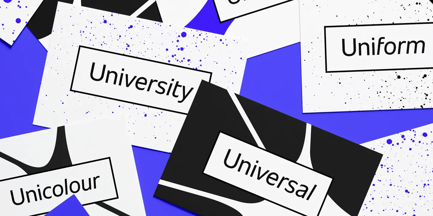
Introducing Unitext by Jan Hendrik Weber – a clean and compact branding typeface that’s comfortable both online and in print. Open counters boost readability, while narrow spacing means it works across a range of environments and usages. Buy it now – seven weights including upright and italics.

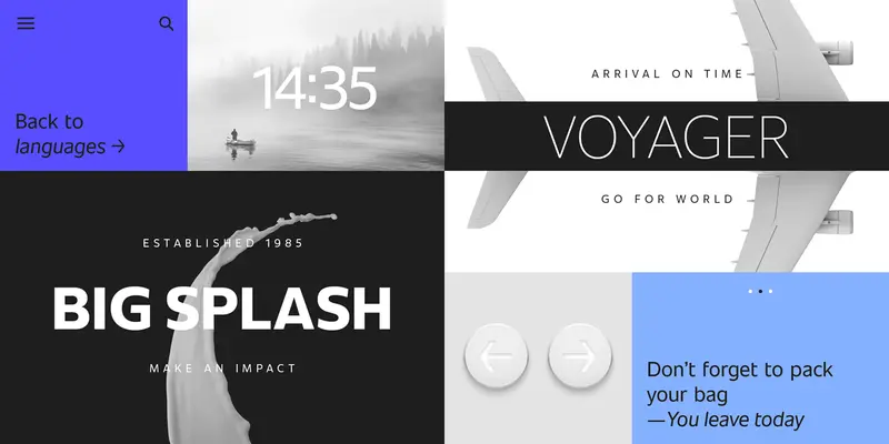
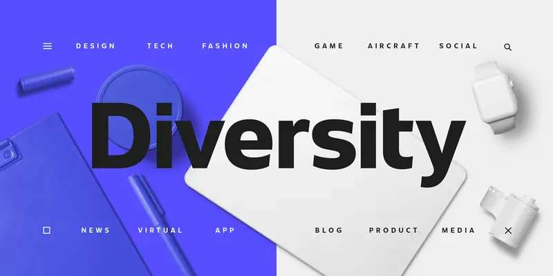
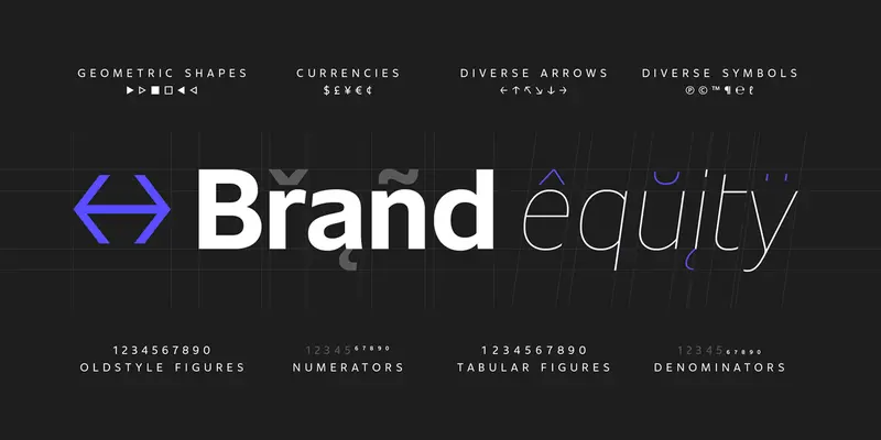

Created with the needs of branding design in mind, Jan Hendrik Weber's Unitext is a crisp, clean typeface that functions well across print and online use. It blends humanist and grotesque qualities, adopting a style that the designer describes as “neo grotesque”. Narrow spacing is what sets this typeface apart, however it also uses open counters and angled details to boost readability. “The ideal font should work at every touchpoint,” says Weber. “And designers shouldn’t need an introduction or a set of rules on how to handle this typeface. Unitext allows designers to work without explanation.”

Hendrik Weber was a creative director for Monotype, where he advised clients on custom fonts and how to leverage type in branding. He also created the Unitext typeface, a popular design created for a myriad of branding needs.
We offer a number of ways for you to start working with our typefaces.
Designers and studios might be deeply familiar with Neue Helvetica, but it’s the product of a pre-digital era. Here are four reasons why it’s time to switch.
Font licensing doesn’t have to be complicated. Here’s everything you need to know about font licenses: What they are, how they work, and why you need them.
