Embrace Ambiguity, “a sans of varying shapes and styles”.
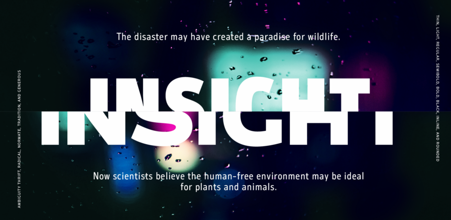
Ambiguity is a type family with five distinct personalities or ‘states’, created as a tool for coaxing designers and brands out of their comfort zone. It embraces both tradition and radicality, as well as generosity and thrift, encouraging us to question our beliefs about the intersection of style and meaning.
“Ambiguity started as a thought experiment,” says Charles Nix, who began turning over ideas for the design in 2016, after listening to Paola Antonelli lecture in Toronto. Antonelli, a senior curator at MoMA, posited that Utopia is within reach if we embrace ambiguity, fluidity, and flux as states of perfection. “She illustrated the point with a collection of works that challenged borders—between design and science, human and machine, technology and nature, and gender,” explains Nix. “The challenge and promise of transforming the world by changing our frame of reference resonated with me. It’s an essential part of the process and products of design.”
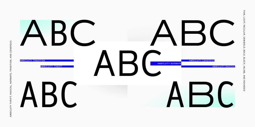
With this in mind, Nix started playing with the proportions of letterforms. He deliberately reversed and recombined traditional proportions to challenge his own bias. The exploration ultimately led to five different ‘states’ for Ambiguity—Tradition, Radical, Thrift, Generous and Normate. Together they offer a variety opportunities to explore the interaction of typographic form and content.
Tradition is conservative, relying on historical letter shapes. Radical rejects inherited ideas of proportion, making typically slender letterforms wide, and wide letterforms slender. “It’s a contrarian,” says Nix. Thrift cherry picks the condensed shapes from Tradition and Radical, while Generous does the same for wide forms. Normate sits at the center, a synthetic blend of all of the others.
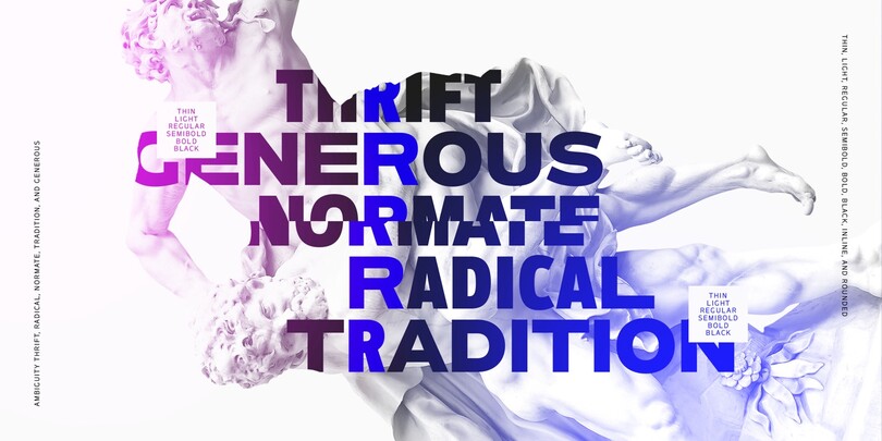
“Tradition is very comforting,” says Nix. “It’s the mask of conservatism. It’s calming because it delivers the proportions we expect. Thrift fits more into a smaller space, so it’s great where words want to get large, like gigantic headlines, or text needs to cram in, like small-screen type. You get a sense of carefree and luxury from the Generous cut. One would expect the Radical to be used in a sort of Dadaist way, but in a classic context it provides an enjoyable jolt.”
Ambiguity is a litmus test. Designers could spend hours trying on typefaces that offer just one of these voices. Ambiguity provides five different personalities—ideas—beliefs—each of which also work seamlessly together.
Explore Ambiguity Today
Ambiguity is included in Monotype Fonts.


