注目の記事
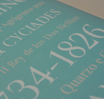
Shorai Sansは、幾何学的な形状が特徴のMonotypeの日本語書体です。Monotypeクリエイティブタイプディレクター小林章とタイプデザイナー土井遼太、そして書体デザインの第一人者、中村征宏氏を制作メンバーに迎え開発されました。


Today we’re welcoming Annie Atkins, a creative in the film industry (just like our last guest, Holly Fraser). She’s known for her graphic props and set pieces for Wes Anderson’s Grand Budapest Hotel and Isle of Dogs. Tune-in to learn about the magic of film.

In episode four we talked with Tré Seals, founder of Vocal Type, about his efforts to break down stereotypes in design and how a middle-school side gig, born out of a brush with serious childhood medical issues, helped him become the artist he is today.

Find design inspiration in an age of information overload.

We are thrilled to have Aaron Draplin on the podcast this week and to dig into the “heavy stuff” with him – existential musings on life and building a career, the importance of hanging on to your inner kid, and the “weird little spot” he’s in as he approaches 50 turns around the sun.

Today’s brands must keep up with a fast-paced digital world and navigate a “new normal” that’s still emerging from the worst of the pandemic. The last few years shifted everyone’s digital expectations, how brands operate, and in some cases, impacted their business models. Moreover, issues like biodiversity, sustainability, diversity and equity, and brand activism are all booming. So how does this all impact brand building? These macro shifts are greatly influencing how companies position themselves, the services they offer, and how they communicate with their customers.

From alternates to X-height, this list of typography terms and definitions covers just about everything you’d want to know about fonts and typography.

Font superfamilies are vast collections of type that can meet a multitude of needs without compromising on consistency. But what defines a superfamily, exactly?

東海旅客鉄道株式会社(JR東海)は、東京、名古屋、大阪間を結ぶ日本の交通の大動脈で、東海道新幹線をはじめ東海エリア在来線を運営しており、日本国有鉄道が1987年に分割民営化した際の 旅客鉄道会社の一社です。
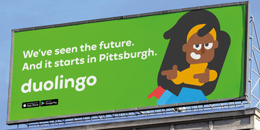
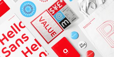
Duolingoは、3億人以上のユーザーが利用する人気の言語学習ウェブアプリです。英語だけでなく韓国語や中国語などさまざまな言語を学ぶことができます。グローバルで展開するサービスの顧客に向けて、世界で統一したブランドの声を届けるため、Duolingoはリブランドを検討しプロジェクトがスタートしました。

M&M’S®は80年以上にわたり、世界中の人々を魅了してきました。時代の変化を受け、より親しみやすい世界観を作るためプロジェクトはスタートしました。有名なM&M’Sのキャラクターも刷新され、All Togetherという名前のカスタムフォントが誕生しました。この書体は、温かみがあり、遊び心のある、インタラクティブなフォントファミリーです。

Monotypeのフォントは基本的に商用利用が可能です。Monotypeで許可されているフォントライセンスについて、また許諾の範囲外となる場合についてもわかりやすく解説します。
適切な書体は信頼感を生み出し、消費者に長い期間に渡り影響を与えることができます。もちろん、書体は良いデザインの多くの要素の一つに過ぎません。また、ブランドの視覚的アイデンティティがしっかりとした基盤を持っていることも大切です。
Bauer Media Group(バウアー・メディア・グループ)は、世界中の数百のデジタル・印刷メディアを持つグローバル企業で、Monotype Fontsを導入して世界中の数百のチームと数千人の従業員にフォントを提供しています。

突然ですが、告白があります。私は20年間、グラフィックデザイナーであり、タイポグラフィに情熱を注いできましたが、これを他の誰かとあまり共有していませんでした。大学の頃、私たちのデザインプログラムでは、あるデータが共有されていました。そのデータには「The Full Fonty™」とタイトルが書かれていて、何百もの(おそらく何千もの)フォントファイルが入っていました。
デザイナーとして、新しいブランドを立ち上げたり、既存のブランドをアップデートしたりすることはワクワクする瞬間です。一方で、企業の成功に向けた重要なステップでもあります。