7 Typographic rebrands that worked wonders.
Today’s brands must keep up with a fast-paced digital world and navigate a “new normal” that’s still emerging from the worst of the pandemic. The last few years shifted everyone’s digital expectations, how brands operate, and in some cases, impacted their business models.
Moreover, issues like biodiversity, sustainability, diversity and equity, and brand activism are all booming. So how does this all impact brand building? These macro shifts are greatly influencing how companies position themselves, the services they offer, and how they communicate with their customers.
“We’ve never faced such a relentless phase of growth,” says Monotype Senior Director, Creative, James Fooks-Bale. “Brands have to evolve at a rapid and continual rate, whether that’s a technological shift, new audience or way of segmenting, a new market or localization.”
We spoke with our Brand Designer, Marie Boulanger, who works at the intersection of type and branding on a daily basis, for a collection of successful rebrands, and how to choose fonts when rebranding your business.
1. Chobani’s soft-serve serif rebrand in 2017.
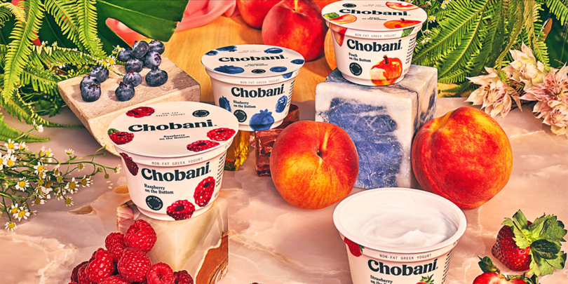
Back in 2017, Chobani, the Greek yogurt brand in the US, was the first major food and consumer goods brand to “go retro” and adopt a softer serif design with a playful custom typeface. The beauty of the rebrand was certainly in the type itself – but also in that the makeover wasn’t limited to just the logo and typeface; everything got a facelift: the brand imagery, colors, positioning, and messaging were softened to a gentler, more human tone.
Why it matters: “I would call it an era-defining rebrand; even now, it’s still extremely relevant because that whole typographic movement: ‘soft-serve’ 70’s nostalgia is still going very strong and that specific rebrand really coined that typographic movement.” – Marie Boulanger.
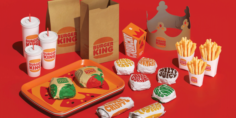
2. Burger King’s nod to nostalgia in 2021.
Similar to the Chobani rebrand, the American fast-food restaurant chain, Burger King, looked to the past to celebrate its heritage at the heart of a rebrand. If Chobani was the trendsetter here, Burger King’s new identity would be a confirmation of the trend. Executed skillfully by Jones Knowles Ritchie agency, this headline-grabbing upgrade “speaks to this emerging type and graphic trend that celebrates a softer service warmth,” as Monotype Creative Director Phil Garnham wrote in BITE.
Why it matters: “Burger King’s identity as a whole is conveying warmth in a way that celebrates creativity, and the brand’s typographic optimism is aligned to its warm bouncy burger iconography. This sense of fun and joy shares comfort at a time when we most need it.” – Phil Garnham.
3. BBC Channel 4’s bespoke type rebrand in 2015.
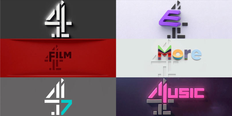
A public channel in the UK that had its own very playful tone and original content, and was generally differentiated amongst the BBC channels, received the royal treatment from a team of 4Creative, Jonathan Glazer, and Neville Brody in 2015. Brody designed two custom typefaces for the channel: Horseferry and Chadwick, used for display headlines and text respectively. The type features idiosyncratic details like angled cuts in the letterforms and peculiar serifs to match the personality of the channel and its content – making it instantly recognizable. Like Chobani, this project extended beyond type, with new brand colors, graphics, and even new ident music.
Why it matters: “The new brand has really succeeded in showing up as unique. You recognize it straight away. The tone is extremely playful and adventurous from a design perspective, and they nailed that kind of audacity in the design. It’s still going strong everywhere today – in video, print, campaigns, across websites, and it’s nice to see a global brand with many touchpoints going so bold.” – Marie Boulanger.
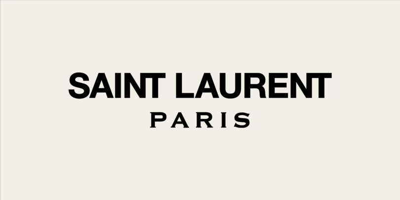
4. Saint Laurent’s iconic simplification in 2012.
Back in 2012, Yves Saint Laurent shed its beloved YSL monogram for a simple new logotype, “SAINT LAURENT PARIS” set in Helvetica Neue Bold. This was the first case of a major luxury fashion brand going all in on a sans serif. In a way, this shifted Saint Laurent away from its French heritage towards a more global perspective. It also signaled that ubiquitous typefaces like Helvetica or Futura for Celine have a home within luxury brands and, in fashion’s case, with their design-focused customers. The bold geometric sans used here retains some detail in the logo work with a couple of ligatures added in, so there’s still a level of artistry.
Why it matters: “In terms of positioning in the world of luxury fashion, this rebrand was huge. It was a way to evolve the brand, focusing more on ready-to-wear styles. It changed the branding game for iconic fashion houses. This was an era-defining rebrand; it’s not even about liking or disliking it, it’s about the impact that it had.” – Marie Boulanger.
5. Buzzfeed News award-winning upgrade in 2018.
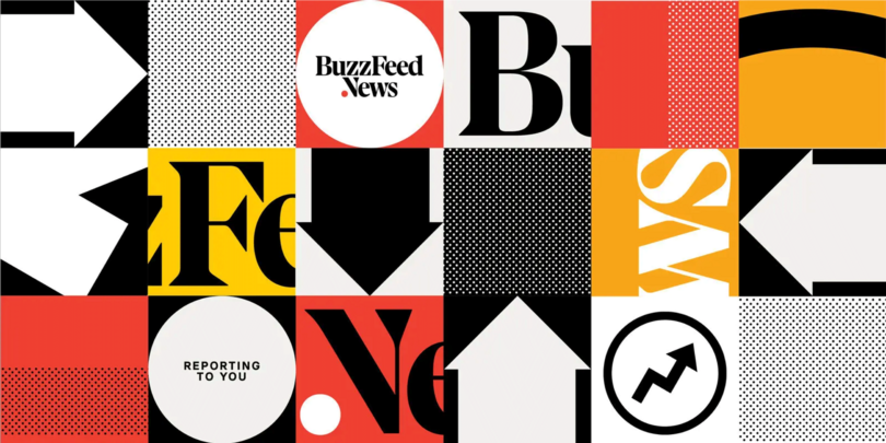
The American Internet and news media company rebranded its type and logo in 2018 to better evoke its role as a home for respected journalism. The new logomark is very much rooted in journalistic tradition with narrow letters commonly used in news printing and chunky serifs, thanks to the help of typographer Tal Leming of Type Supply. This new identity helped solidify Buzzfeed News’ departure from lighthearted, buzzy listicles to real on-the-ground reporting.
Why it matters: “Buzzfeed News nailed aligning their new type with a redefined brand mission. The previous logo was goofier with small caps, and the new logo is rooted in journalistic tradition. They managed to shift perspectives about what their brand is and what they do.” – Marie Boulanger.
6. Gotham for the 2008 Obama campaign.
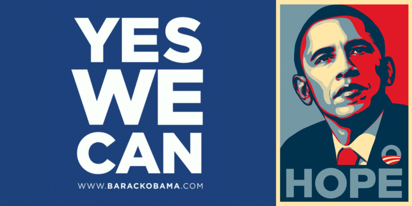
Gotham is everywhere. Originally designed for GQ magazine in 2000, and later released for public use in 2002, the typeface has found itself on everything from Coke bottles to presidential campaigns. Former American President Barack Obama used Gotham in his 2008 presidential campaign. Though it’s a sturdy geometric sans, Gotham’s mainstream appeal and widespread use also supported Obama’s win.
Why it matters: “The campaign’s decision to use Gotham Bold would forever cement the font’s association not only with the President, but with the presidency itself, and make Gotham the aspirational choice of everyone who is driven to seek higher office through a desire to serve.” - Jonathan Hoefler.
7. Hermes becomes Evri with a living logotype in 2022.
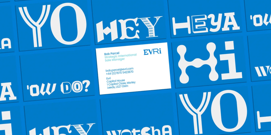
Hermes, the UK’s largest dedicated parcel delivery company, recently rebranded as Evri. SuperUnion, along with the help of the Monotype Studio, designed a living logotype using variable font technology. Senior Creative Type Director Phil Garnham worked closely with Superunion to create the logo, which has over 190,000 versions, to help the brand realize its mission of positive and reliable delivery experiences for everyone, everywhere.
Why it matters: “Evri is a great example of a confident brand that is willing to push and adopt evergreen technology to delight their customers.” – Phil Garnham.
Choosing fonts for rebranding.
While typography is not the only piece of the rebrand puzzle, it’s truly your brand’s visual voice and can help support you in two main ways:
- The practical stuff.
- Character sets – Make sure your type has the character sets you’ll need.
- Future-proofing - if you’re planning to expand to a new or global market, be certain you have language support.
- Legibility – Is your type designed to be accessible and readable across your key platforms and touchpoints?
- The emotional side.
- Type carries your message, make sure it’s speaking in your brand tone.
- Type can give customers a taste of a specific feeling, make sure it isn’t fleeting and based on trends or fads.
- Type can reference artistic movements or periods that are important or integral to your brand’s inception or history.
Ready to rebrand? Find a true design researcher.
Now that you’ve amassed inspiration for your own rebrand, here are some tips on what to look for in a partner, whether you’re looking for an agency, a type foundry, or an independent designer to reimagine your identity. Find a partner who is ready to fully immerse themselves in your brand and soak it all in: do the research to understand both what the brand was and where it’s going. Don’t be afraid to look to the past, pore through the archives, and carry important pieces of heritage to the new form. Our friends over at XYZ Type recently did exactly this with their fantastic work on the Rolling Stone Magazine update in late August 2022.
“The assignment was a paradox. How could we make the logo look like it did in the past without making it feel dated?” explained Jesse Ragan at XYZ Type. “To approach this challenge, we absorbed as much as we could from all of the previous iterations of the logo, picking and choosing what worked, to synthesize them into a complex solution that meets the wide-ranging modern needs of the publication. My hope is that loyal readers will believe the old logo is back, but on closer inspection will be surprised to notice how much it has been modernized.”
So there you have it, a case study from one of the biggest pop culture magazines in history, which strikes a beautiful balance between legacy and modernization. It just goes to show that you don’t have to throw away the past to design a logotype or brand typeface that will suit the complex needs of the digital age.
