


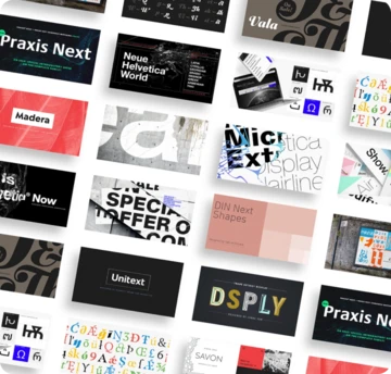


The secrets and subtleties of handwriting fonts.

Out of all the thousands of fonts in the world, handwriting fonts are a category unto themselves. But even within that seemingly narrow niche, there is a range of styles that reflects the variations and subtle differences found in actual handwriting.
Carl Crossgrove of the Monotype Studio breaks down these different characteristics to discover what makes each style authentic and human.
Famous hands, or celebrity handwriting.
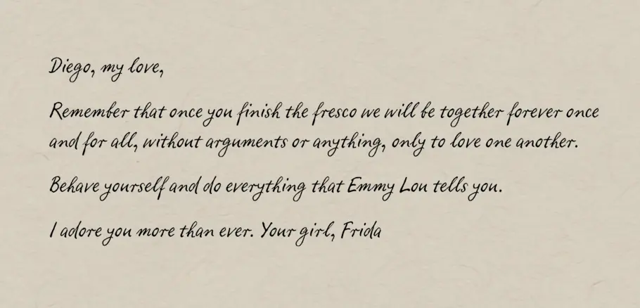
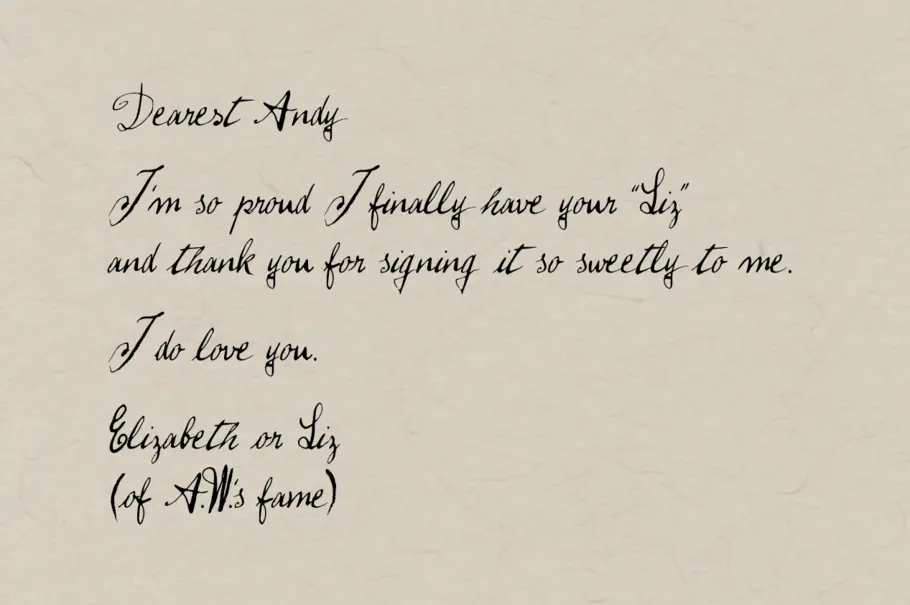
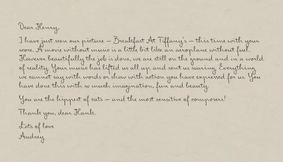
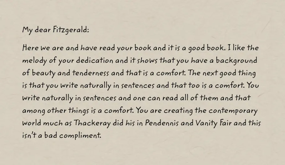
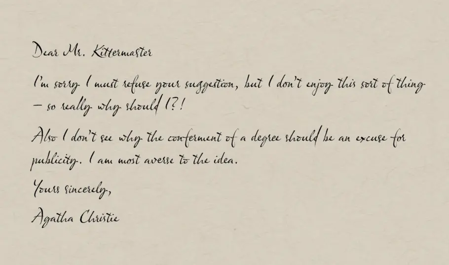
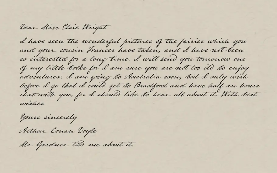
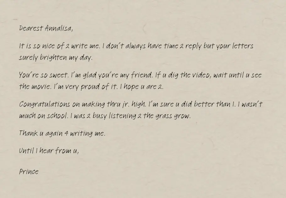
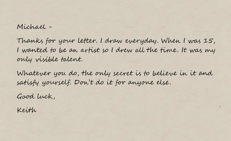
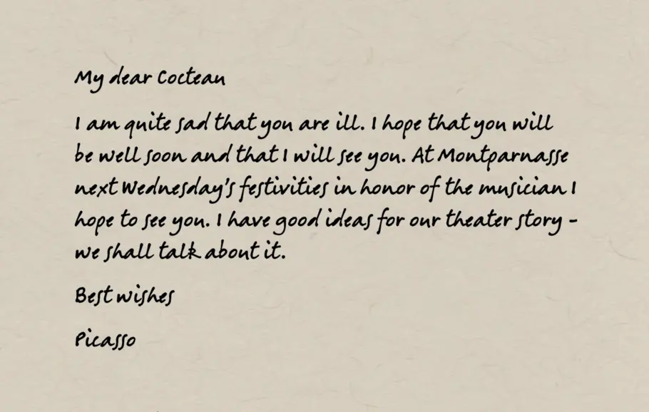
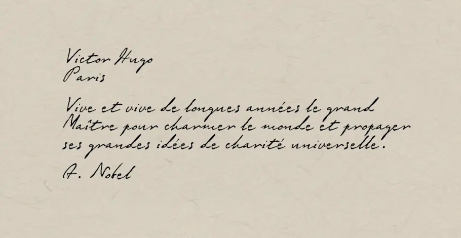
The content of written correspondence from famous poets, statesmen, criminals and freedom-fighters is of great interest. But the handwriting styles can be fascinating, too. With enough care and attention to rhythm, fonts can be made based on the writings of famous figures. Franz Kafka’s various moods are captured in FF Mister K and Josef K. Andy Warhol is famous for art, but also for a unique handwriting style, which is most likely actually his mother’s. There are typefaces made from the handwriting of Sigmund Freud, D. H. Lawrence, Albert Einstein and Paul Cezanne. 3 Islands Press has made typefaces from a number of historic figures including Abigail Adams, Frederick Douglass, and Mirabeau Buonaparte Lamar.
Personal, closely-based on real writing.
Monotype has employed many type designers over the years, and one retired design staff member, Brian Allen, had his handwriting immortalized in Segoe Script. Linotype Ego, Feltpen, Elisa, and Notec are based closely on real handwriting. ITC Zemke, Viner, Weber and Berranger Hand typefaces are all personal styles. Hermann Zapf’s Venture Script is based on his regular handwriting. Olicana by Nick Cooke is a very individual, but convincing script with three different textures. Suomi Hand Script is a typeface with a genuine handwritten look. Nicky Laatz specializes in handwriting styles, like Gotcha, Pink Lemonade and Bon Vivant Script.
Many of these designs use OpenType, ligatures and contextual alternates to reproduce a more realistic, random effect, since no two letters are really identical in any written correspondence.
Stylized or simplified handwriting.
Occasionally there is a need for a typeface that conveys the informality of handwriting without completely masquerading as actual handwriting. Letters may not connect, but they are still casual and hand-written. Some handwriting is much less cursive, and these fonts reproduce that effect. Go for these when an informal, friendly or casual effect is needed. Andy, Fineprint, MVB Calliope, Cavolini, Koorkin or Scooter are some of the many options.
There are a number of different formal handwriting styles, which give a distinct period flavor to text. These could be considered Instructional Hands; specific schemes taught and propagated by a writing master as a foundational writing hand for students. There are dozens of these styles, from many countries and many centuries. As fashion and technology changes, the prevalent handwriting styles change, too.
Zaner-Bloser, Ames, Palmer and Spencerian were some pointed-pen methods taught in the United States during the early twentieth century. Bickham Script, P22 Zaner, King Bloser, Snell Roundhand, Business Penmanship, and Burgues Script are all based on penmanship styles from this period. Many of the instructors, like Bickham and Snell, were impresarios whose writing manuals displayed virtuosic, extravagant displays of skill. In the twenty-first century, very few people are able to write in these historic styles, but a few writing experts keep the flame alive, and meet every year at the International Association of Master Penmen, Engrossers and Teachers of Handwriting (IAMPETH) conference. These handwriting styles and fonts can also be categorized as Copperplate, Pointed-pen, or Formal Scripts.
Chancery Italic was the method shown in many historic writing manuals of the sixteenth century, by Palatino, Cresci, Amphiareo, Tagliente, Mercator, and others. P22 Operina and 1522 Vicentino are both based on Arrighi’s writing, Cataneo BT is based on writing instruction of Bernardino Cataneo, and Mercator by Arthur Baker is based on Mercator’s instruction.
The same chancery Italic style enjoyed a resurgence in the second half of the twentieth century, having been identified as a very economical, clear and fast writing method by Edward Johnston, Alfred Fairbank, Lloyd J. Reynolds, and John Howard Benson. Caliban, Captain Quill, Amarone, and Florens are typefaces that refer to this more recent Chancery Italic resurgence. All these chancery styles also belong to another category of types known as Calligraphic, Broad-pen, or Edged Pen.
Simpler, more primary instruction is represented by Rosemary Sassoon’s various typefaces based on her experience in teaching children. The styles are intended to be simple, fluid and easy for children to master. As with the nineteenth- and sixteenth-century writing manuals, Sassoon’s instructions and accompanying fonts are intended to teach the basic forms and techniques of good handwriting.
The newfound art of actual handwriting.
For all this talk of handwriting fonts, what about the source material … actual handwriting? For people looking to sharpen up their own penmanship, Crossgrove recommends A Handwriting Manual, by Alfred Fairbank, and Italic Letters, by Inga Dubay and Barbara Getty. You can find more resources from the Italic Handwriting Society, or the work of Rosemary Sassoon.
Related content.

Behind the font: Carl Crossgrove of the Monotype Studio.
Behind the font highlights the people and process behind the fonts you love and use. This installment features Carl Crossgrove of the Monotype Studio.

Behind the font: Jessica McCarty of Magpie Paper Works.
Behind the Font highlights the people and process behind the fonts you love and use. This installment features Jessica McCarty, founder of Magpie Paper Works and Rare Bird Fonts.

What’s behind the rise of ‘quirky’ serifs?
Sans serifs have long dominated the world of corporate branding, but some companies are going for a different look: Fun, funky serifs. What’s behind the change?