What’s behind the rise of ‘quirky’ serifs?
You may have noticed a reemergence of serif typefaces appearing across logos, wordmarks, and display fonts. High-visibility brands like Chobani and WeWork feature a serif logotype, whereas Slack and Oscar Health use a serif font as their primary display fonts. With grotesque and geometrics sans serifs fonts dominating the branding landscape for the past few decades, it’s interesting to note this stark departure.
The argument for sans serifs
Sans serif fonts have come to connote progress and modernity, whereas serif typefaces evoke a more old-fashioned, traditional feeling. This explains why sans serif designs have been a popular choice for industries such as aerospace, information, medicine, and biotech for the past 60 years. And within the tech industry, giants such as Google and Yahoo have completely eliminated their use of serif fonts, while newer companies launch without a serif typeface in their branding at all.
As Monotype Studio type designer Juan Villanueva points out, “Sans serifs have been made the go-to, safest design branding option…[they] carry a connotation of neutrality, simplicity, and agility. Changing that is hard.”
Another reason for the ubiquity of sans serif fonts is their on-screen legibility. It is widely argued that by switching from serif to simpler sans fonts, people can better read letterforms on illuminated screens, particularly small ones.
However, technology has caught up by implementing bigger, high-resolution screens. A serif can be rendered in seven pixels, and the iPhone 7 has a resolution of 1,334 x 750 pixels. Present-day screens are putting those legibility concerns to rest.
The departure
It seems after decades of using sans serif fonts as if there were no serifs in town, designers are looking back at serifs as a way to infuse brands with charm and character. Serif designs offer unique visual opportunities that aren’t present in a lot of major corporate branding. It’s possible designers and brands are inspired to embrace as well as emphasize their originality through fonts rich in personality, finding authentic and unique alternatives from the minimalist look.
Carl Crossgrove, Senior Typeface designer at the Monotype Studio, has noted the emergence of the “quirky” serifs, defining them as “crisp, machined transitionals with wedge serifs.”

What can we make of this trend? “I think more people are recognizing a sameness and wanting something different,” he says. “Somehow sans type is so prevalent that now serif type seems quaint or unusual.”
In a time where consumers crave authenticity, brands must be able to deliver their messaging in a way that resonates with their audiences and stays true to who they are. For some brands, sans serif fonts do not fully capture their personality and what they want to communicate. To stay relevant, they must adapt their look to one that feels more authentic and that might not be the popular look of the time.
Villanueva also connects the trend to consumers’ demand for brands to be more relatable. “What I suspect is behind this [change] is the constant and rapid news cycle, technological developments, and social media where companies try to shape public perception through their branding and manifestations across their multiple channels… especially today where the customers expect more intimate relationships with the brands they follow.”
But how does this translate to design?
Fonts are a key element of brand identity. It’s the through line of each visual customer touchpoint and may be the only brandable asset in cases where elements such as color, imagery, or iconography can’t or won’t work. And, each typeface has a distinctive voice and tone.
Choosing a font to represent your brand begins with understanding your brand identity and truth. It’s important to find or design a font that aligns with your brand’s personality traits to be truly authentic. When rebranding, consider the impressions you want to make, the values you want to reflect, and the emotions you want to evoke. Understand how these elements fit into your brand and how the consumer interacts with the brand. Your fonts should reflect these qualities and should clearly communicate what’s at the heart of the brand.
For Chobani, the new wordmark—what Crossgrove would describe as “an old-fashioned soft serif design, like Goudy, Cooper, and Windsor”—captures the feel-good, healthy yet indulgent sensation of the product in a dynamic, smooth, curvy, and solid serif. It represents the earthy wholesomeness of the product better than the tech-y feeling font used before it. By better aligning with Chobani’s brand values, the new typeface communicates the approachability and warmth of the brand in an expressive way that’s not over the top or trite.
Will we see more brands adopting a serif?
Villanueva hesitates to call the emergence of the quirky serifs a trend. “Medium and Evernote [may have adopted] logos with serifs, but their UI and web typography are still predominantly using sans serifs, aside from Medium’s blog entries, which makes me think those changes are happening on the surface level and not as in-depth as in Chobani’s.”
As more brands explore ‘quirky’ serifs for their branding, there can be a temptation to get swept up in the excitement of a new look. But, brands should be wary of design choices that don’t fit their identity because it could mean risking authenticity and therefore, relationships with customers.
Still, as brands evolve, they’ll continue to find ways to engage their audiences, balancing authenticity with digital accessibility. Though this does not necessarily mean we’ll see more serifs, it’s clear that fonts are a key component of visual identity and provides a broad palette for brands to express their voice.
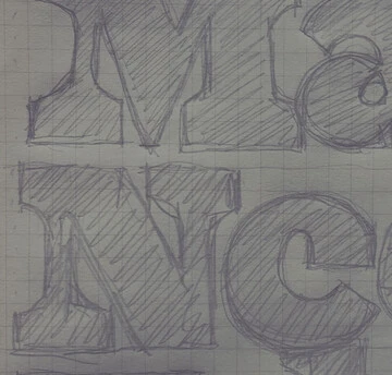
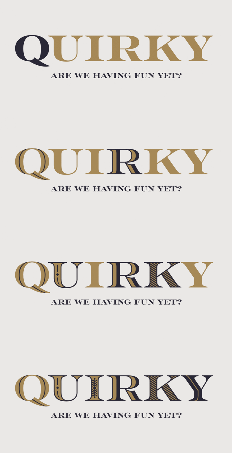
The images in this story use Rosella, by Sabina Chipara. You can find Rosella in Monotype Fonts, along with over 250,000 other fonts.
