Meet Hope Sans, a Type Directors Club Typeface Design Competition Winner.

Hope Sans has been selected by the judges of the 22nd Annual TDC Typeface Design Competition to receive the Certificate of Typographic Excellence. It will be included in the Annual of the Type Directors Club, “The World’s Best Typography,” and will also be shown at the 65th Awards Exhibition (TDC65) in New York City.
Hope Sans is a typeface with a dual personality. On one hand, it’s a no-nonsense sans serif in six weights, versatile enough to take on anything from body copy to branding. But it’s also a throwback to the swash-heavy styles of the 1970s, with almost all of Hope Sans’ characters offering alternates that turn its tone of voice inside out.
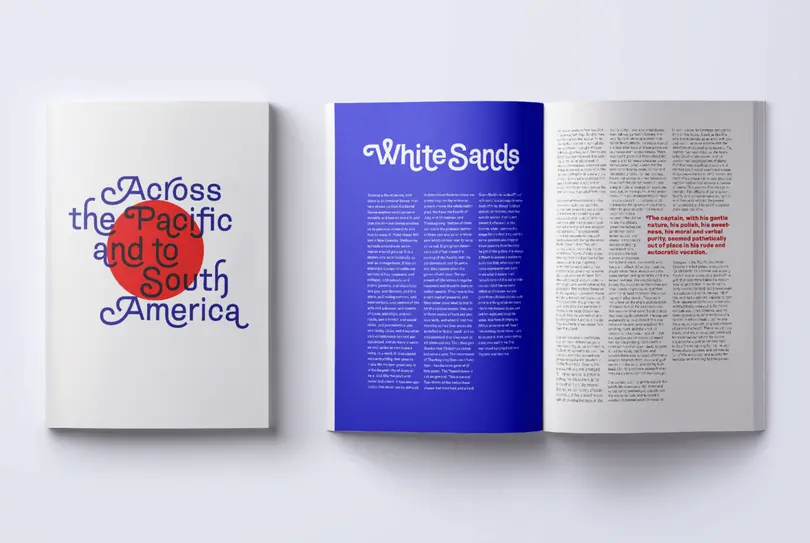
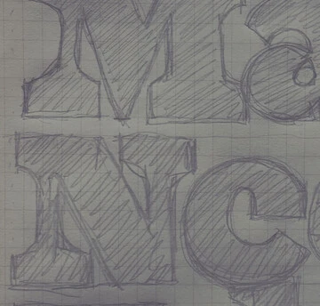
“My idea was to revive this softened handlettering style from the middle of the century,” explains Nix. “But I wanted to take that one step further—through the 50s and 60s and into the 70s. I grabbed some of the crazy stuff that was going on in phototypesetting. If you could draw a swash, you could tack it onto a letterform. Throughout the 70s people were creating dada-esque swash versions of popular—and some not-so-popular—type styles.”
Hope Sans’ set of swash alternates offer almost endless combinations, giving designers a chance to change things up, and uncover what’s hiding behind the typeface’s sedate first impression. “I can’t quite imagine how people will use it,” says Nix, “but I wanted to provide enough components for designers to create really surprising settings and lockups with it.”
Even the design’s alternate-free appearance isn’t devoid of its own moments of playfulness, with its “gothic sobriety” offset by flared strokes and cupped terminals.
“It’s important in grotesques that they look machine-like, and unassailable,” says Nix. “They look universal, or at least that’s the role they’ve taken on over the last 50 or 60 years. When hugely-popular fonts like the Helvetica and Univers typefaces were introduced they almost immediately became a shorthand for the international typographic style. I wanted to rewind to that mid-century moment, when the new grotesques were really taking off, and look at the ways that contemporary artists like Mortimer Leach, Peter Dom, Robert Evans, and George Abrams were making sans serifs by hand.”
Nix took cues from a wave of more relaxed grotesques that appeared in Madison Avenue advertising, giving the letters what he calls a “relaxed draping”, lending a little more softness and grace than some of the more rigid grotesque counterparts.

“If you look at the lowercase A, you would expect that shoulder to be very supportive and muscular, almost architectural,” he explains. “Instead it just tilts a little. I looked for places in the design, small places, where it could just ‘relax’ a little bit, where it could drop its shoulders.”
Hope Sans’ large counters and open spacing means it can work effortlessly across a range of environments—including digital, print, text, headlines, editorial, advertising, and branding—and for any use designers can imagine for its enormous set of swashes.
“I think people will find things in the back of the house and pull them to the fore,” says Nix. “It could be some crazy seventies-swash-orgy-style with tendrils reaching all over the place, or something almost Renaissance where you just tip in a swash capital and leave it at that.”

Get the Hope Sans fonts
Hope Sans by Charles Nix is included in the Monotype Fonts.
