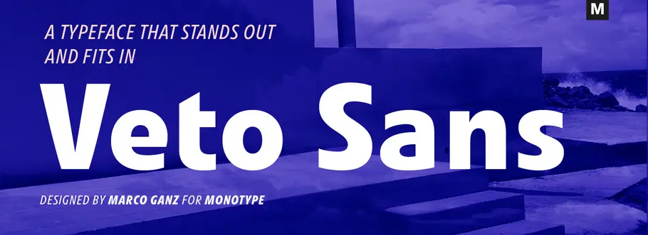
Veto Sans and the art and craft of Marco Ganz
Marco Ganz, Designer
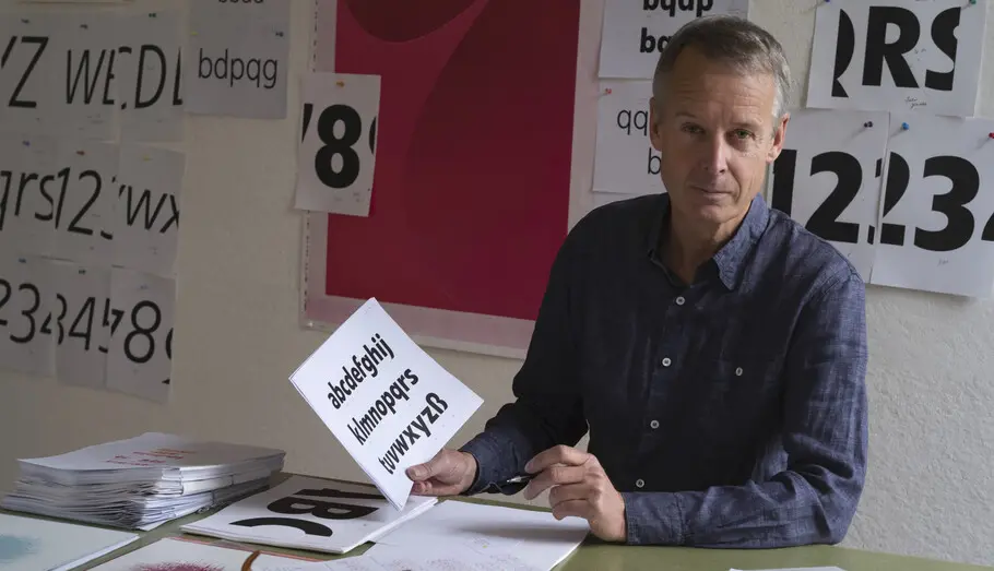
“Typeface design is not an art. It’s a craft,” says Marco Ganz, the designer of Veto Sans. “People are familiar with letters. Letters have a purpose. Art has no purpose beyond making people think or wonder.”
Ganz considers himself both a craftsperson and an artist—and is adroit in both endeavors. His Veto Sans family excels on screen and in print, its characters are distilled to their purest forms while remaining poised and elegant. Ganz’s sculptures, however, are provocative and challenge the viewer.
His “Blue Cocoon” is a 28-foot long, high-precision form that could pass as a land speed record car. Blue Cocoon’s smooth shape is held aloft by two four-foot tall wheels that resemble something from a fantastic Roman chariot. Its streamlined shape looks like it’s traveling at 300 miles-per-hour, even though it’s standing still.
Hints of speed influenced shapes also find their way into Veto Sans. “Evoking a sense of speed was a main goal when I designed the Veto Sans italics,” says Ganz. “I wanted them to look fast.” It’s not only the dynamic slant of the characters that creates the feeling of speed, but also the vibrant flow of the drop-shaped letters that adds additional acceleration to the italics. “In German, there is a word ‘ideallinie’,” says Ganz. “It’s the curve a master race car driver would take around a corner: the fastest, shortest, most direct path possible. A smooth curve without any abrupt changes of direction. The word translates into ‘racing line.’ This is the concept I used when drawing the Veto Sans italics.”
Marco Ganz.
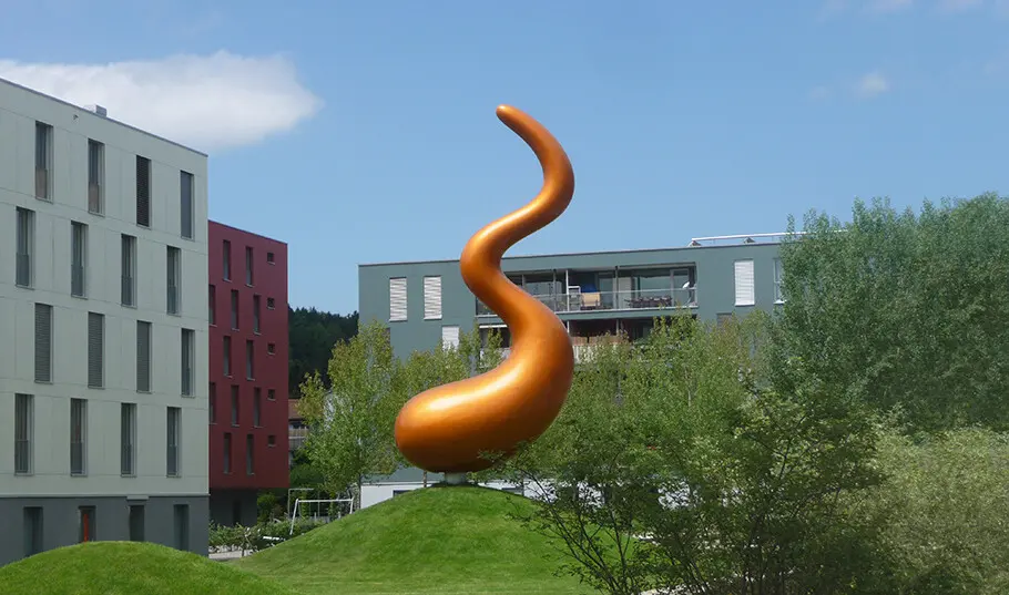
“Snaporaz,” by Ganz, is a two-story, eight-ton wooden sculpture that clearly makes people think—or wonder what it is. It’s a lively and enigmatic shape that looks as if it could transform itself into something else at any time. According to Ganz, “Snaporaz does not represent anything, it rather opens something up.” Snaporaz is the embodiment of the German word “gewöhnungsbedürftig,” a word that has also been used to describe Ganz’s Veto Sans typeface. Loosely translated, it means “in need of getting used to.”
Ganz does not take offense to this description. In fact, he relishes it. “There are typefaces that are as familiar and comfortable as a pop tune,” he says. “Then there are others that you have to get to know. Veto Sans is the latter.”
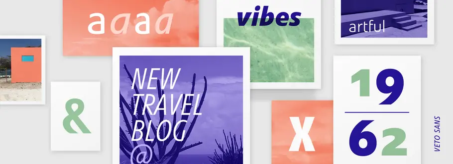
Not all of Ganz’s sculptures are outsized. His “Cats” editions are small enough to hold in your hand. Intended for mounting on a wall, they are soft colorful shapes made from foam covered with electrostatically applied fibers creating a flocked surface. Depending on the outline shape of the sculpture, and a process called “concavity cutting,” the form is given a three-dimensional shape. “It’s all about physics,” says Ganz. “When the sculptures are on a wall, the space around the shapes is just as important as the sculptures themselves,” he continues. “This same ethic is applied when I design a typeface. The space around the letters is just as important as the shapes themselves.” One need only look to the lowercase x in Veto Sans to see Ganz’s attention to negative shapes. The outside of the diagonal strokes curve subtly as they converge.

Ganz also uses a different vocabulary when discussing his typefaces. “When I design a letter, I make it look healthy and supple. I try to create immediacy in my typeface designs without making something that is obvious,” he explains “Ordinary people see nothing unusual or new in Veto Sans. Which is perfect! It takes someone with an eye for typeface design to see its nuances and purposeful contradictions.”
Art and technology are melded into Ganz’s three-dimensional creations. The vision is his, but he relies on sophisticated tools, innovative industrial workshops and technological expertise to realize them. So it is with his typeface design. Veto Sans was a collaboration between Ganz and Andreas Frohloff. Ganz concentrating on the drawing of the characters and Frohloff converting them into carefully constructed fonts. “We worked closely together for several months. I was the designer, but Veto Sans would not be what it is without Andreas. His longstanding expertise in font production significantly improved the final product.”
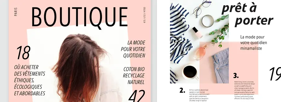
The drawing of Veto Sans may not have been an artistic endeavor in Ganz’s eyes, but the typeface family is clearly a melding of artistic opinion, design ethic and technological prowess. You can explore the full Veto Sans family at Fonts.com and MyFonts.


