


DNS1
DIN Next Slab
DIN Next Slab, also produced under the direction of Akira Kobayashi, the typeface is a variant based on the optimized shapes of DIN Next. The expansion will make the popular font all the more flexible and versatile.
DNS1
DIN Next Slab, also produced under the direction of Akira Kobayashi, the typeface is a variant based on the optimized shapes of DIN Next. The expansion will make the popular font all the more flexible and versatile.

Between1
Akira Kobayashi’s Between™ typeface comes in three main states. While different from each other, they all offer human-centered design to ensure that copy set in them is affable and approachable.

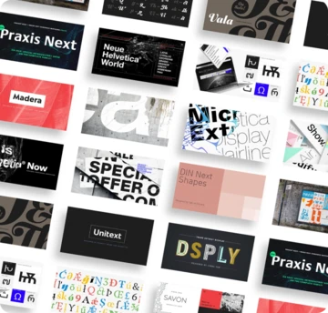
Unitext1
Created with the needs of branding design in mind, Jan Hendrik Weber's Unitext is a crisp, clean typeface that functions well across print and online use. It blends humanist and grotesque qualities, adopting a style that the designer describes as “neo grotesque”.

The Pegasus typeface, originally designed by Berthold Wolpe, is full of surprises. The E and F both have oversized serifs. The A and H have cross bars of very different thicknesses. The K and g look a little unhinged, and the g boasts a distinctive, spiky loop.

Initially designed for Fanfare Press, the Fanfare typeface packed more into a small space than most typefaces. It was a natural for book and movie titles, and more general branding. Albertus is serious, classical and monumental, while Fanfare is modern, light and playful.

In the Albertus Nova typeface, Toshi Omagari has revived a number of alternate capital letters created by Berthold Wolpe that have been unavailable in the existing digital version. This includes the uppercase M, W, J, E, R and Q. He designed five weights - light, thin, regular, bold and black- as well as Greek and Cyrillic characters.
Read our GDPR strategy guide, articles and FAQ to learn more about the changing privacy landscape and what it means at Monotype. We are well positioned to help our customers adapt to the changing regulations and see it as an opportunity for brands to build even more meaningful engagement with their customers over the long term.

SAP3
Monotype’s Terrance Weinzierl helped software company SAP to develop a typeface for SAP Fiori, for which SAP won a Red Dot Award in 2015. It was important that the design of the typeface works well in text-based UI environments without compromising on personality. The new typeface, called 72, has won a 2017 Red Dot Award.