DIN Next™ Slab
A sturdy, square serif.
A sturdy, square serif.
Like a new concrete bridge crossing the autobahn, DIN Next™ Slab brings a sturdy, square serif to the font family that has its roots in the German road sign system. With 14 new fonts, all inspired by the classic German DIN 1451 typefaces, its industrial heritage makes it surprisingly versatile for a wide range of design applications.
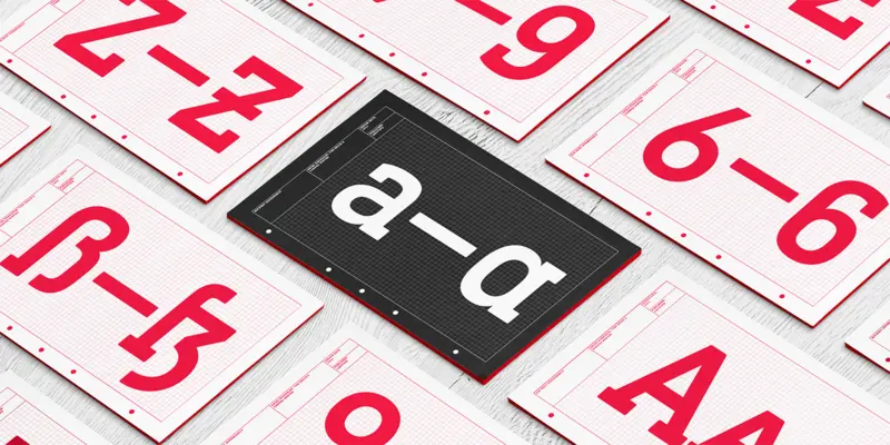
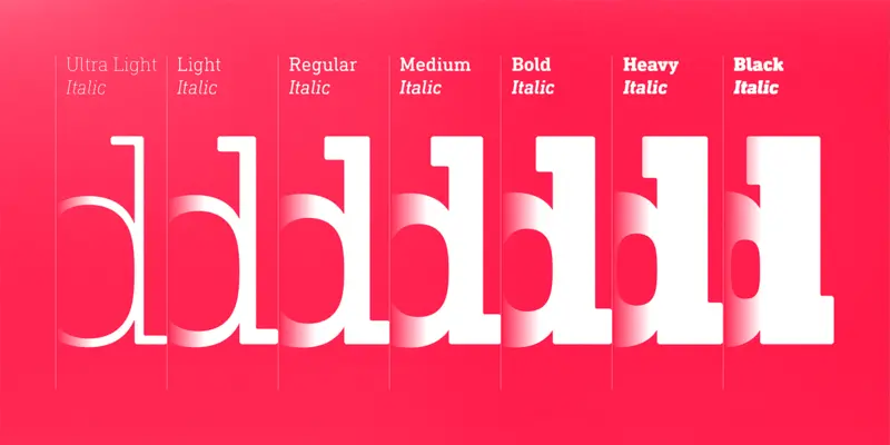
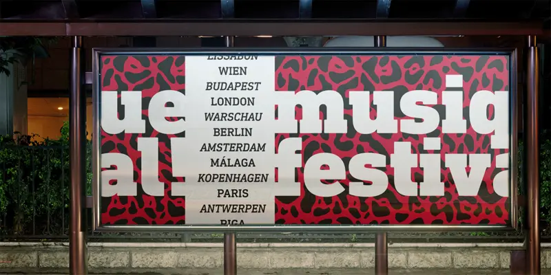

Now even more design possibilities with the popular DIN Next. With its technical and neutral character, DIN Next has earned a permanent place in contemporary typography. Now, DIN Next Slab expands the font family further, offering new design potential.
Now comes the next step, DIN Next Slab, also produced under the direction of Akira Kobayashi. On a team with Sandra Winter and Tom Grace, Kobayashi is creating the new font variant based on the optimized shapes of DIN Next. The expansion will make the popular font all the more flexible and versatile. Apart from that, the geometric slab serifs underline the technical and formal nature of the font and emphasize a central design element of DIN Next.
However, the team did have some challenges to overcome. While it is relatively easy to imagine DIN Next Light with slab serifs, the amount of available space quickly disappears when it comes to the Black styles. Winter explains that many tests and trials were necessary to find a compromise between space, letters and the serif shapes. Experiments with modified contrast in the weight or only one-sided serifs were quickly abandoned. The central, technical and powerful character of the font changed too much. Nevertheless, it was necessary to simplify slightly the shape of some letters, such as the ‘k’ or ‘x’, for example. These changes, first developed in the Black styles, were applied to all weights in order to lend the font a consistent appearance.

Creative Type Director Akira Kobayashi has three decades of experience, with an extensive background in Japanese typeface design and a deep understanding of calligraphy. After studying at Musashino Art University in Tokyo for four years, Akira Kobayashi accepted his first job at phototypesetting manufacturer Sha-Ken Co., where he was involved in the lengthy and intricate process of designing Japanese fonts.
We offer a number of ways for you to start working with our typefaces.
Monotype’s Akira Kobayashi worked closely with Sony’s Chief Art Director Hiroshige Fukuhara to create an original typeface ready for nearly 100 languages.
This custom-designed font family, Alibaba Sans, will help partners and customers power on-brand designs.
