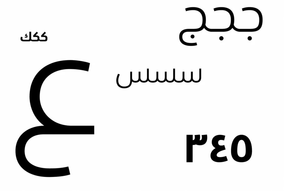
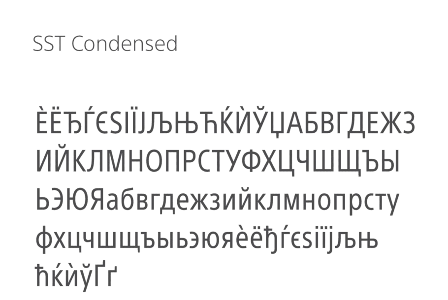
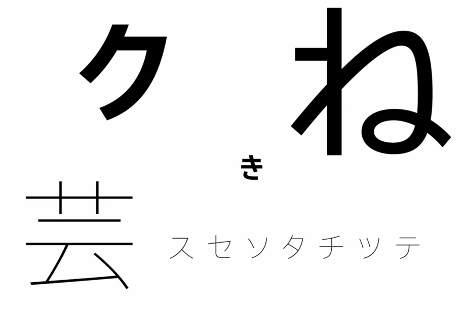
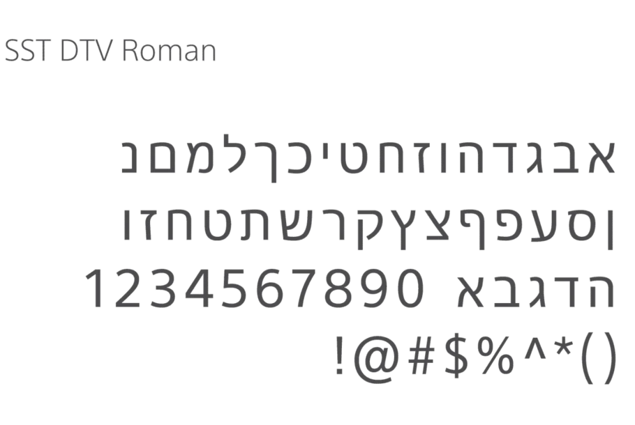
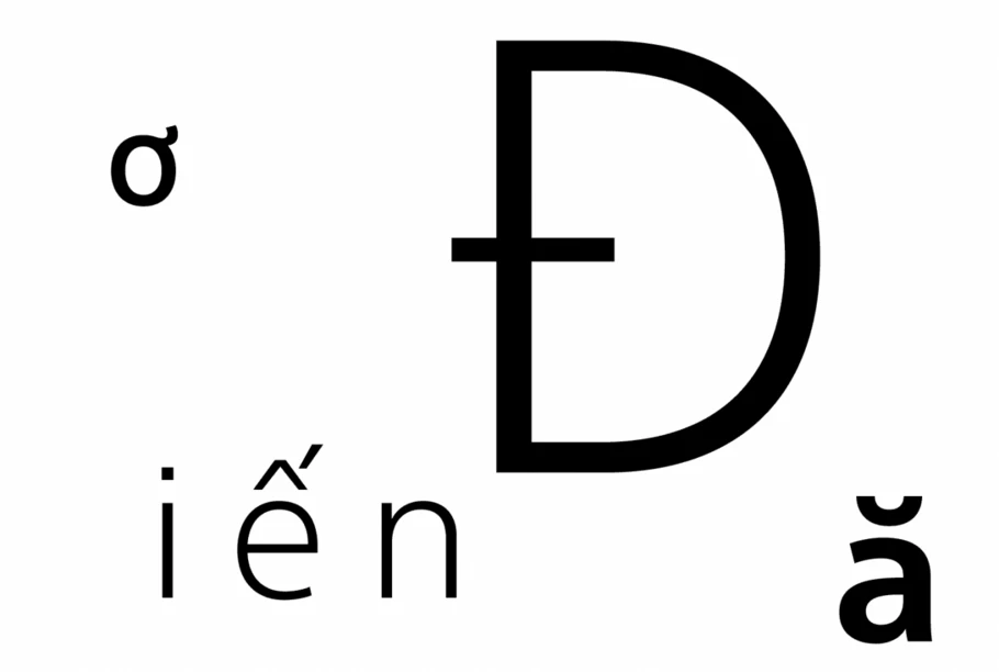
One typeface, 93 languages for Sony.
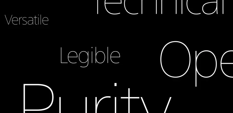
Monotype Type Director Akira Kobayashi worked closely with Sony’s Chief Art Director Hiroshige Fukuhara to create an original typeface ready for nearly 100 languages, numerous customer touchpoints, and decades of use.
Sony came to Monotype with an unapologetically audacious vision for an original typeface design that would be put to use on its products, in stores, online, and in essentially every one of its touchpoints with customers around the world—customers who speak any one of 93 languages, no less. After developing a full understanding of Sony’s wish list for its SST® fonts, Monotype Type Director Akira Kobayashi admits to feeling “a weight of responsibility knowing how the project would help build the Sony brand image…It makes me smile now, when I recall how daunting this complex project seemed.”
On their blog, the multinational corporation says it was confident that Monotype was up to the task, thanks to the foundry’s firm understanding of typographic history and ideals, its own long history, expertise in multilingual development, and in-depth support ranging from typeface design to display optimization. “Typefaces are key elements of design that shape our impression of products and the user experience itself,” says Sony.
The challenge
Explains Sony Chief Art Director Hiroshige Fukuhara, “My initial inspiration was to create an authentic typeface, something I was passionate about. All project members shared my regard for authenticity. We sought an original typeface, yet one built on solid typographic traditions. We hoped it would endure for decades to come. And multilingual development was planned from the start.
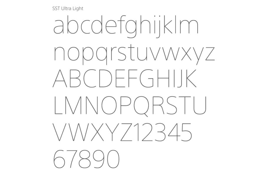
Using the Frutiger® and Helvetica® typefaces as jumping-off points, Sony’s SST® typeface is something of a hybrid of these two fonts, marrying Frutiger’s organic readability and Helvetica’s sharp geometrics. Of chief importance, the typeface developed for Sony had to support usability and the enjoyment of Sony’s content—company-wide and worldwide. Other requests included a type that was legible even at small sizes, understated, firm, sharp, technical, pure, timeless, and versatile—performing as well on a smartphone as it did on a billboard. It also couldn’t be too startlingly different from Helvetica, the font that Sony had used many times prior.
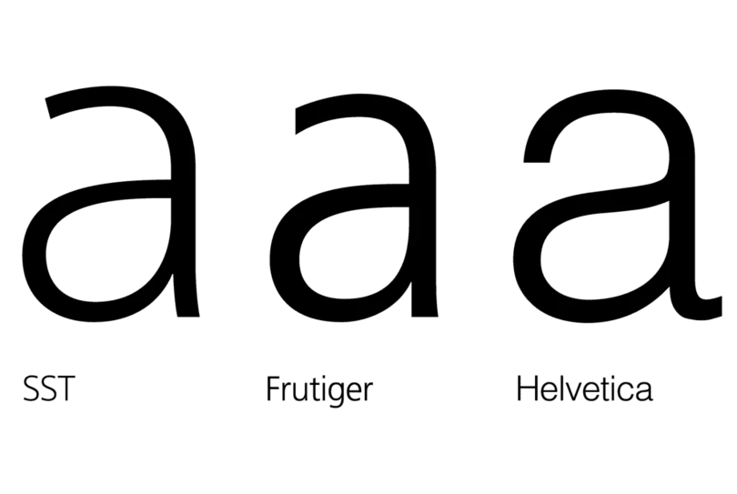
Sony’s SST typeface marries Frutiger’s organic readability and Helvetica’s sharp geometrics.
“As we saw it, the type should stand back and not add much extra,” says Kobayashi. “Ideally, it brought together a range of elements—hard and soft qualities, a sense of product identity, natural proportions, and so on … For this reason, it’s a compliment to say that no traits are out of the ordinary, if we compare the features of individual characters to those in other typefaces. Few people at a store would probably notice that the type on Sony packaging looks different. In this respect, I think we took a very natural approach to ensuring the typeface matches the image of Sony products.”
The solution
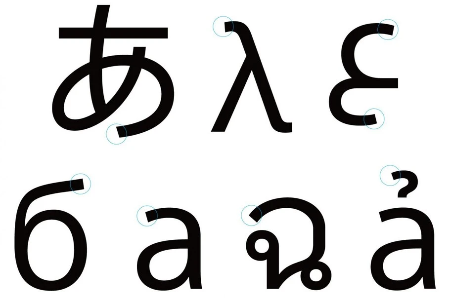
The same painstaking attention to detail that Sony uses in product development was applied to the development of the SST fonts. The line width is designed to look consistent, even when it’s not, taking into account that optical illusions can affect the way characters appear. Vertical and horizontal lines are of fairly even width, and ample space is given to apertures and counters to maximize legibility even at smaller sizes. All characters are similarly sized, so that a C is only 1.2 times bigger than an S, for example
To unify a single font that would support not only English and Japanese but also Greek, Thai, Arabic—a total of 93 languages—Monotype drew on the talents of its network of local designers who looked to Kobayashi for direction on details like curvature and line width. Quite literally, Sony’s typeface ideals were translated into many languages. It proved to be particularly challenging to unify a typeface that includes Asian language; SST is the world’s first project in Sony’s sector to do this. Nevertheless, in the end, the typeface was ready for an impressive 93 languages.
The SST typeface has already been introduced on the Sony website, on product packaging, and in user manuals, and it will soon be established as Sony’s corporate typeface, as well as employed on a variety of Sony products.
The Studio team.
Akira Kobayashi.

Creative Type Director Akira Kobayashi has nearly four decades of experience and an extensive background in Japanese typeface design and is a 2022 TDC Medal and Keinosuke Sato Award winner. After studying at Musashino Art University in Tokyo for four years, Akira Kobayashi accepted his first job at phototypesetting manufacturer Sha-Ken Co., where he was involved in the lengthy and intricate process of designing Japanese fonts.
