Tencent expands global presence with a new brand identity and typeface.
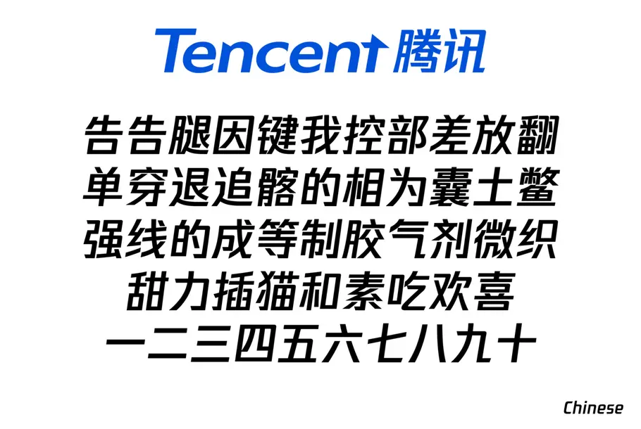
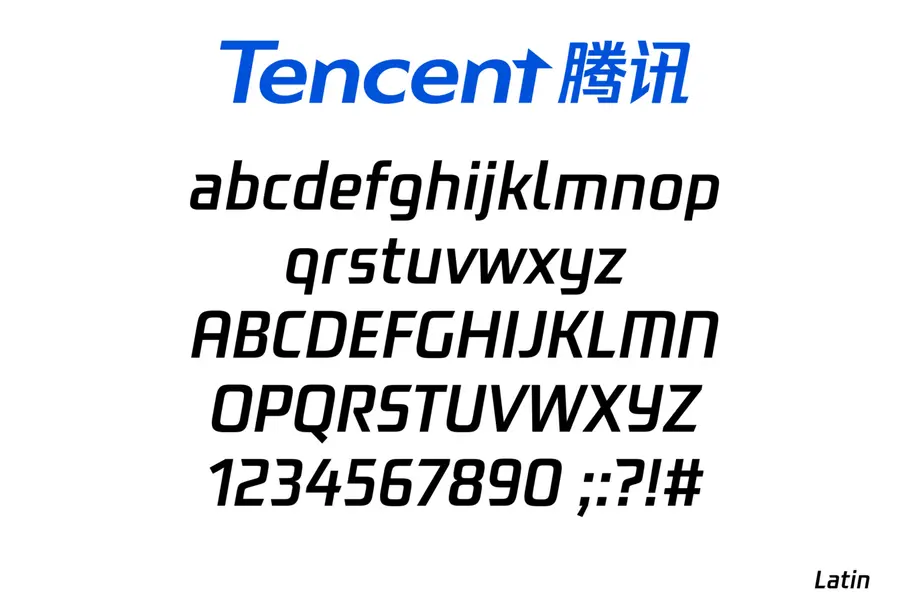
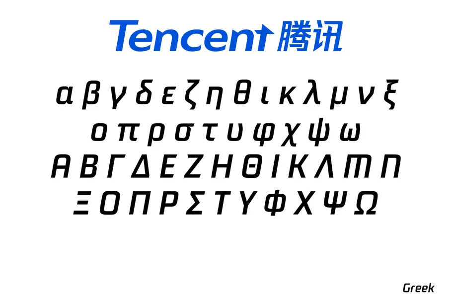
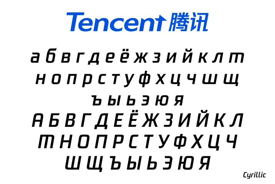
Monotype developed a global typeface family for Tencent, a leading provider of Internet-based services in China. The forward-thinking design embodies Tencent’s commitment to technology and the future. Monotype Type Designer Julius Hui led the creation of the slanting, futuristic typeface which focused on creating a perfect harmony between Chinese, Japanese and Latin characters— allowing Tencent to deliver a consistent, recognizable brand voice, worldwide.
If you’re using a messaging app in China, chances are it’s owned by Tencent – a leading provider of Internet value added services in China that owns WeChat, as well as a whole host of social media platforms, entertainment subsidiaries and payment services.
Tencent’s net worth is currently more than $200 billion, and it has been named the world’s tenth most valuable public company by Wells Fargo. Although best known in its home country, Tencent has plans that go far beyond China, hoping to “preside over the global tech revolution of the future,” as its chairman and CEO Ma Huateng recently told The Economist.
With such lofty goals and an increasing amount of global brand awareness, the time had come for Tencent to expand its corporate typographic voice in line with its ambitions. The company approached Monotype to design a bespoke typeface, based on its existing logo, that could convey its vision of “innovation, responsibility and enablement”. It needed to communicate not just with the brand’s Chinese market, but also with its growing base of users around the world.
“The commission of this custom typeface is timed with the company’s 19th anniversary and represents Tencent’s willingness to invest in their image and create a typeface that is harmonious across geographies and languages,” says type designer Julius Hui, who led the project from Monotype’s Shanghai studio. “Custom type is the voice of a company being visualized,” he adds. “It helps project a desired brand image to an audience with precision.”
“We live in a world of global technology, and more people outside of China are using Tencent products to communicate,” adds type designer Juan Villanueva, who designed the Latin fonts. “With many different languages in use, it’s nice that they can all be united in tone and style effectively through type.”
Hui worked closely with Tencent on an updated logotype, giving the letters a more contemporary feel that would convey the brand’s dedication to technology and innovation. A “cutting edge” is represented literally on the entry and exit strokes throughout the typeface. The design also slants forward at an 8-10° angle, leaning into the future.
The type’s slanting style posed a particular challenge for Chinese characters – whose structure can become loose and easy-to-collapse when not drawn upright. Hui and his design team experimented with several solutions, trying different slopes, different degrees, and even creating a slanted box in which they could draw slanted Chinese characters.
“For the conflict between Chinese characters and the slanted style, we applied many optical corrections to each character to make it comfortable for our eyes, and natural,” says Hu
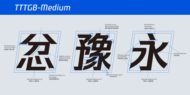
Chinese is traditionally drawn completely upright. To reflect Tencent’s dedication to the future, Julius decided to create a slightly italic Chinese design that slanted forward. Optical corrections were put in place to ensure legibility in this new forward-thinking design.
With Tencent’s global mission in mind, the company also needed a Latin counterpart that would complement and work alongside the Chinese. Monotype designer Juan Villanueva oversaw the development. Villanueva started with a broad-edge pen, rewriting Chinese characters to get a better understanding of their structure. Latin and Chinese had to work together in a “true partnership”, despite operating as two very different writing systems – Chinese ideographs fit into a box, while Latin has very different constraints.
“I certainly focused on the aesthetic features, but what was really important to me was understanding the internal logic behind the Chinese design – like how the stroke direction (ductus) determines the angle of the entry and exit strokes, and how a sudden change in direction determines a round vs sharp corner,” said Villanueva.
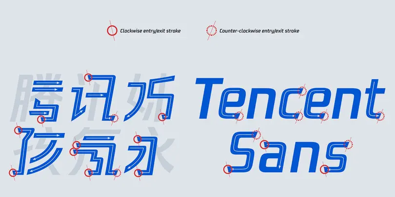
The Chinese and Latin fonts share similar entry and exit strokes. Notice the intentional “cutting edge”, a reference to Tencent’s products and brand values.
Villanueva designed a low-contrast and oblique sans serif that blends the warmth of early geometric sans, such as Paul Renner’s original Futura drawings, with the rational forms of more recent industrial sans such as Sebastian Lester’s Neo Tech. Its sharp cuts are intended to match both the spirit and appearance of the Chinese design.
“Both styles are rid of ornaments and share a dynamic angle – their clean aesthetic and sturdy proportions feel modern, with a nod to history and a lean towards the future,” he adds. “I was looking for a combination of shapes that were bold, graphic, rooted in history yet contemporary.”
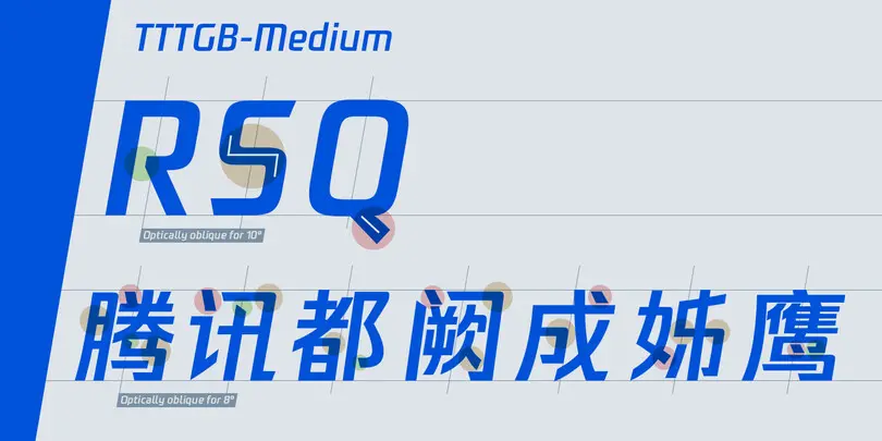
Notice how the features in the Latin characters mirror features in the original Chinese design. For example, the open counter of the R (green), the flat spine of the S (yellow) and the tail on the Q (red).
To combat the two languages’ different structures, weight has been added to the Latin version to help it harmonize with the Chinese, and its biform design means shapes from upper and lowercase alphabets are mixed (as Chinese has no upper or lowercase). Individual details reference shapes specific to Chinese ideographs, such as the open counter of the R, the flat spine of the S, and the tail on the Q.
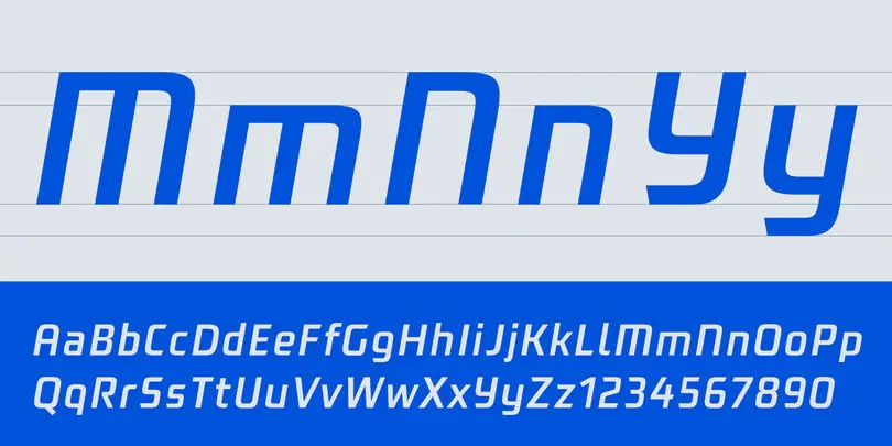
In Chinese, there is no such thing as “uppercase” and “lowercase” letters. This allowed Juan to include “biform” characters in the Latin design. Notice how the uppercase M, N and Y look similar to a lowercase character.
Japanese Kana have also been created, abstracting strokes and shapes from the Chinese design. Monotype designer, Ryota Doi led the development of Japanese. Creating harmony between Chinese and Japanese characters is no easy task. Chinese characters are very structured and designed to fit into a box, whereas Japanese (Hiragana) ideographs have a more organic rounded shape.
“The biggest challenge was obviously how far I should pursue emphasizing Chinese characteristics,” explains Doi. “Merging the hard impressions of Chinese into the organic style of Japanese could have negative impact on readability. I had to carefully consider the user’s eyes movements– horizontal rather than vertical – and create balance and stability between the designs.”
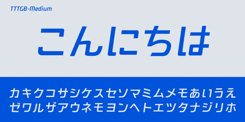
Japanese Kana characters were also created to harmonize with the Chinese design. The Japanese fonts were designed by Ryota Doi.
“Increasingly, Chinese companies are expanding into new markets and geographies, serving a much more diverse customer base than they have historically,” says Hui. “And while Tencent has had experience doing business across borders, they wanted to ensure that as they expanded their offerings to new areas, that their brand image and message translated and resonated in every region.”
“A typeface is an important part of conveying a brand’s voice and promise to its customers,” the company says. “We wanted to ensure that our voice demonstrates how technology is incubating new possibilities for social development and quality of life. This typeface echos our values.”
