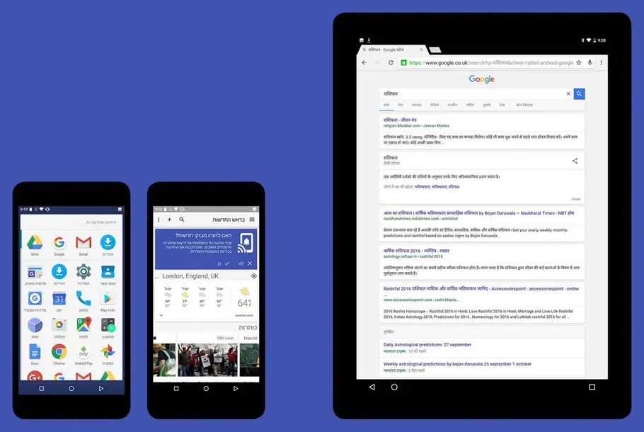
More than 800 languages in a single typeface: creating Noto for Google.
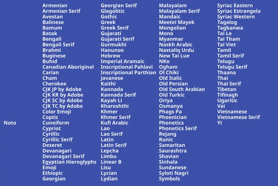
A typeface five years in the making, Google Noto spans more than 100 writing systems, 800 languages, and hundreds of thousands of characters. A collaborative effort between Google and Monotype, the Noto typeface is a truly universal method of communication for billions of people around the world accessing digital content.
The brief: ‘no more tofu’
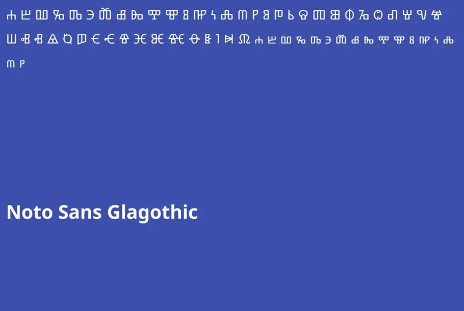
Google set Monotype a straightforward brief: “no more tofu” – tofu being the nickname for the blank boxes that are shown when a computer or site lacks font support for a particular character. To meet Google’s requirement, Monotype needed to develop one typographic family that could cover the more than 800 languages included in the Unicode Consortium standard.
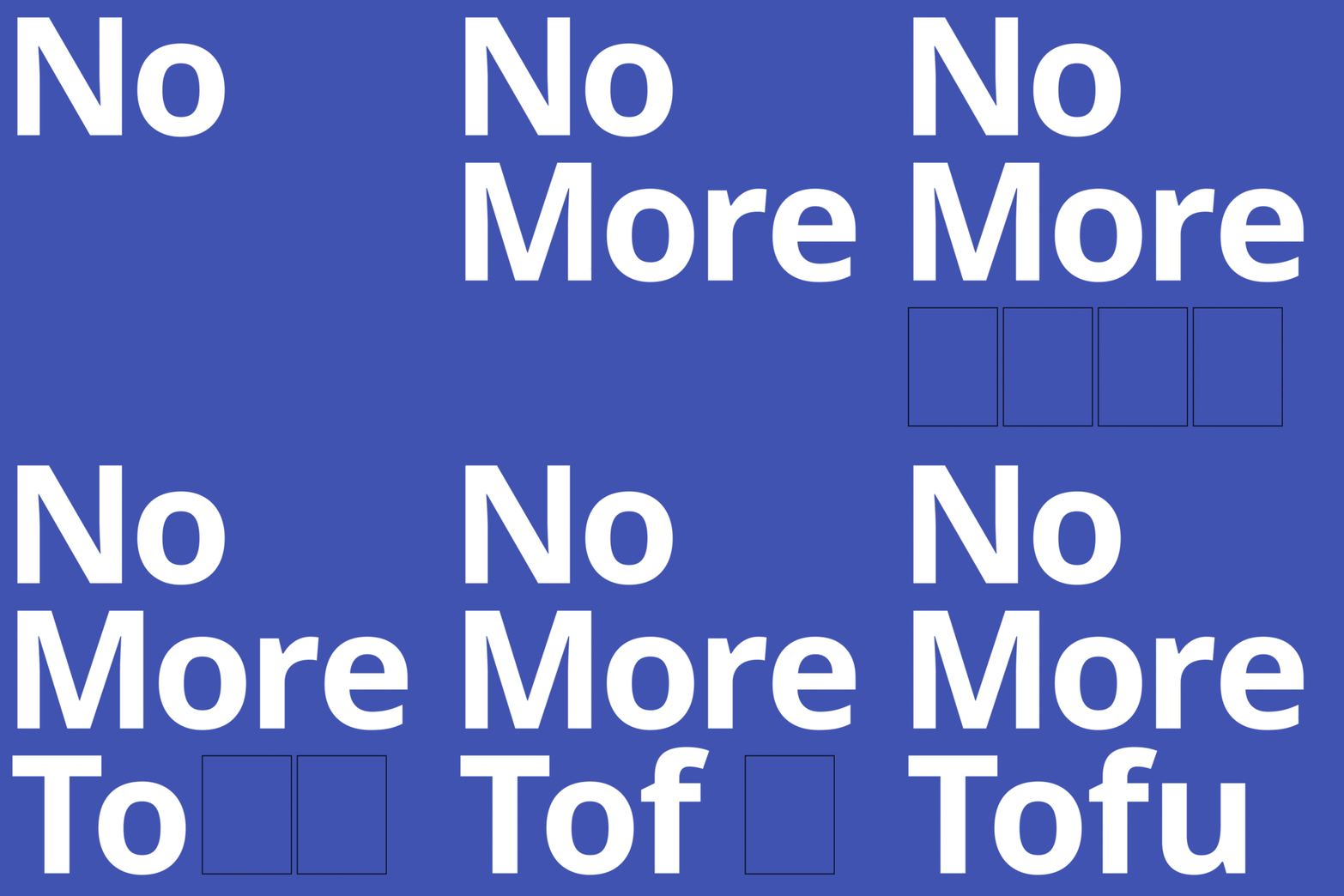
Tofu is an old nickname for the boxes that appear when a computer lacks support for a particular writing system or character.
This mammoth effort required harmonious design and development of an unprecedented number of scripts, including several rare writing systems that had never been digitized before. “It was this really phenomenal, daunting project,” says Google internationalization expert Bob Jung. “Looking back at it, I’m even surprised myself how ambitious we were.”
“Our goal for Noto has been to create fonts for our devices, but we’re also very interested in keeping information alive,” he adds. “When it comes to some of the lesser-used languages, or even the purely academic or dead languages, we think it’s really important to preserve them.”
Working with an open source design philosophy, the project involved liaising with individual designers and linguists around the world to perfect each letterform. Taking more than five years to reach its current stage, Noto required an intense and coordinated research effort, partnering with cultural experts to investigate the nuances of each style, and incorporating direct feedback from the communities using the script.
The research: cultural preservation
To give Adlam – a writing system for the Fulani language of Africa – a new identity, Monotype worked with the script’s original creators. Having direct access to the inventors of this writing system allowed the designers to incorporate stylistic choices and features that would reflect the creators’ original intentions, and bring the Fulani-speaking community the first chance to use the script digitally.
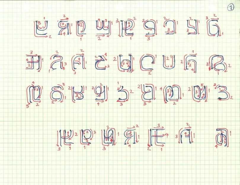
Adlam was the first time in Monotype’s 100+ year history that the type designers worked directly with the script inventors. This is an early drawing of Adlam characters.
Traditional and contemporary elements were blended in Noto Armenian, which involved the Armenian community directly in the design process; while Tibetan monks offered expert feedback on Noto Tibetan. This vertically stacked script posed a unique challenge, with Monotype designer Toshi Omagari’s own study of the writing system supported by Buddhist scholar Shojiro Nomura, as well as the monks’ own constant manuscript study.
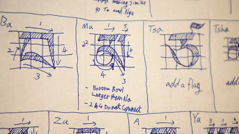
This is a page from the notebook that Toshi Omagari kept while studying the calligraphic traditions of Tibetan.
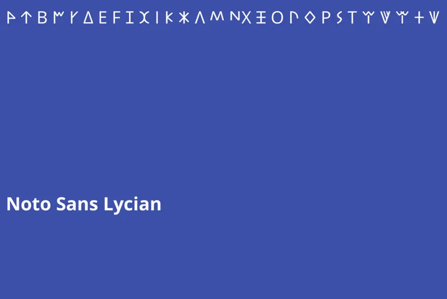
Noto was also an opportunity to bring a digital version of Urdu Nastaliq to life, giving greater access to the 100 million people that use it, as well as reinvigorate Ogham – an alphabet that dates back to the 4th century, and is found mostly on monuments and manuscripts. Monotype designer Steve Matteson unearthed copious images of the medieval script to create Noto Ogham“There are some characters you can only see on stones. If you don’t move them to the web, over time those stones will become sand and we’ll never be able to recover those drawings or that writing,” explains Noto product manager Xiangye Xiao.
The result: a digital language for everyone
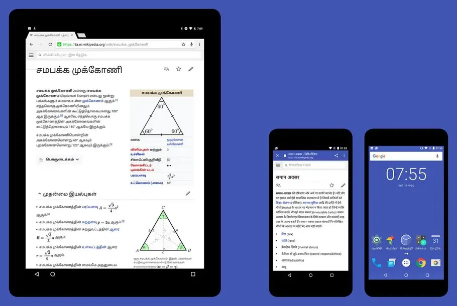
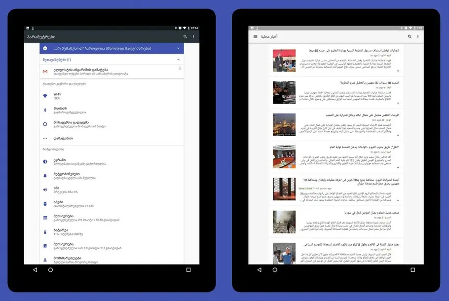
In addition to the cultural role the typeface is finding, Noto is a digital workhorse, powering the text shown in Android and Chrome devices and spanning a huge amount of styles up to eight weights. It supports symbols, emoji and musical notation.
Noto is available from the Google Noto Fonts website, where it’s finding an ever-expanding range of uses. “We get emails everyday asking, ‘Can we use this font in our automation system?’, ‘Can we use it in the TV on a flight?’,” says Xiao.
And the story doesn’t end there. As part of a wider effort to facilitate communication across culture, and the lofty aim of finally developing a font that supports all languages, Noto continues to be updated in line with the Unicode Consortium.
A special thank you
Monotype would thank the team of designers, researchers, script specialists, hinters/finishers, quality assurance, and tools developers who contributed to the Google Noto project. We would also like to thank the countless reviewers and native speakers who provided opinions and insights on the Google Noto scripts.
Monotype employees:
Vickie Allison; Maria Glenda Bellarosa; Jelle Bosma; Priscilla Brugman; Nadine Chahine; Christopher Chapman; Carl Crossgrove; Karen Dupre; Jim Ford; Deborah Gonet; Josh Hadley; Mary Hanson; Linda Hintz; Robin Hui; Adel Hunter; Linda Jenkins; Cheung Kin Keung; Micah Stupak; Karl Leuthold; Kevin Lew; Alistair Lloyd; Kamal Mansour; Steve Matteson; Guy Mayger; Charles Nix; Toshi Omagari; Dave Opstad; Tom Rickner; George Ryan; Devin So; Chuong Ton; Bob Tremallo; Juan Villanueva; Susan Waksmonski; Jim Wasco; Terrance Weinzierl; Steve Zafarana; Sue Zafarana
Partners and friends:
Abdoulaye & Ibrahima Barry; Jo De Baerdemaeker; Cadson Demak Ltd; Diane Collier; Fontef Type Foundry; Kalapi Gajjar-Bordawekar; Gajjar & Vilhjamsson Private Limited; Yanone Gerner; Kimya Gandhi; Patrick Giasson; Giasson Ltd.; Glyphs; John Hudson; Indian Type Foundry; Yanek Iontef; Kigali Designs; Letterjuice Ltd.; Ben Mitchell; James; Montalbano; Elena Papassissa; Rainer Erich Scheichelbauer; Fiona Ross; Zachary Scheuren; Georg Seifert; Vaibhav Singh; Terminal Design; Tiro Typeworks Ltd.; Anuthin Wongsunkakon; Pascal Zoghbi
