Akira Kobayashi.
Creative Type Director.
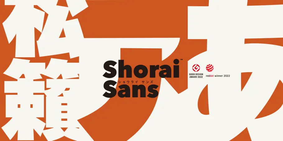

Shorai™ Sans was awarded a Red Dot Award in the Brands & Communication Design category for high design quality. Judged by international industry leaders, this award further showcases Monotype’s authentic font selection and creative performance.
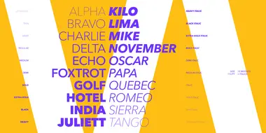
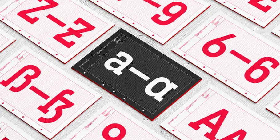
Between™ comes in three main states. While different from each other, they all offer human-centered design to ensure that copy set in them is affable and approachable.
With its technical and neutral character, DIN Next has earned a permanent place in contemporary typography. Now, DIN Next Slab expands the font family further, offering new design potential.
In his words.
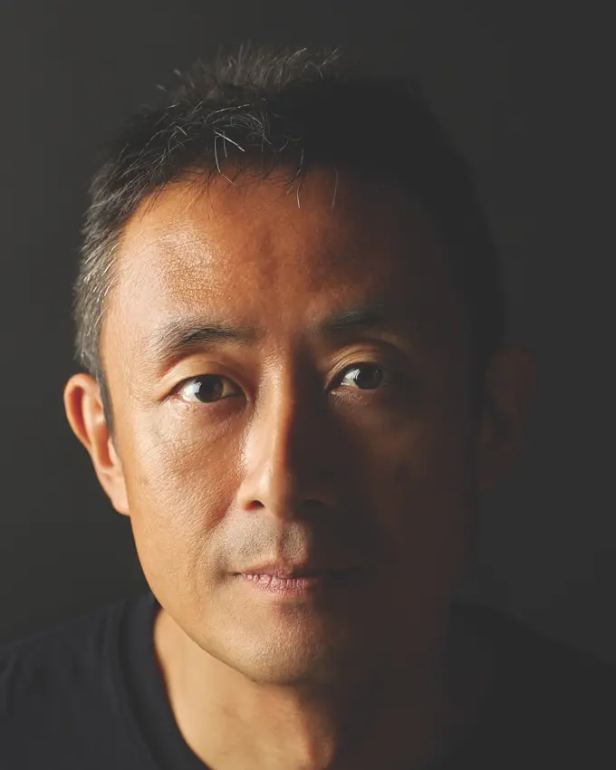
Creative Type Director Akira Kobayashi has nearly four decades of experience and an extensive background in Japanese typeface design and is a 2022 TDC Medal and Keinosuke Sato Award winner. After studying at Musashino Art University in Tokyo for four years, Akira Kobayashi accepted his first job at phototypesetting manufacturer Sha-Ken Co., where he was involved in the lengthy and intricate process of designing Japanese fonts.
After leaving this role he studied calligraphy at the London College of Printing. Akira worked at Jiyu-kobo Ltd. and Japan TypeBank Co., Ltd. before becoming a freelance type designer. In 2002 Kobayashi released Optima Nova – a modernization of Hermann Zapf’s Optima design – and in 2009 he partnered with Adrian Frutiger to update his eponymous typeface family. Most recently in 2022, Akira directed the development of Shorai Sans, after designing Tazugane Gothic, Monotype’s first original Japanese typeface in 2017.
Over the course of his career, Akira has designed more than 50 font families including DIN Next, Akko Pro and Neue Frutiger, and worked with major brands including Sony, UBS and Panasonic.
Akira has worked on custom type for Alibaba, Bridgestone, Garena, Mazda, Mercari, and English and Japanese families for Sony.
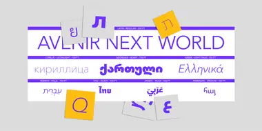
Additional designs by Akira include FF Acanthus, Akko, Calcite Pro, FF Clifford, Conrad, Cosmiqua, Eurostile Candy, ITC Japanese Garden, TX Lithium, ITC Luna, ITC Magnifico, ITC Scarborough, ITC Seven Treasures, ITC Silvermoon, Skid Row, ITC Vineyard, and ITC Woodland. Akira also designed Eurostile Next, Tazugane Gothic Info and Trade Gothic Next, coauthored with the Monotype Studio. In addition to Neue Frutiger, Akira worked with Adrian Frutiger to design Avenir Next, Frutiger Capitalis and Nami. He co-designed Diotima Classic with Gudrun Zapf von Hesse; and Optima Nova, Palatino Nova, Palatino Sans, Virtuosa Classic, and Zapfino Extra with Hermann Zapf.
Akira has won a number of prestigious awards, including the 2022 Type Directors Club Medal, a Keinosuke Sato Award, Red Dot, Good Design Award, Japan Typography Annual 2023 Best Work award, all for his work on Shorai Sans.
Aside from designing, Akira keeps busy. He serves as a juror for Red Dot, the Tokyo Type Directors Club, Japan Sign Design Association and is a lifetime member of the TDC.
Akira also serves as a visiting professor at Tama Art University (Japan) and is an honorary visiting professor at Kanazawa College of Art (Japan). He also does educational outreach at the following universities: Central Academy of Fine Arts (PRC), Donghua University (PRC), Hong Kong Polytechnic University (Hong Kong), International School Communication Design, Beijing Normal University (PRC), Kanazawa College of Art (Japan), Kyoto Institute of Technology (Japan), Macao Polytechnic Institute (Macao), Musashino Art University (Japan), National Taiwan University of Science and Technology (Taiwan), and Shanghai Institute of Visual Art (PRC).
Studio releases.
Shorai™ Sans
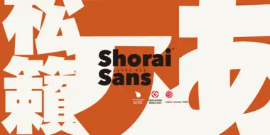
Shorai Sans balances the subtlety of traditional hand-drawn brushstrokes with clean, geometric outlines. An intellectual-looking sans serif, Shorai’s simplified letterforms and vast weight ranges provide creatives with a holistic branding solution, opening new horizons in Japanese typography.
Neue Frutiger


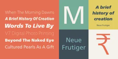
The original Frutiger typeface was designed in the early 1970s by Adrian Frutiger and his studio for the way finding system of the Roissy Charles de Gaulle airport in Paris. Soon after the airport was opened, a huge demand for the typeface arose from companies wanting to employ it in other signage systems, as well as in printed matter. The Frutiger typeface came out as part of the Linotype library in 1977. Epitomizing functionality and clarity both in signage and as a bread-and-butter typeface in print, Frutiger became a modern classic.
Neue Frutiger® is the 2009 version of the Frutiger typeface family. It was revised and improved by Akira Kobayashi in close collaboration with Adrian Frutiger.
DIN Next®

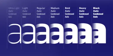
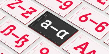
DIN has always been the typeface you root for—the one you wanted to use but just couldn’t bring yourself to because it was limited in its range of weights and widths, rendering it less useful than it could be. The century-old design has proven to be timeless, but modern use cases demanded an update, which resulted in DIN Next—a versatile sans serif family that will never go out of style.
This classic design turned modern must-have includes seven weights that range from light to black, each of which has a complementary italic and condensed counterpart. The family also included four rounded designs, stretching the original concept’s range and core usability. DIN Next also boasts a suite of small capitals, old style figures, subscript, superscript and several alternate characters.
Tazugane Gothic
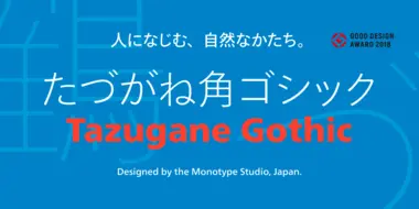
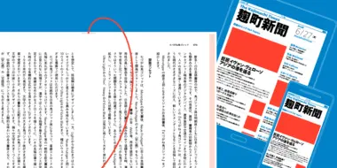
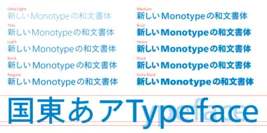
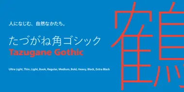
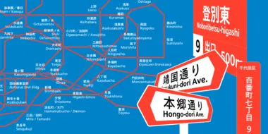
The Tazugane Gothic typeface family is the first original Japanese typeface created by Monotype. Designed by Akira Kobayashi, Kazuhiro Yamada and Ryota Doi of the Monotype Studio, the Tazugane Gothic typeface offers ten weights and was developed to complement the classic Latin typeface, Neue Frutiger. The design of the Tazugane Gothic typeface balances an original, humanistic style with elements of traditional Japanese handwriting.
Between
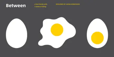
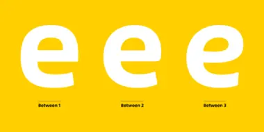
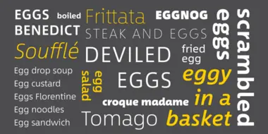


Akira Kobayashi’s Between™ typeface comes in three main states. While different from each other, they all offer human-centered design to ensure that copy set in them is affable and approachable. An added benefit is the ability to transition “between” font designs, choosing different styles – or even individual characters – to create hierarchy, contrast or emphasis.
Related content.
SST: a font for everywhere.
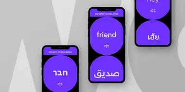
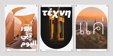
The SST font tackles a central challenge of branding – universality. The SST superfamily supports more than 90 languages including Japanese, Thai and Arabic.
One typeface, 93 languages for Sony.
Monotype’s Akira Kobayashi worked closely with Sony’s Chief Art Director Hiroshige Fukuhara to create an original typeface ready for nearly 100 languages.
Alibaba Groupʼs new typeface brings beauty and simplicity to company’s ecosystem.
This custom-designed font family, Alibaba Sans, will help partners and customers power on-brand designs.
