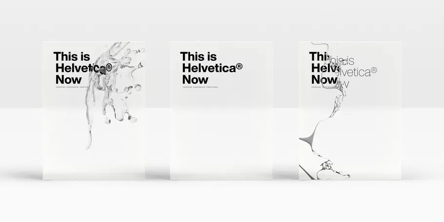
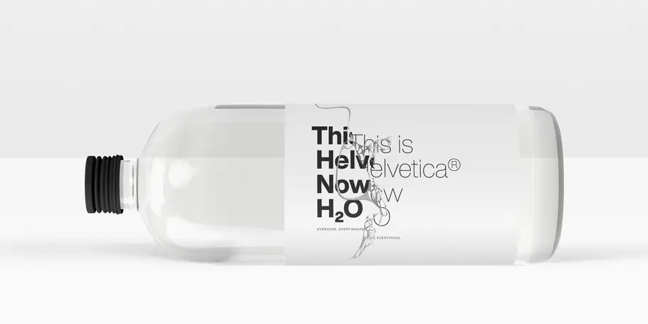
This is Helvetica® Now
Everyone. Everywhere. Everything.
Everyone. Everywhere. Everything.
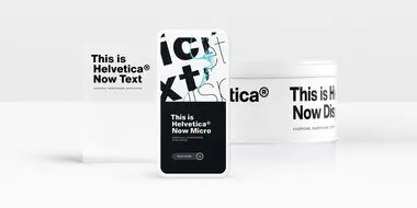
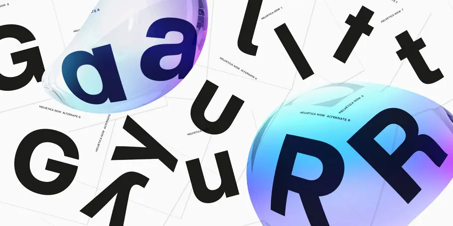
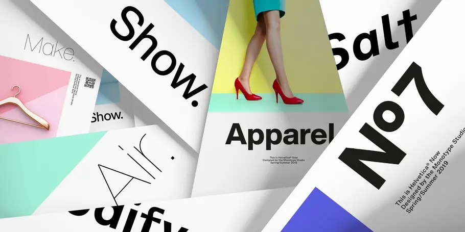
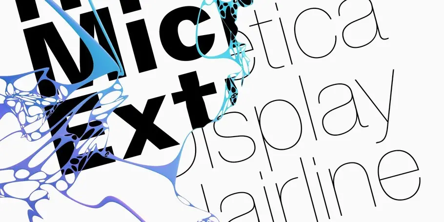
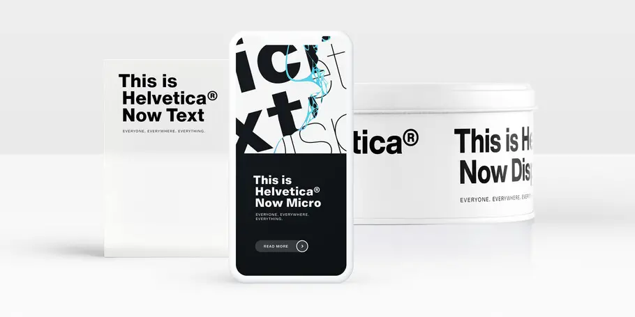
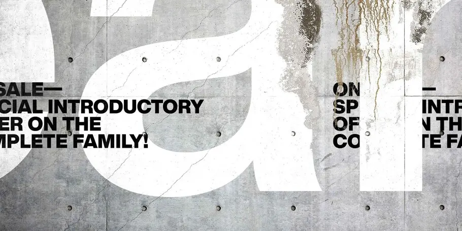
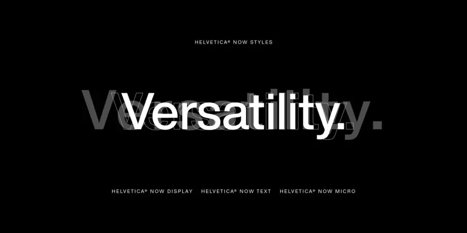
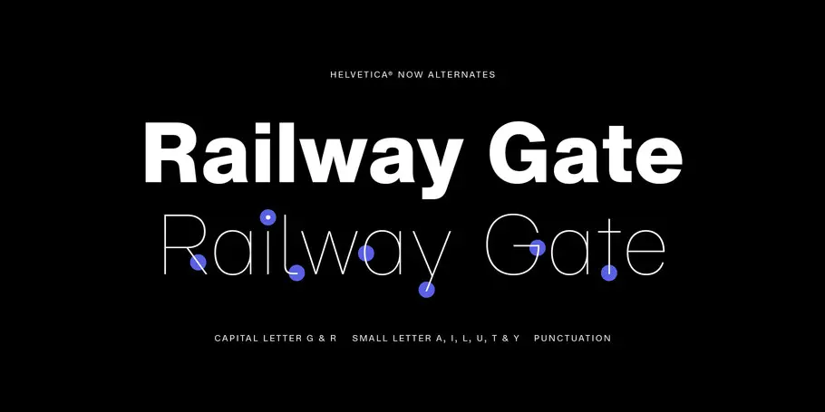
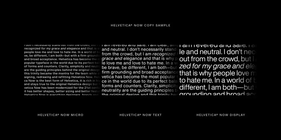
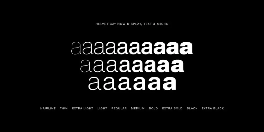
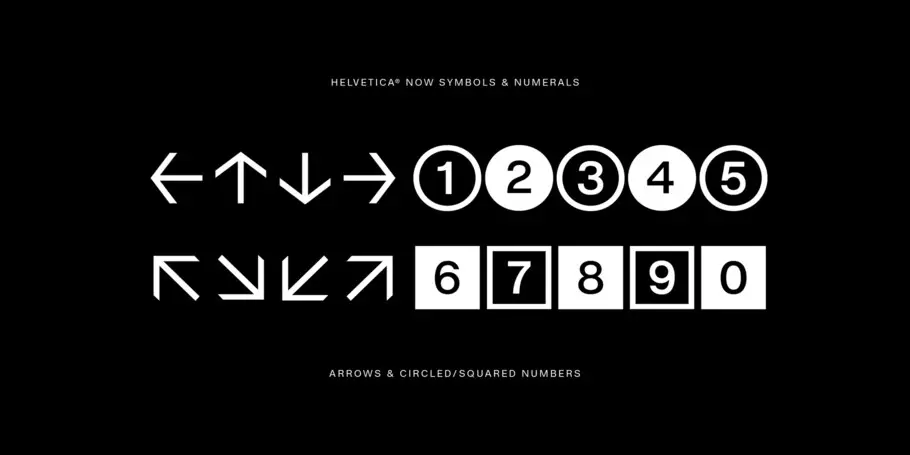
Helvetica® Now is a new chapter in the story of perhaps the best-known typeface of all time. Available in three optical sizes—Micro, Text, and Display—every character in Helvetica Now has been redrawn and refit; with a variety of useful alternates added. It has everything we love about Helvetica and everything we need for typography today. This is not a revival. This is not a restoration.
This is a statement.
This is Helvetica Now: for everyone, everywhere, for everything.
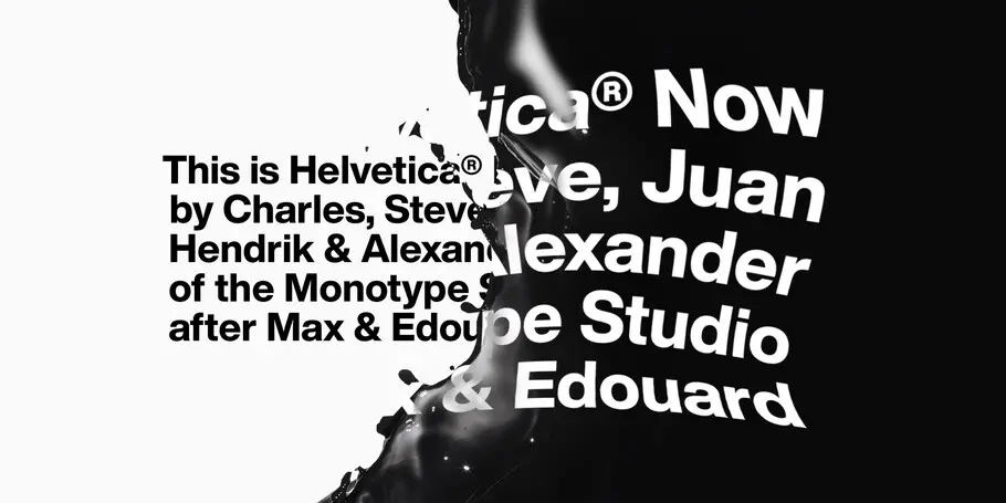
The planning and design for Helvetica® Now began in December 2014, with the goal of creating a Helvetica that addresses the needs of today’s designers and creatives. Helvetica Now was a collaborative effort involving dozens of designers and engineers in the Monotype Studio.

Charles Nix is a Creative Type Director, designer, typographer and educator. He designed a number of popular typefaces in the Monotype Library, including Walbaum and Hope Sans, which received a Certificate of Typographic Excellence in the 22nd Annual Type Directors Club Typeface Design Competition. He’s also designed custom typefaces for Google Noto, Progressive Insurance and the Philadelphia Museum of Art.

Hendrik Weber was a creative director for Monotype, where he advised clients on custom fonts and how to leverage type in branding. He also created the Unitext typeface, a popular design created for a myriad of branding needs.

Alexander Roth was a type designer at Monotype. Born in the former Soviet Socialist Republic of Tajikistan and raised in Germany, Alexander became fascinated by languages and letter shapes at an early age. He studied video production, animation, graphic design, typography and type design before joining the world-renowned type foundry, FontFont, as a font technician intern.

Juan Villanueva is a Type Designer at the Monotype Studio in New York City. His contributions to the Monotype Library include designs such as Walbaum and Sagrantino. He’s worked on custom typefaces for clients including Tencent Sans, Ricky Zoom, and multiple Google Noto fonts.

As a Senior Type Designer in the Monotype Studio, Terrance Weinzierl has been creating and modifying typefaces for the Monotype Library and a wide range of brands since 2008. In addition to working on custom projects for Microsoft, Google, Barnes & Noble, Domino’s and SAP, he’s designed type for video games, professional sports teams and auto manufacturers.

Tom Rickner is a Creative Type Director with a career in type that spans more than three decades. During that time, he has mastered nearly every aspect of type design and font production, from his earliest days editing bitmaps, to designing some of the very first Multiple Master fonts for Adobe and TrueType GX Variations fonts for the Font Bureau and Apple.
We offer a number of ways for you to start working with our fonts.
This ebook takes a look at the evolution of font design to illustrate why today’s brands need fonts optimized for the customer experience. The eBook gives examples of how new fonts are created (and old favorites are reimagined) to handle the demands of modern technology, so you can ensure the font you choose for your brand won’t let you down.
Designers and studios might be deeply familiar with Neue Helvetica, but it’s the product of a pre-digital era. Here are four reasons why it’s time to switch.
