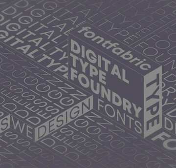

Ressources pour les créateurs et les marketeurs
Imaginez la situation. Votre agence fait parler d’elle. Vous avez acquis de nombreux clients et d’autres sont bientôt prêts à vous rejoindre. De nouvelles opportunités se profilent à l’horizon. Tout cela est très excitant. Les chargés de clientèle sont ravis. La direction est ravie. L’équipe créative est également ravie. Mais… Est-ce que votre équipe de conception doit s’attendre à une nouvelle dose de stress au moment d’intégrer un nouveau client ?
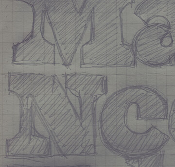
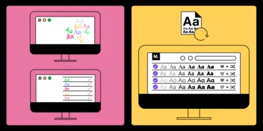
Vous y revoilà. Vous êtes à votre bureau et vous plongez dans le design d’un nouveau projet. Votre première étape, choisir une police de caractères. Pour commencer, vous parcourez une liste de polices en ligne. Le nombre de polices disponibles est impressionnant et, très vite, vous êtes envahi par une multitude d’options. Après de longues heures de recherche, vous tombez enfin sur une famille de polices qui vous plaît. Mais saura-t-elle s’adapter à un affichage sur mobile ? Pas sûr. Vous passez à une autre option, mais n’êtes pas convaincu que ce style de police va pleinement être en phase avec votre public cible.

In our first episode of Season 3, we welcome the new Senior Director of the Monotype Studio, Tom Rickner, as a first-time host. Tom speaks with Jim Moran, master printer and collections officer for the internationally-known Hamilton Wood Type Museum. Keep reading for a glimpse into the museum’s history and to learn why the letterpress is still so important today.

Monotype’s Executive Creative Director, Charles Nix, speaks with guests Michu Benaim Steiner and Lope Gutierrez-Ruiz, about their Texas-based design studio, In-House International. They’ve done type work for over 100 clients, and their typeface Perfora was recently featured in Monotype’s Type Trends Report. Keep reading for a behind-the-scenes look into their creative process.
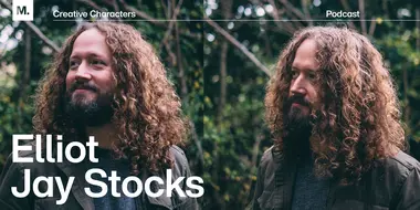
Elliot Jay Stocks, designer and musician, joined us on the podcast this week to speak about passion projects. Known for his typography work, Elliot is a freelance designer and was previously Creative Director at Adobe Typekit. Today, he’s working with Google on Google Fonts Knowledge.

Aaron James Draplin: Getting into the ‘heavy stuff’ with.
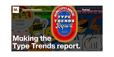
This week, we take you behind the scenes of one of Monotype’s biggest, and most anticipated campaigns of the year: the annual Type Trends report. Tune in to hear from the report’s curators, Creative Type Directors Terrance Weinzierl and Emilios Theofanous on their experiences producing the report.

In-House International: Iterative, content-first design.
This week, we take you behind the scenes of one of Monotype’s biggest, and most anticipated campaigns of the year: the annual Type Trends report. Tune in to hear from the report’s curators, Creative Type Directors Terrance Weinzierl and Emilios Theofanous on their experiences producing the report.

We are thrilled to have Aaron Draplin on the podcast this week and to dig into the “heavy stuff” with him – existential musings on life and building a career, the importance of hanging on to your inner kid, and the “weird little spot” he’s in as he approaches 50 turns around the sun.
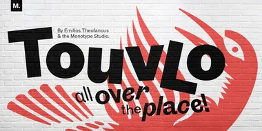
Nouveauté créée par Emilios Theofanous, directeur de la création typographique pour le Studio Monotype, Touvlo – « brique » en grec – est un hommage à Londres et à sa vue depuis la fenêtre du studio.
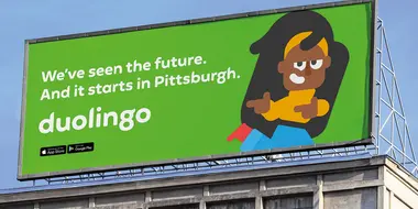
Une police personnalisée distincte (et avec des ailes) pour Duolingo.
Un développement typographique pour l’évolution de Raiffeisen Bank.
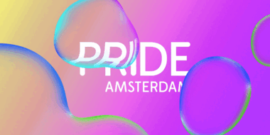
Monotype s’est associé à D8 pour créer une nouvelle identité dynamique pour la Pride Amsterdam, l’une des plus grandes Marche des fiertés dans le monde, qui attire des milliers de visiteurs.


