When type goes tiny: How brands can deliver legible text at small sizes
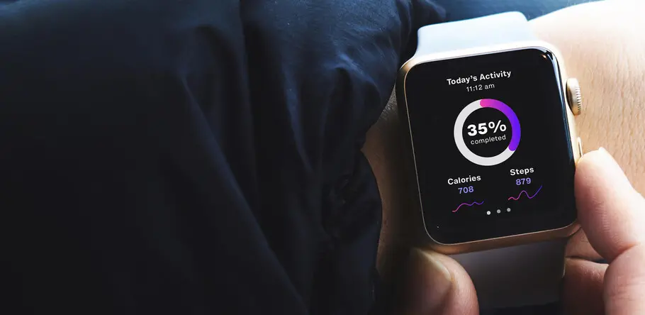
Tiny type poses a big design challenge. “Micro type”—typically under 10 point—is a fast-growing part of our collective reading diet. Whether in eBooks, smart watches, package labeling, or any number of “micro type” environments, when letterforms become smaller, spacing gets tight, details get lost, and forms blend together. The resulting legibility issues can make for a frustrating reading experience.
Micro type legibility is further complicated by vision challenges brought on by age or other factors.
“Designers today are going for an aesthetic where things are of light contrast, with a lot of white space and very small type sizes,” notes Monotype Creative Type Director Steve Matteson. “They don’t consider the fact that more than 60% of people over 20, at least in America, either have or need vision correction.”
For Matteson, it’s crucial not to forego a positive user experience for the sake of prevailing design trends. He says it’s key that designers and typographers have typefaces available that can both work within a contemporary aesthetic and perform well at small sizes; otherwise they run the risk of alienating—or outright failing—users.
Making tiny type legible
No single digital typeface is likely to work perfectly in every use case. Since they’re usually designed to work in text sizes—between 10 and 12 point—fonts often need to be tightened for larger sizes and loosened for smaller ones. That leads some designers to compensate by adding or subtracting equal amounts of space between all of the letters (known as tracking). But tracking can undermine the balance of the letter spacing. For instance, letters like T or V will always look too loose compared to an H or an I. Manually adjusting these imbalances (known as kerning) can be time consuming and inconsistent.
Monotype’s Helvetica Now attacks this problem by introducing a set of three optical masters designed to perform perfectly in particular size ranges: Display for sizes above 14 point; Text for sizes between 8 and 14 point; and Micro designed for use in tiny type—between 4 and 8 point.
“It’s like going into a house and having it all arranged for you,” says Matteson. “You’ve got optimum space between the wall and the coffee table and the chair, and you don’t have to nudge things here and there to get it right.”
“The Micro weight is all kinds of trickery and tomfoolery, widely opening up the spacing and dramatically changing the shape of the letters,” says Monotype Type Director Charles Nix, who, along with Matteson, helped develop Helvetica Now. “The result is like Pointillism or Impressionism in painting. The Micro conveys the idea of the typeface.”
And although the design team dug into the details of the typeface—to make sure light gets in and letters don’t become crowded black blobs—Helvetica Now is still unmistakably Helvetica when viewed at tiny sizes.
“Micro typefaces are designed to be used very small, but the underlying structure needs to remain apparent,” adds Matteson. “It’s like looking at the skeletal development of Homo sapiens. When you scrutinize any one of the stages, you can clearly see the differences. But when you look at the continuum, what you see is an obvious and consistent human form. Despite the outward differences in the optical sizes in Helvetica Now, in use together they are all very obviously Helvetica.”
Tiny type matters
Tiny type is on the rise, particularly with the prevalence of mobile-first design, which relies heavily on legible micro sizes to represent text reliably across a variety of screen sizes and resolutions. Failure to optimize for micro settings can lead to a subpar legibility.
Those failures are not limited to screens. Type used at small sizes in print plays an essential role in conveying key information. For example, legibility is extremely important on prescription-drug labels, and nutrition information on food packaging is legally required to be legible while also being small enough not to detract from the rest of the package.
Beyond its practical usage, choices for tiny type can have something of an ‘invisible’ effect on people, according to Matteson. Type that isn’t made for small sizes can interrupt a fluid reading experience, leaving people feeling frustrated even if they haven’t noticed or recognized the shortcomings of the letters themselves.
Modern brands are already aware of the style demands in presenting messages across many different platforms and environments, but type size is a factor that may get overlooked. A type family that performs well in print and on screen is a baseline necessity. It’s just as important—maybe more so—that the family be optimized to give customers a consistent, enjoyable, and legible experience of the brand—no matter how small it gets.


