Neue Helvetica comes into its own for TED.
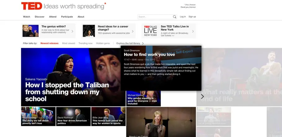
With their first site redesign in seven years, TED turned to Neue Helvetica as the perfect typeface for conveying ideas worth spreading.
Starting out with roughly six months of research – which included trawling through the enormous collection of emails TED had received about the site, as well as an extensive survey – the entire launch took around a year in total, with TED documenting the details of the process on their blog. “We talked to a lot of people in our community – organizers, translators, speakers, attendees and avid TED.com fans. We continued to leverage that community to do user testing throughout our design process,” Thaniya explained. What emerged from this deep engagement with the TED community was an alignment with the aims of the team — to create neutral, updated space that would frame the content without interfering with it. From the beginning it was clear that the site design needed to act as a facilitator rather than a stylistic device.
The team admit that, in the past, the conference part of TED has been ahead of the website in terms of art and design, but that the re-launch was an opportunity to close the gap. “We’d just been getting away with a system stack of fonts, which has been underserving the TED brand, so we wanted to make sure that we caught up with everything that’s been done on the conference side. That’s one of the things we wanted to maintain and that speaks to the core aesthetic pieces that we didn’t want to mess with,” said Aaron Weyenberg, the team’s lead UX designer.
One of these core pieces is the type, and from the very beginning the TED conferences had incorporated the Helvetica® typeface into their communications and branding, with the original TED logo based on the Neue Helvetica® design. However the usual detractions leveled at Helvetica are, in this case, advantages for TED. “All of the criticisms of Helvetica I think are a strength – a criticism being that it’s ‘safe’. But for us that’s a strength, because it stays out of the way of the ideas of the speakers that we want to be the stars”, said Mike. TED is also clear about their respect for the typeface, telling us, “Helvetica is an exquisitely cut typeface, no matter how ubiquitous and common and boring some people say it is, it’s not badly designed.”
It was Helvetica’s ability to take the backseat that made it work so well for TED, and Aaron explains, “Helvetica’s a somewhat neutral face, and when we think about what we’re trying to do with TED – which is create an archive of ideas – we’re not trying to be trendy. We want it to feel timeless in a way.” Aaron goes on to say that, while TED’s photography, video and poster images are all strong, the site content needed to be ‘quieter’, to a certain extent. “The content can become a little bit more functional,” he says. “The range we have now is still a beautiful font that allows us to create different voices from instructional copy, to information copy, to transcripts. So it gives us flexibility without becoming overt.” Helvetica also offers space and tolerance for other types of aesthetics, allowing the TED team a certain level of experimentation.
With collaboration from Huge, the creative agency TED partnered with on this project, the team tested various weights and line spacing to make sure the typeface worked across all the content variations of the site. Editorial demands also meant details such as length of names and headlines needed to be taken into account. “The nuance of detail about how we treat italics and headers and stuff like that changes over time, but we don’t actually deviate from Helvetica,” Mike says. Another challenge came in the breadth of languages that TED works with, and the extensive language support that Helvetica offered was also a critical factor.
The new TED.com is a standout example of how the oft-criticized elements of Helvetica can become essential requirements. In a situation where design needs to comfortably play a background – yet still essential – role, Helvetica can come into its own. “We’re not really a design organization,” Mike concluded, “we’re an ideas organization. So for us, the design is in service of the ideas. That’s why it’s all about communication.”
