


SNCF relies on industrial and brand design to deliver consistent, reliable customer service.
Summary.
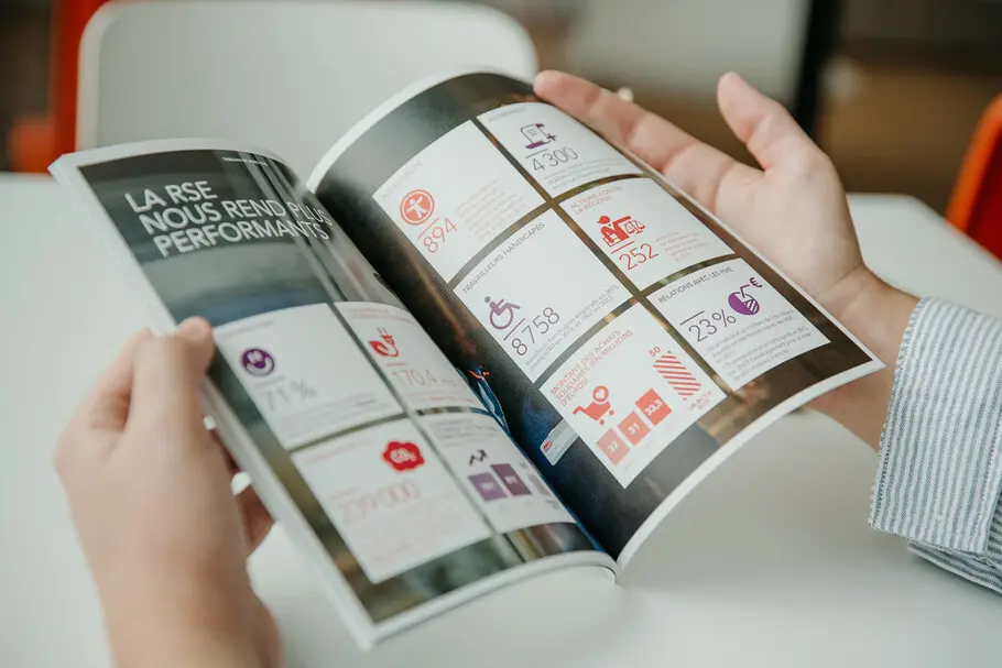
The SNCF (Société nationale des chemins de fer français) is France’s national state-owned railway company. Founded in 1938, and based in Saint-Denis, near Paris, the company operates the national rail system in France and Monaco, including the highspeed TGV network. The SNCF has two sub-organizations: the track operator (SNCF Réseau), the rail operator (SNCF Mobilité) and about 900 subsidiaries. Collectively, the brand employs more than 260,000 people in more than 120 countries in the world, operates 30,000 km of track, and runs 15,000 freight and passenger trains daily, carrying more than five million passengers.
The challenge.
Competition in the rail sector is more nuanced than other industries, though still driven largely by the experience that a brand is able to deliver for its customers. Since its inception, SNCF has recognized the importance of design at all phases of its customer experience. Beginning with strong consideration for industrial design, the “broken nose” locomotive style developed by Paul Arzens broke various speed records and became a legendary hallmark of French railways from the 1940s through the 1970s. Similarly, famed industrial designer Roger Tallon developed the TGV high-speed rail service, paying particular attention to the aesthetic and feel of everything: from the seating, to the colors, to the lighting, to even the route maps found in each and every train.
Throughout its history, the company has updated its branding to align with the modern interests of its audience. This is underscored by the evolution of the SNCF logo, which has taken several forms in the past 80 years:
- 1938: Circular monogram designed by Maximilien Vox
- 1947: Coat of arms with a simplified map of France and diagonal initials
- 1966: More modern logo, set in bold italic, with green colouring, which stood for strength and speed
- 1986: Simplified version of the word mark, designed by Roger Tallon, without a frame and set with an open version of the letters that looked like rails
- 2005: Logo in carmine and vermilion, designed by Carré Noir, is introduced
- 2011: lifting of the 2005 logo
The brand needed a corporate typeface that would complement its logo, especially as the organization evolved and grew to include sub-brands under the parent organization. Because of this, we tested multiple typefaces with different intrinsic design features, in different settings: well-lit vs. dimly lit and across polarities (black on white text vs. white on black text).
The solution.
What makes a typeface legible?
The team at SNCF believes that strong typography is essential to the perception of the brand. Working with Monotype, SNCF chose Avenir as its corporate typeface. The choice was driven by the need for efficiency given its enormous operation, and the desire to convey reliability, consistency, and strength to its customer base.
Additionally, Avenir represented a cohesive style element that could connect across the company’s sub-brands even as those sub-brands maintained their own corporate identities. It also needed to be timeless and future-forward enough to support all customer touchpoints, including on the interior of SNCF trains, which are meant to run for a 30-year period. This is a unique consideration that other verticals don’t typically need to address. To be successful, SNCF needed to ensure that its entire design team would have access to the Avenir font family, and Monotype worked with the brand to quickly deploy the asset on more than 22,000 workstations.
Put simply on the corporate design website: “[Avenir] is simple, round and easy to read.”
A bit about Avenir.
Avenir, designed by Adrian Frutiger and first published in 1988, is a geometric sans serif that does not rely on straight lines and circular effects but maintains more of a Humanist character. Frutiger drew on the psychology of perception to design Avenir, using minor variations in the upstrokes and downstrokes to achieve a harmony between each character that would not be possible in a design purely based on geometrical lines.
– Isabelle Patard, Head of Brand Identity, SNCF
Avenir is designed with legibility in mind, especially in smaller point sizes. Using blunted apices (for example in the “A” and “M”) and subtle differences in the line thickness of bowls helps dilute the rigour of the font. “Avenir” is French for “future,” and was chosen not just to signify a contemporary typeface, but also as a nod to Futura® by Paul Renner, as well as to ITC Avant Garde Gothic® by Herb Lubalin.
Results.
Through its partnership with Monotype, SNCF is able to maintain a strong corporate identity while evolving to address market needs, introducing sub-brands like Ouigo, an affordable travel solution, and TGV inOui, a premium service offering. Avenir helps SNCF by:
- Enabling in-house creatives to access brand font needed to design online and offline experiences
- Maintaining consistency across channels and between various sub-brands
- Future-proofing the brand so it is prepared for the needs of today as well as the vision of tomorrow


