


Behind the font: The challenges of going it alone.
Typeface design is a mysterious business. While most people are acquainted with the dropdown menu in Word or a website like MyFonts, not everyone realizes there’s a host of independent designers and foundries all quietly making their contribution to visual culture.
But fonts don’t magically materialize out of the ether. From concept to design, engineering to marketing, developing a brand new font family can take months or more. There’s a human behind every single one; meticulously drawing the forms and shapes that will give voice to countless messages around the globe.
It’s a rigorous process even when you work for a large foundry like Monotype, and even more so for independent designers who have to do it all themselves.
Play the long game
One of these is Paulo Goode, an independent designer based in Ireland who, despite being relatively new to the game, has released several popular designs in the last five years. Goode originally trained as a technical illustrator, but transitioned to graphic design after buying a Mac in the early 90s.
“I had been used to using type via Letraset dry transfer lettering sheets as well as speccing type for a Compugraphic typesetting system,” he remembers. “But now I could set my own type and stretch and distort it however I wanted to. It was an exciting time.”
After several years in full-time graphic design roles, Goode decided to break into the typeface market and has been creating fonts full-time since late 2016. He credits his first typeface, Carrig, for giving him the confidence to turn a ‘sideline hobby’ into a full-time job.
“I love the excitement of starting a new typeface,” he says. “Taking it from sketchbook to screen and being able to start typing words with it. I love the email ping of every new sale—it’s still such a thrill that people want to invest in my typefaces and I’m always so thankful for that.”
However, he admits that despite his experience, he doesn’t yet feel completely established. “I’ve been plugging away, slowly improving, trying different ideas, and quietly providing good value fonts,” he says. “I have a small following of loyal subscribers, many of whom regularly invest in my type designs. But I believe it is imperative to have a bestselling typeface (or more), or one that is lauded by the design community, before you can become established.
“As a long-time graphic designer and font purchaser prior to becoming a type designer, I believe that many will remember the name of a great typeface, but they are less likely to be concerned with who designed it.”
For Jess McCarty, finding her angle has been integral to success. McCarty launched Magpie Paper Works—a foundry that specializes in hand-drawn fonts and custom lettering—in 2010, and says her interactions with people are what’s kept her in the business. After a career in advertising, McCarty started designing luxury wedding invitations as a ‘second shift’ after her day job. While searching for a particular font for a project—an edgy, modern calligraphy script that didn’t feel digital—McCarty decided to make it herself. “I thought, ‘How hard could it be?’,” she says. “Really hard is the answer.”
“I love being able to talk to my customers about what they need, and what they’re doing with the fonts,” she says. “As type designers, we have this incredible opportunity when we’re talking with someone who might not know how to install a font; or maybe they’re just creating a document in Pages. We can welcome them into our industry, and show them how amazing it is to have access to products you can use to make beautiful things in your life—whether that’s a print, or maybe just making your PowerPoint presentation look a bit nicer.”
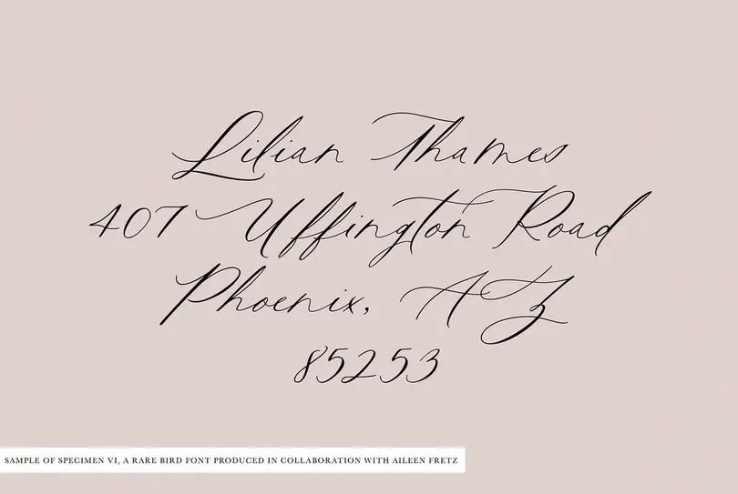
Having launched two additional foundries—Rare Bird Fonts in 2017, which is aimed at the wedding market, and Section Type (also in 2017), which focuses on vintage revivals—McCarty says the hardest part of her job is turning her brain off. “I have lots of ideas always bouncing around in my head and a lot of administration. There’s the not-so-sexy side of type design such as doing the books or making Instagram posts. It’s not like a desk job I leave at 5 p.m. and turn off until the next morning. I joke that I’m never really alone—whenever I’m in the shower my businesses are with me.”
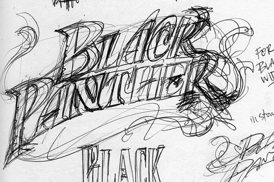
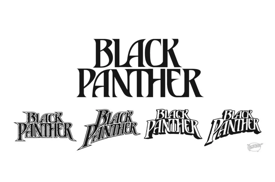
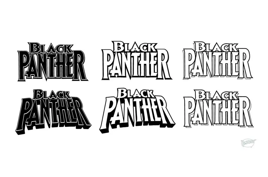
“Everyone thinks fonts just magically appear because they come pre-installed on your computer,” adds John Roshell, co-founder of Comicraft. “They have no idea there are people that create them, or whose livelihoods depend on them.”
Roshell got his start in the early 90s, working with Comicraft founder Richard Starkings on a font that could retain the imperfections and idiosyncrasies of Starkings’ lettering style. He later made fonts for the ‘sound effects’ in comic books, as well as type based on different artists’ handwriting.
In 1995, Comicraft began selling its typefaces on floppy discs, CD-Roms and via mail order on its website, mainly to other comic artists and letterers. And for Roshell, finding this particular audience has been essential to the studio’s success. “I think the fact that we had a lock on this one little specific realm definitely helped us,” he says.
“We’ve built our audience through email lists and social media, and we have a loyal base of people who buy pretty much everything we put out and are excited about what we do. I think it helps to have a specific genre.“
Even so, he believes, as does McCarty, that there’s still work to do when it comes to educating people about type, and reaching casual users that don’t understand why fonts aren’t free, how to use them, or where and how to buy new ones. It’s something McCarty says she tries to combat by staying active on forums, and making herself available to buyers with questions about how to use fonts.
“I talk about the difference in fonts as being like buying a $10 bag at Walmart or Target, or a $10k bag from Hermes,” the designer explains. “You’ve got all the options in between, and I try to talk about the human side of type design—that there’s a person behind the other side of your computer screen.”
Jess McCarty, Founder, Magpie Paper Works.
His suggestion for tackling this lack of understanding? “Try it,” he jokes. “Download the trial version of Glyphs, and try making your own font, because that right there is going to show you how difficult it is, not only to make something that works well, but the refinement you have to put in to make something that really works well. It’s a strange balance of creative and technical.”
Get noticed
In addition to the time spent creating fonts, there’s the legwork of getting your creations noticed. According to Goode, it’s a highly competitive marketplace and only becoming more so. “I thought when I started selling online that the type market was oversaturated, and four years later, it seems ridiculously so,” he says.
For some designers, distributors such as MyFonts have been a way through this maze, helping foundries to share and sell designs. Goode stresses that having his type releases chosen for promotion has been invaluable in helping him make a career of type design.
“MyFonts is unparalleled as far as traffic and the eyes that are watching, and the Hot New Fonts list is fantastic for a designer,” says McCarty. “If you catch the zeitgeist at the right time, and you’re building something your customers are looking for, you can experience a lot of success. You have a marketing partner that is working with you actively, and behind the scenes as well. I don’t think I would have had success when I started if MyFonts hadn’t existed.”
A healthy font marketplace is essential in an industry increasingly besieged by piracy and infringement. Font piracy is a huge problem for the entire community, but it has an outsized effect on smaller foundries and independent designers who may not have the resources to push back.
Jess McCarty, Founder, Magpie Paper Works.
“We’re constantly trying to keep an eye out for piracy, and we have to write to these people and say ‘Hey look, this is how I pay the bills and put food on the table.’” Although Roshell says people are surprisingly gracious, it’s an uphill battle against the perception that fonts are there for the taking.
And while independence comes with its own setbacks and challenges, there’s a sense of optimism about the future of typeface design—even if it is mixed with trepidation. Font literacy has undoubtedly shot up in the last five years, meaning users are becoming more likely to understand the work that goes into typeface design, and the value it holds in visual communication.
“You see memes about fonts, which warms my heart,” points out McCarty. “It’s not this weird thing that only a certain kind of person uses or buys. As more designers have come into the field, I think people are frightened about what the next five years are going to look like, but I think a rising tide raises all ships. The more people making beautiful products, the more customers are seeking beautiful products. We can all benefit.”


