4 popular book cover design trends in 2023.
This post is a guest piece from our friends at Reedsy, a website that connects authors with publishing professionals.
As a self-professed bookworm, one of my favorite things to do — besides reading — is to bask in the beauty of my book collection. And though some people still insist that we shouldn’t judge books by their covers, visual presentation does play a huge role in conveying essential information about a book, and in creating desirable consumer products.
When discussing cover design, imagery often takes the spotlight. However, typography is central to both the functionality and visuals of book covers — conveying key information like title and author name and evoking genre and mood. So, in this article, I’ve taken a look at a broad selection of recent and upcoming book releases in a variety of genres to get a sense of what style of typography is trending in publishing right now.
No frills, bold, sans serifs.
One trend that is hard to avoid is the use of chunky, simple sans-serif typefaces set against busy or bold backgrounds. Take, for instance, R.F. Kuang’s Yellowface — a literary fiction novel that uses an American Typewriter-style type for the author name and tagline, but condensed, bold sans serif for the title. The overall minimalism of the cover intrigues; it’s confronting, unapologetic, and visually pleasing.

Layering sans serifs on top of vibrant designs or colors in this way is popular across the literary fiction genre, especially when the background is a bit busier. You can see, for instance, how it plays out on the covers of Napolitano’s Hello Beautiful, Taylor’s The Late Americans, and Heng’s The Great Reclamation.
But it’s not only literary fiction that has embraced this design trend. We also see it in a slightly different iteration on the crime and mystery/thriller shelves:

There’s nothing particularly groundbreaking about this use of loud typography in book cover design, but it’s a trend that’s likely here to stay. It works well in both the aesthetic and practical sense: the clear, prominent type quickly helps you identify key information and its relative simplicity allows book designers to employ bright and eye-catching imagery without upsetting the visual hierarchy. There’s rarely any interaction between imagery and typography, but neither compete for attention; instead they complement each other to create a striking, yet balanced effect.
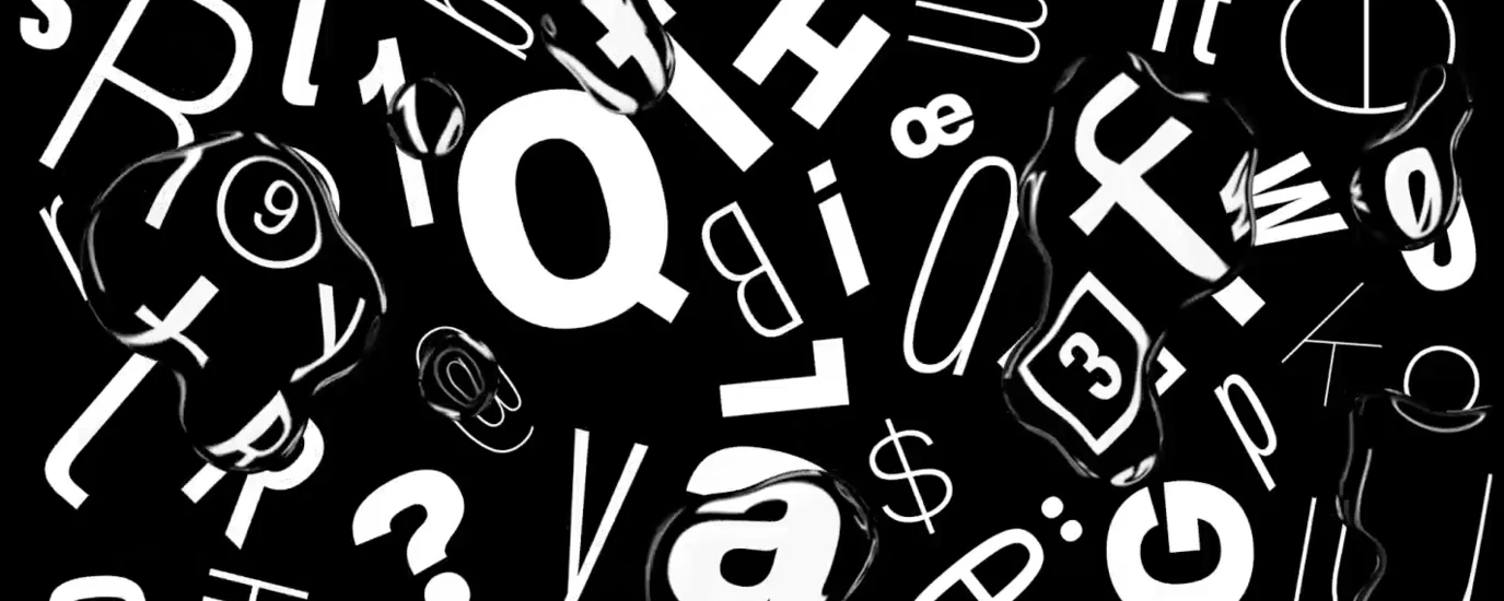
Looking for similar inspiration? Check out the Superhero or Super Sober trends in the 2023 Monotype Type Trends report.
Messy script fonts with a handwritten quality.
Another big trend is hand lettering or typefaces that resemble messy scribbles. This is particularly common when it comes to memoirs, where the human texture of handwriting serves as a reminder that you’re about to read something deeply personal and intimate, as if straight from the author’s own pen (even though it may have been written by a ghostwriter).

In some cases, like Biting the Hand, and B.F.F., this sort of lettering is reserved for subtitles and taglines only, with chunky sans serif fonts for the title, hitting two trends at once and giving the covers a literary feel. Other times, like with Zig-Zag Boy and Good Girls, the handwritten, irregular type is used throughout, experimenting with point size and bolding to create texture and a more dynamic effect.
But this loopy, scribbled typography is not just reserved for memoirs. We also see it on a lot of literary fiction covers, such as the unruly, Sharpie-like writing on Bellies by Nicola Dinan, or the urgent whiteboard scratches of Birnam Wood by Eleanor Catton. Meanwhile, both the irregular print of Evil Eye and the soft curves of The Humble Lovers bring the mind to gentle or playful brush strokes, which pairs exceptionally well with the child-like drawing of the eye, and the artistic oil-painting of the dancer. Monotype’s “Liquify” trend from this year’s trends report matches up nicely here.

Using this type of typography opens possibilities to inject personality and individuality into the design, as the specific slant and neatness (or lack thereof) of the handwriting speaks to the mood of the book.
Editorial-esque serif fonts.
Of course, book cover designers haven’t forgotten about serif fonts, and they make a strong showing in upmarket fiction, often marketed towards readers who appreciate the aesthetics of a well-designed book as much as a well-written story. These covers go for elegant and stylized fonts, hinting at equally sophisticated contents.

What these covers have in common is that they — unlike the busy covers we saw earlier — use simple, realistic, photographic, or plain backgrounds with one or two main elements, akin to the zen designs highlighted in the Monotype trend “Super Sober.” On their own, they can feel a bit plain, so instead of using a sans serif typeface to balance out an otherwise busy motif, here, serifs add an element of visual interest and dimensionality in the design.
The photograph of a woman mimicking a hand-gun on Stone Cold Fox, for instance, is given a luxurious magazine feel with the svelte serif typeface in lime green, taken all the way to the edges of the cover. Similarly, the photograph of the despairing woman on Natural Beauty gets a stylized, rounded typeface for a softer touch, perhaps to remind the reader of the curves of a body, contrasted by the piercing needles and sharp ends of the serifs to hint at the pain the main character will inflict on herself in the name of beauty. And the extended, slim serif typeface of My Nemesis overlaid on a white border with a central design piece brings the mind to high-fashion magazines with Didone type, while Flux uses a saturated lemon-yellow as its base, but a sharp, italicized serif font to cut through and wrap around the abstract holographics. Arguably, the sans serif type that worked well with the illustrated elements of Yellowface would get drowned out in Flux’s edgier graphics, which require something with a bit more grit.
Throwback, retro typefaces.
Lastly, we see a lot of retro typefaces on the covers of genre fiction like horror, crime, and suspense. From the 80s vampire-romance vibes of Burn the Negative with its dropped, fang-like lettering, to the slasher cover of Silver Nitrate, with the chunky, barely-there metallic serifs. It’s culty, spooky, and nostalgic all at the same time.

Paired with saturated primary colors and motifs that draw the eye, these retro typefaces allow readers to make associations to pop culture and hint at the general vibes of the story. This is especially effective with the genre fiction where readers are often looking for another version of something they have enjoyed in the past, where similar tropes and plots will be deployed in new, yet familiar ways — much like this type of typography.
Typography not only communicates the metadata of a book — like title, author, and taglines — but also intangible things like mood, genre, and intended audience. It is a vital part of book cover design that, just like imagery, cycles through trends and phases. It’s impossible to cover all of them here, and there are, of course, always going to be covers that both conform and go against the grain. But hopefully, this article has served as a general overview of what’s currently trending in publishing, in four broad brushstrokes.
Linnea Gradin writes about writing and publishing over at Reedsy — a website that connects authors with publishing professionals and gives tips on broad topics like how to make an audiobook or which book writing software to use for the best result.
Related content.

10 Ways to use the 2023 Type Trends in your designs.
Learn how to take styles from our 2023 Type Trends and apply them to your own designs.

The Role of Fonts in Modern Publishing.
Fonts play an indispensable role in shaping your experience of published media, working in a deliberate way to communicate the information clearly and legibly.


