


The role of fonts in modern publishing.

Open up any book. Peruse a magazine article. Whether you’re reading printed or digital material, the content is the focus. You probably haven’t realized how the typography works in a deliberate way to communicate the information clearly and legibly. After all, it is the content at the core, not the design. However, fonts play an indispensable role in shaping your experience of published media.
Making Covers Count
You may have noticed a resurgence in the popularity of typographic-driven covers, and maybe even the use of a particular font, on fiction and non-fiction books. We all know not to judge a book by its cover, but is this a fair statement? Covers are designed to communicate a book’s key attributes, the title and author, and tease what’s to come inside. Designers can convey these points most efficiently when using only type, excluding elements like photography, illustrations, and graphics.
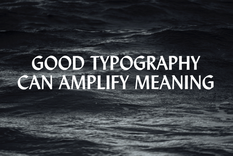
“Strictly typographic solutions are beautiful and smart. When the cover is type alone, the focus is squarely on the title and author,” says Monotype Type Director Charles Nix. “Nothing is competing for attention, and the title can be larger when it’s not sharing real estate. Good typography can amplify meaning—it can hint at something deeper or unexpected. It can arrest the reader and focus attention simply by being different.”
In practical terms, Nix says type and lettering-centric designs are less expensive and faster to produce because they don’t involve the costs and considerations of using additional artwork. The pressure publishers put on art directors to create more with less is far from new, yet has inspired creative and interesting designs that have successfully appealed to readers.
What’s Inside
Once you’ve decided to open a book or download an eBook, you encounter the text. Book designers are deeply concerned with legibility, and gravitate toward fonts that promote comprehension in extended reading. When searching for type in which to set a book, Nix outlines five requirements designers must consider:
1. Is it readable?
The type must be highly legible and conducive to being understood. Readers must be able to consume the piece efficiently. However, it must also be enjoyable and allow one to read without thinking about the type at all.
2. Will the text fit in the given space and still be large enough to be readable?
Publishers of printed books expect the content to fit into a certain number of pages. The chosen typeface must be able to work within that economy. In digital-format books, the reader can change the type size, but the need for economy is still present. As digital pages are an abstract notion, it’s difficult to conceptualize finishing “1,200 pages” when you cannot physically see or touch them. An economical typeface for digital books can provide psychological comfort by reducing that abstract page quantity. Digital type economy also yields more characters per line on small screens. More characters per line mean more words per line. And more words per line lead to a better flow of meaning and comprehension.
3. Will the font cover the character requirements?
The font must have the accented characters and/or other special glyphs required by the book. If other attributes are required, like true small-caps, old-style figures, or other specialized features, those characters must also be in the font’s library.
4. Does it have a large enough family to fit the manuscript mandate?
If the text requires a variety of bold weights or a good looking and contrasting italic, the selected font must have a family that covers these needs. Designers must consider if it has optical sizing for working with very small or very large type, particularly on device screens. For information-rich applications, (e.g. tables, infographics, diagrams), it would be useful for a primary font to have a companion sans serif family.
5. Does it feel right?
This takes a lot of study and a good bit of instinct, but a good book designer will have a feeling for type and an ability to pair textual and typographic essences. Designers should not only care about how the font looks, but what it says and how it delivers the content. Proper leading, kerning, and word spacing are essential, but the font must also pay mind to the author’s intention.
When it comes to eBooks, Nix implores designers to consider an additional component. “Does the font license cover use in eBooks? Because eBooks are software, copies of the fonts used are bundled with the files that make up the digital package. Distributing copies of someone else’s software inside of your software usually requires a license extension, which may mean additional fees.”
The Move to Magazines
Though the nature of periodical publishing versus book publishing differs, the same typographic guidelines apply. Typesetters must consider legibility, size, breadth of characters and font families, overall feel, and licensing. However, copy in a magazine or newspaper tends toward shorter words than a piece of expansive prose. Printed periodicals also typically feature short-line-length and multi-column settings rather than the large single column text block characteristic of books. Type must acknowledge and work with the idiosyncrasies of the format to create the best reading experience.
In the digital age, magazines have evolved to meet the demands of a growing online audience. “We have more autonomy over the digital experience than we had ten years ago,” says Theresa Mershon, Creative Director for UX and Product Design at Hearst Magazines Digital Media (HMDM). With a higher amount of customization and control, publishers can prioritize UX through speed, simplicity, and adaptability to deliver content to their audiences across varied devices and channels.
Web fonts are fundamental for optimal responsive design. Content should be clean and legible whether readers are reading on their phone, desktop, or tablet. This automatic scalability should be seamless and contribute to the ease of using the site regardless of screen size. However, maintaining a brand across web platforms means little if sites take forever to load. Web fonts load quickly and look great, so readers stay engaged and present. “Our goal is to have the most beautiful page experience possible without affecting performance,” Mershon says.
Publishers can integrate web font best practices while also maintaining their brand, which has different requirements in the digital space. “For a publisher to maintain style across media, they have to satisfy at least two criteria,” Nix says. “They have to understand the value of maintaining a consistent visual language and enforce that value throughout their organization as well as having a ready, dependable, affordable, and expandable method of distributing type throughout their company and production chain.”
HMDM uses the Monotype Fonts service, which offers them access to Monotype’s full library, allowing them to deliver on-brand messaging on any device, in any environment, virtually anywhere across the globe. That way, HMDM can use different fonts across their portfolio of publications (e.g. Elle, Cosmopolitan, Esquire, etc.) as well as across platforms (e.g. web, social, etc.).
Mershon agrees with Nix but also notes that different media can embody different brand personas. “It’s important to have a consistent visual brand across channels,” she says, “but the key is to embrace both identities and present whatever side appeals to the audience on that particular channel. Type is essential to striking this balance, because it allows brands to change their voice without losing that essential visual connection. This means that even if the actual experience is substantially different from one channel to the other, the reader always knows it’s still Cosmopolitan talking.”
Publishing Moving Forward
Regardless, maximum legibility combined with aesthetic appeal remains the goal to create the best possible reading experience. On screen or off-screen, the proper font is more necessary than ever to communicate a message effectively. As the ways people consume information and publishers push out content evolve, the need for sound typography will never change.


