Do sci-fi fonts work in the real-world future?
Dave Addey.
In a recent episode of our Creative Characters podcast, Monotype host and Creative Type Director, Terrance Weinzierl talked with designer and researcher Dave Addey about how the futures we envision aren’t always practical for the reality we live in – through the lens of design in sci-fi films.
As an example, Dave talks about the transparent screens seen in Minority Report and other movies, which look impressive as imagined, but would be legibility nightmares in real life.
“Where I think we need to be a little wary as designers,” Dave points out, “is that the designs that we see in sci-fi movies, which can feel awesome and inspirational, are not necessarily always great real-world designs.”
Some of the fonts that moviemakers use to evoke the future don’t actually function well in real-life settings either. Terrance and Dave discuss how certain sci-fi fonts, especially Eurostile Next, were used in car displays in the 80s and 90s largely because their letterforms matched the shapes of the car – not necessarily because they were the most legible choice for a dashboard.
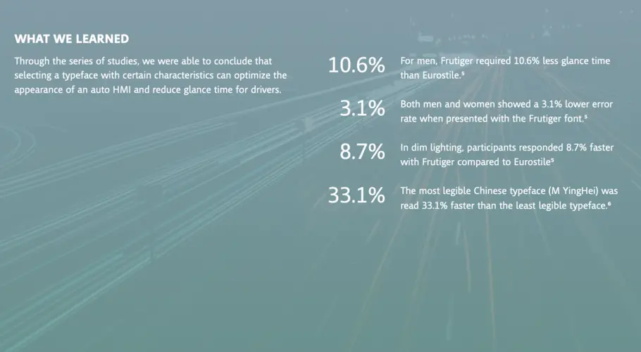
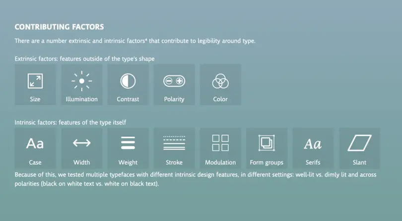
Several years ago, Monotype actually partnered with the Massachusetts Institute of Technology (MIT) to test whether Eurostile Next was a good choice for in-car displays. The research explored the impact of typography and design choices on legibility in car displays or dashboards. By setting up a driving simulation experiment in a car with eye tracking technology, we were able to explore the effects typeface choice has on glance time and response time across several variables. We tested a number of intrinsic and extrinsic design factors such as color (black text on a white background and vice versa), font style, sizing of text, as well as the typographic attributes of two different typefaces, Frutiger and Eurostile.
Not quite road-worthy.
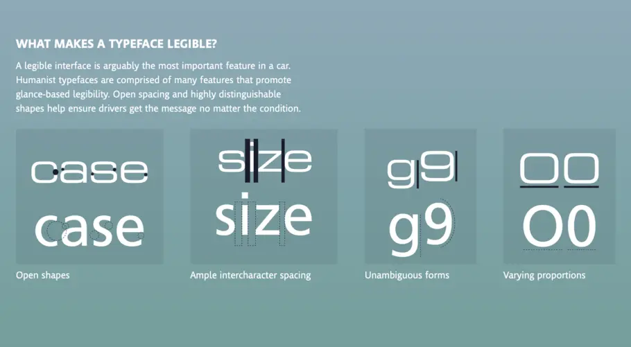
Through this series of studies, we were able to conclude that selecting a typeface with certain characteristics can optimize the appearance of an auto HMI and reduce glance time for drivers. Frutiger, a humanist typeface with open shapes, ample character spacing, and unambiguous forms, was found to be more legible than the square grotesque Eurostile.
Sometimes the future looks different than predicted but in this case, it means we have the “right” in-car technology to keep us moving safely on the road. To learn more about the legibility research, check out this article in Print Mag or download our eBook, How to win the in-car technology race.
