


Font engineering and the importance of what you can't see.

Fonts are more than a pretty face. Underneath their polished surface is an intricate array of data and functionality that few people ever see. Yet this hidden world is integral to the reliability, performance and appearance of a font.
It shouldn’t be surprising, then, that it takes a village to produce a well-made font. Designers, sometimes a team of them, pore over details to get the letterforms just right: From research to sketches to edits, revisions, and iterations.
But after the designers are done, there is a key next step to ensure the font files themselves—the actual “thing” that is created and downloaded onto users’ machines—delivers those designs in flawless fashion: font engineering.
What’s in a font, anyway?
Most people only experience a font in its final context, whether they’re reading a billboard or typing a document. In this way, we experience fonts much like we experience a car—most of us are concerned mainly with how it drives and how it looks, but there’s a lot going on under the hood.
A font is software that is made up of both data and code, both of which interact with each other as well as the applications and operating system in which the font is installed. The data includes items like the contours of glyphs, metrics such as advance widths or vertical spacing, or text strings such as font family and style names or copyright and trademark strings. The code can include aspects of the font like TrueType instructions or hinting, and the OpenType line layout code which helps ‘shape’ text to produce the correct order and combination of glyphs from a set of input strings.
File format: OpenType.
OpenType was developed around the turn of the millennium and has become the primary standard format for digital fonts—the foundation on which a font is built.
The OpenType format is highly flexible, and easily extensible. The format continues to grow and expand as new technologies are developed and new use cases are identified. It supports large character sets, multiple languages, works equally well on desktop as well as handheld or embedded systems, and offers easy access to a wide range typographic features. These features include useful typographic elements such as small caps, swashes, ligatures and alternate glyphs, all of which help designers use a font to its fullest capacity.
Such feature functionality may be the “icing on the cake” for Latin-based typography, but in other more complicated writing systems like Arabic or Indic, certain OpenType features are a basic necessity. For example, while Latin has two cases of each letter (upper & lower), Arabic can have multiple variant shapes of a letter, and the correct shape is dependent upon the context of the surrounding letters. The shape will change depending upon whether it is at the beginning, middle or end of a word, or entirely on its own.
These contextual glyph substitutions are stored within the font as code, which is executed by the font renderer on the device in question. Without this engineering the characters would not connect properly, and the text would not read correctly.
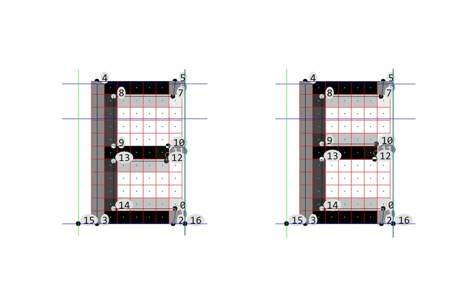
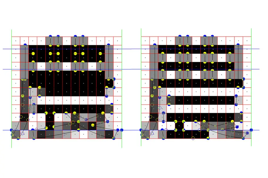
The data: Internal tables.
Understanding what features and functionality can be represented in an OpenType font is just the first step in building a functioning font file. The next step is understanding how that functionality is built and stored within a font file. The OpenType font is defined as a series of tables, each with its own structure, enabling software developers to store both data and code in the most efficient means possible. Some tables are required for a font to function on any OpenType-compliant system. Other tables are optional, and may or may not be used by the platform or application in use.
An experienced font engineer understands what they will need for each environment, so that they can engineer a font that works as intended in each specific scenario. Details such as how the names appear in the font menus of applications, vertical metrics, the ideal level of hinting, and many smaller aspects of the font’s behavior are controlled by what data is stored in different tables.
When existing fonts are updated or revised, font engineering can become even more complicated. It is very easy for a change in font data to have unintended consequences for the user. As an example, metrics changes can cause documents to reflow once the font is updated. As a font is improved over time, through the addition of new characters, or perhaps improved hinting, it is critical that certain “legacy” data is maintained to prevent changes in functionality or appearance for the user.
The role of font engineers.
“The role of the font engineer at Monotype is to take the typeface designs from the design team and turn them into high quality font software,” says Guy Mayger, a Monotype font engineer with over 35 years of experience.
The role of a font engineer is as broad as it is essential. Font engineers solve technical issues that dictate how the font works within an operating system; identify rendering requirements and apply a suitable strategy; work with legacy data; and develop and ensure OpenType features work as expected.

Depending on the project, font engineers may only get involved when the design is complete. But sometimes they’re involved right from the start, especially if the project involves existing designs with legacy data that needs to be reviewed prior to formally beginning the design. In these cases, font engineers can identify potential challenges before the type designers dig in. “Monotype’s extensive experience in handling older data means font engineers can add new characters or amend features of the font without damaging any backward compatibility/legacy issues,” Mayger explains.
When the design is final, a font engineer steps in to take care of all the tasks that “finish” the font. Quality control is key—defining and checking required OpenType features, occasionally making smaller outline corrections and maintaining administrative font data. In most cases, the font engineer verifies details with the designer to ensure the final product is the best it can be.
For custom fonts, this might mean Monotype font engineers adjust the internal tables to meet the customer’s specific needs. Mayger, who’s worked on projects for major global tech and automotive companies that cover the full range of languages and scripts, says his role “has included tasks that enhance and improve the rendering of glyphs and ideographs in many different environments. Once this stage is complete, we then have to check and validate all the data we create. [Monotype’s font engineers have] developed many in-house tools and scripts that work with most formats of data to increase the efficiency, robustness, and elegance of font engineering tasks, and ensure the data is technically correct, clean, and error free.”
Sometimes, the role of font engineers ventures into some pretty innovative problem solving. Mayger explains, “We’re able to merge different fonts together. For the automotive sector, we have created fonts merging Latin, Arabic, Hebrew, Thai with Chinese, Japanese and Korean to build ‘super-fonts’ that are used in digital displays. Combining these scripts into one font makes for easier handling within the UI. We also look to reduce the footprint of the file to minimize the file size.”
“The engineer is also responsible for ensuring that all the copyright, trademark, and license details are correct so the customer knows their data not only works correctly, it’s also legal.”
The importance of font engineering.
For brands, a font needs to deliver on three fundamental qualities, in addition to its appearance. Fonts need to be reliable, predictable, and durable enough to support a visual identity across a wide, sometimes unknowable range of touchpoints.
“A well-engineered font will work as well as possible in many different environments. Graphic designers don’t need to worry if their work will look the way they want because font engineers ensure the fonts act as expected. I think if the font sits back and does its job, we’re successful; if it stands out because something looks off, maybe the kerning or weight, we have some engineering problems that are impacting the experience,” Mayger says.
Brands want their audience to have a seamless experience. They want to create as little friction as possible to get a prospective customer to convert, whether they’re reading a blog post or point-of-purchase sign. And when a brand is paying for the use (or custom design) of a font, they expect a high-quality product that will hold up in the present and future. Well-engineered fonts do all these things.
Guy Mayger, Monotype Font Engineer.
When a font lacks proper engineering, there is a risk of data not working or not working as expected. One of the more challenging aspects in font engineering is to ensure that fonts behave similarly across different platforms. There are multiple sets of vertical metrics in a font, and different operating systems and applications don’t all use them in the same way.
Similarly, font names can vary from platform to platform, and applications differ in terms of which names from the font are stored in a document. Navigating these challenges takes continual study of new versions of software, and testing of older data on the latest software to ensure functionality has not degraded.
These same kinds of challenges can occur when an existing font is extended or upgraded in some way. The addition of new accented characters in a Latin font requires careful consideration of the previous font’s vertical metrics. If new glyphs were drawn that exceed the current maximum height, the result would be either clipping on screen (when a portion of the glyph cannot be rendered) or the vertical metrics would need to be increased to accommodate these shapes. Changing the vertical metrics would mean that existing documents opened with the new font would reflow, with potentially fewer lines of text per page. This kind of change in behavior is unexpected and unacceptable to most customers.
As modern brands move toward flexible visual identities that can bend and stretch with trends in the marketplace, fonts are often the primary way to ensure continuity across touchpoints. This puts a lot of pressure on the fonts themselves. Smart engineering is essential to making sure they’re up to the task.
Mayger concludes, “Monotype’s aim is always to produce and provide reliable, durable fonts for its customers, and that means design and data quality.” After all, a beautiful font isn’t worth much if it can’t deliver the functionality and flexibility the modern marketplace requires.
Tom Rickner, Director of Monotype Studio Design, also contributed to this piece.
Related content.

Behind the font: Carl Crossgrove of the Monotype Studio.
Behind the font highlights the people and process behind the fonts you love and use. This installment features Carl Crossgrove of the Monotype Studio.

What should brands know about variable fonts?
Learn how variable fonts can help brands looking to distinguish themselves in the modern marketplace.

How fonts can help you win the technology race.
As technology raises the stakes for brands, fonts can either level you up or hold you back. A simple, well-organized font system is essential to making sure you can keep pace.