Do people really ‘need’ typography? (Hint: Yes, they do).
– Charles Nix
Type is everywhere all the time, from mundane signage to extraordinary examples of cutting-edge design. In some cases, people might think type doesn’t matter, but our own Charles Nix has a different theory.
Key points from Charles Nix’s typographic hierarchy of needs.
Not only does type matter, it’s a necessity. Nix carefully unpacks his views on what it means to meet typographic needs by drawing from Maslow’s pyramid and some examples of successful type use.
Brief overview of Maslow
Most industry leaders are at least somewhat familiar with Abraham Maslow and his famous Hierarchy of Human Needs theory. Maslow ranked five categories of psychological needs into a pyramid, positing that each layer of motivation must be ‘adequately satisfied’ before addressing the layer above. From the base up, they are: Physiological; Security; Love & Belonging; Esteem; and Actualization.
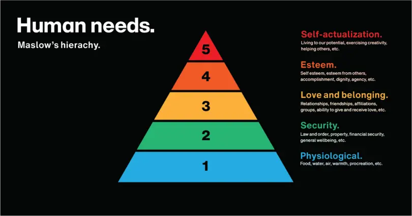
Maslow’s Hierarchy has influenced management, education, technology and more by helping leaders take a humanist approach to motivating employees, students, customers, clients and even family members. It has also been subject to reviews and rewirings, and even Maslow himself varied his own theory (twice) in 1970 with the addition of Cognitive, Aesthetic and Transcendence needs.
Introduction of Nix’s hierarchy
Maslow’s pyramid inspired Senior Executive Creative Director Charles Nix to reframe the ways people and brands use type. If human needs could be modelled this way, why not typographic needs? Nix’s Hierarchy of Typographic Needs outlines a path for people to become better users of type and breaks down the ways type is used in ordinary life, design, and branding. From the base up, they are: Font Physiological Functionality; Font Security; Typographic Love & Belonging; Typographic Esteem; and Typographic Actualization.
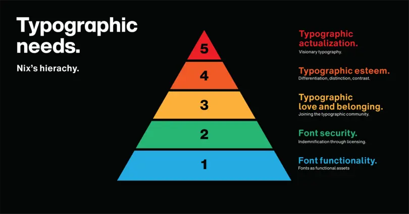
Notably, the first two stages focus on the functional uses of fonts (a specific set of a typeface, e.g. Helvetica Now Bold 14-point) to encode language, and through their legally compliant aspect as licensable software. The top three stages refer more widely to ‘typography’ (the art of typographic design, e.g. Helvetica Now), from finding a place among the typographic community to differentiating your craft from existing trends until, if you’re ambitious enough, realizing an influencing force.
Font Physiological Functionality
The base of Nix’s typographic pyramid represents basic font functionality, the most fundamental typographic requirement. For a font to do what a font needs to do, the precise form of type is incidental. Instead, legibility and readability are imperative. Just as we rely on food and shelter to live, reliable fonts must be usable for the writer and interpretable for the reader to encode language successfully.
“Functional type is the basis and beginning of all typography.” - Charles Nix
It is easy to take for granted the thought put into this stage. Yet, font usage at this stage is immensely important and even lifesaving, from using fonts of a specific size, weight, and contrast for a road sign so it can be read quickly by speeding drivers at a distance, to using numbers, dots, and arrows for teaching children basic literacy lessons.

Font Security
Beyond the functional aspect of fonts is the need for font security. Font security addresses the use of fonts in a way that is legally compliant, ensuring they are correctly licensed and thereby freeing the user from monetary and legal obligations
“Font security is essential: If you don’t have a license for the font software, you cannot legally use the font software.” – Charles Nix
Font security is important for two reasons: First, the peace of mind that comes with indemnification. Properly licensing a font is security from prosecution for software piracy. Second, and crucially, licensing software credits the value of well-designed software. The moment a font user eliminates licensing gaps across their font files, they take their first step towards the next stage of the typographic pyramid.
Typographic Love and Belonging
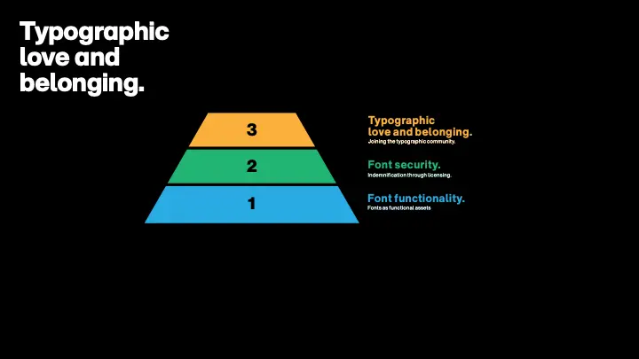
Once type users transcend the purely functional and legally compliant aspects of typography, they can start to truly appreciate it and join the typographic community. Entering the love and belonging stage is a type of awakening, with the heightening of perception and appreciation of the myriad of ways type be used to convey more meaning.
“It is a celebration of the idea that the form of language impacts the meaning—that in typography, form and meaning are joined to amplify communication.” – Charles Nix
Communal and conceptual, this stage is a safe space for aesthetic development, when typographers form preferences (e.g. Garamond over Caslon or serif over sans) and alliances with typographic tribes (e.g. traditional or modernist). Most typographers live happily at this stage and together play an important role, collectively driving trends by applying these shared typographic preferences.
Typographic Esteem
Sometimes, the drive for a more unique typographic voice transforms a typographer. Beyond the need for typographic belonging is the need for typographic differentiation as a declaration, in typographic terms, “I am different. I have qualities that can’t be conveyed by existing typefaces.” Typographic esteem is a two-way road, equally as important to fulfil self-esteem validation as is external validation from the typographic community.
“I can feel that my typography represents me and my message and I can feel that others see and understand the way my typography represents me.” – Charles Nix
Duolingo, a leading language-learning app exemplifies typographic esteem. Monotype created a typeface for the brand that reflects their point of view and three-point mission: To personalize education, be universally accessible and make learning fun. Giving their typeface a unique voice establishes typographic esteem internally by reaffirming their value and externally because that visual voice differentiates their brand from their competition. It is so recognizable that it helps them win customers’ esteem.

Typographic Actualization
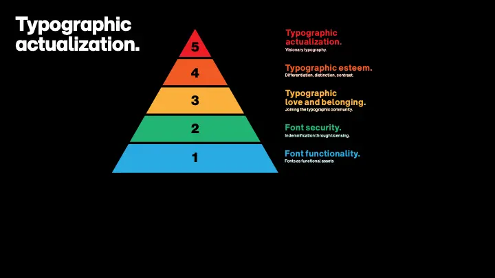
Typographic actualization is trans-typographic—beyond typography and about typography. It isn’t a status. It’s a mindset translated into an inspiring energy that fuels a mission of inclusivity to the top of the pyramid.
“Unlike esteem, which is about differentiating yourself from others, actualization has everything to do with what’s inside of you.” – Charles Nix
Typographic actualization is visionary typography - from finding and answering specific typographic needs in a new way, to transporting type users across time and space to a new way of thinking [link to ‘everyone is a typographer’]. Actualized typographers have the power to influence and the responsibility to be a positive force, inspiring the next generation to take the craft further while playing an important role in its history. Their impact elevates communication and culture, proving categorically: Typography matters.
| Pyramid level | Maslow’s Hierarchy of Human Needs | Charles Nix Typographic Hierarchy | ||
|---|---|---|---|---|
| 1st (Base) | Physiological | Having access to food, water, air, rest, warmth, procreation | Font Physiological Functionality | Fonts must be able to communicate meaning |
| 2nd | Security | Trust in law & order, property ownership, £ security, health | Font Security |
Font software must be licensed + expresses typography valuing |
| 3rd | Love & Belonging | Bonding with groups: friends, family, SOs, locals or teams | Typographic Love & Belonging |
Discovering type preferences and alliances with type tribes |
| 4th | Esteem | Sense of achievement validated both internally and externally | Typographic Esteem | Internal and external validation by differentiating your brand + craft |
| 5th (Top) | Self-Actualization | Achieving full potential and positively inspiring others | Typographic Actualization | Ability to express yourself and help others actualise |
Conclusion
Simultaneously an artform and a canvas for expression, the duality of typography provides an undeniably immediate opportunity for connection. For anyone expressing anything in text form, it is essential that the first two stages of Nix’s pyramid are met. But those who want their message to really resonate alter the tone of their text with font choices (from using italics to indicate mischief to distinguishing their brand with a unique font family). As Nix’s pyramid shows, typography is useful, fun, and empowering!
