How fonts can help your customers feel right at home.

When it comes to your brand, your customers aren’t just evaluating your logo or your colors or the typography, they’re evaluating how your brand makes them feel. More than anything, brands are built on feelings—all the thought you put into design and the experience is simply in service of creating a feeling.
Cultivating the right feeling for a brand is key because it helps your consumer understand how your brand fits into their lives, and the whys and whens of using your product or service. Buzzfeed makes its readers feel entertained and happy. Häagen Dazs has built its brand on luxuriousness. Subaru’s brand is rooted in care and safety. And so on.
The feelings a brand cultivates can set itself apart from other competitors in a category. By going after a desirable feeling, they can take more share of the market and create a strong brand affinity. And the feeling to know right now is perhaps best summarized as “coziness.”
“Cozy” gets common
Though not a common term in design or type, “cozy” is a composite of qualities—human, approachable, warm, rustic, honest, and handmade. Combining these qualities in branding is not an inherently new concept, nor is highlighting its desirability, especially in categories like bedding, furniture, or tea.
What’s novel is that this feeling is now being used to sell vitamins, tote bags, skincare, shoes, and even liquor. The branding is marked with the aesthetic of domestic comfort, warm colors, relatability, and memes about being home. But why are brands that seemingly have nothing to do with the home taking this unexpected approach?
Simply put, consumers are craving some comfort—and yes, this trend predates the coronavirus pandemic and subsequent lockdowns that have forced everyone to stay home. Younger millennials and older Gen Z-ers, in particular, are gravitating toward self-care, hygge (defining moments as charming or special), and homey bliss. They want products that will make them feel like they’re at home, even when they’re not, and find respite from what feels like an increasingly chaotic world. These consumers are reacting to a hustle culture in which every moment must be monetized, rejecting the attention economy, and dismissing the aspirational lifestyle aesthetic reinforced by flawlessly curated Instagram posts.
“The current design landscape is fixated on geometry, pixel-perfection, efficiency, minimalism, and so on,” says Pedro Arilla, Monotype Creative Type Director. “Moreover, the more we rely on digital services and experiences, the more we notice the lack of physicality attached to them. Therefore, a need for organic shapes, slow design, natural materials, and tactile experiences is growing. It’s not about pre-digital nostalgia, it’s about the beauty of human imperfection.”
This is the antithesis of busyness, chaos, perfection, and burnout. Instead, people are seeking comfort, security, warmth, ease, contentment, and relaxation. As the world reels from a global pandemic, consumers are turning inward to find a sense of stability and calm. Much of this aesthetic revolves around spending time with friends and family—just at home (or virtually, for now). So, how do brands cultivate a feeling that’s warm and welcoming, but—importantly—sociable?
Home is where the serifs are.
Whatever you call it—”coziness,” “hygge,” or simply hominess—this concept means different things to different people. But there are a few key commonalities successful brands have used. Judging from the prevailing aesthetic, peak coziness is marriage of vaguely Scandinavian minimalist interior design inside a rustic (yet modern!) country home. Think: Lots of plants, a few fur blankets, books, definitely a cat or dog, warm colors, perfect furnishings, and casually attractive people who are probably independently wealthy. Seem familiar?
In general, though, warm brand colors, a personable and casual brand tone, texture, and warm-hued photography with more maximalist features, including real people, are what could make up the “brand guidelines” of this aesthetic.
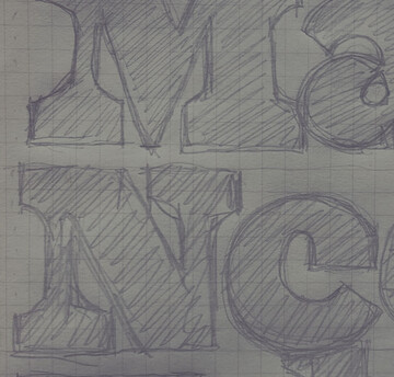
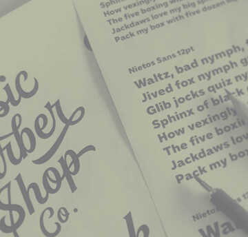
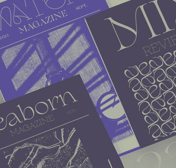
Serif fonts have become the go-to choice for brands looking to capture this mood, and it’s easy to see why. Serifs bring a measure of playfulness and personality through their design flourishes and varied strokes, which help infuse charm and character into the design. Compared to the clean, perfect lines of a geometric sans (the predominant design choice of the past decade), they can capture a more human, handmade feel.
“In type,” Arilla says, “some qualities for a warmer font are non-geometric proportions, soft serifs, calligraphy reminiscences, and analog typefaces inspiration. There are different mechanisms to reach a rustic and human look and feel. Depending on the type genre, these features might differ. However, the common thread is to avoid neutrality.”
Make the right call for your brand
It’s up to each brand to determine if this aesthetic will resonate with consumers. “If you want your brand to feel warm, your brand fonts should reflect those values,” Arilla suggests. “There are other mechanisms (color, photography, illustration, copywriting) to help, but the main one is type.”
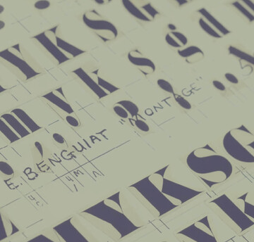
When it comes to selecting a font, Arilla says there are plenty of options out there—brands can commission a custom font or choose from existing designs. “Brands always want to speak with their own voices. This can be done with new, tailored designs, or with the fresh use of an old typeface,” he says. “There are always new releases that capture this mood, along with reinterpretations of classic designs and old typefaces that are yelling for a second life, like Clearface, Americana, or Bookman. These designs, when used properly, can transport one to very specific places.”
Pedro Arilla, Monotype Creative Type Director.
However, if pivoting to a new typeface across all brand materials isn’t realistic, brands can try subtler changes like adopting a new serif subhead font into a sans-heavy font library, shifting Instagram photography away from staged moments to a more casual approach, or muting a bright color palette by including more warm earthy tones. If it’s done well, shifting toward a cozier look will show your consumers you understand them and are trying to deliver on a feeling they’re craving. But keep in mind that even if this move is genuine, design trends tend to have a shelf life, especially if the whole marketplace adopts the trend.
On the other hand, sometimes design trends, no matter how popular, just aren’t the right fit. “Every brand has its own values and its own strong points. In any case, forcing an artificial feeling isn’t a great idea because brands that are natural and authentic connect best with their audience,” Arilla says.
Consumers can see through an abrupt, out-of-character, opportunistic design and marketing change, which ultimately can can damage a brand’s credibility and relationship with consumers. It’s hard to know if a trend is here to stay for a while (like sans serifs), or is simply passing through. It’s up to marketers and design heads to decide if this is the right move right now for your brand.
