Crafting soundscapes: the art and intuition behind Hugh Miller’s award-winning album cover design.
Hugh Miller.
We had the pleasure of speaking with London designer and Art Director Hugh Miller about the project that landed him the 2024 Freda Sack award, the highest accolade from the International Society of Typographic Designers. The ISTD International Typographic Awards showcase the very best examples of typographic excellence in design.
Typography is a powerful tool. It can weave together complex narratives that resonate with both the creator and the audience. Hugh Miller’s record sleeve design for SO:LO’s album At the End of the World, Plant a Tree, does exactly that. We recently caught up with Hugh and discussed his collaboration with SO:LO, exploring his creative process, the inspiration behind the design elements and printing techniques, and the power of creative intuition.
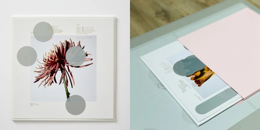
The project marked Hugh‘s first record sleeve design and SO:LO’s debut vinyl project, making it a significant milestone for both artists, who also happen to be friends. The process began as most creative projects do, with deep conversation. It was important for Hugh to understand SO:LO’s motivations for making the album, to tell a strong visual story that evoked the narratives present in the lush, ambient music. “It was a real trading of ideas and exchange of discussions,” Hugh said, “You build something to create a language that you feel is representative of the music.”
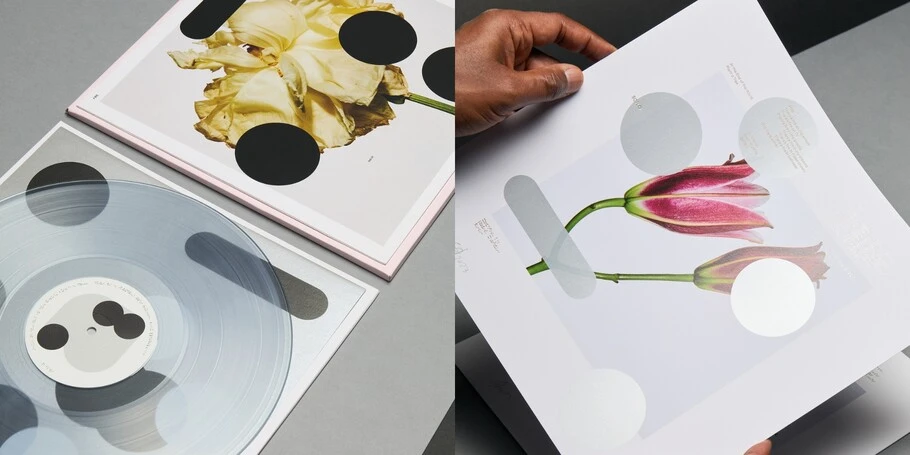
Hugh aimed to reflect the music‘s ambient nature and environmental message by incorporating organic imagery of plants and flowers into the artwork. This bridged the gap between the digital and the organic, creating a tactile experience that resonated with the listener.
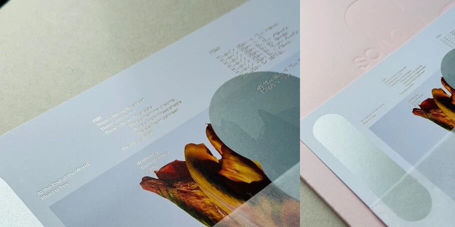
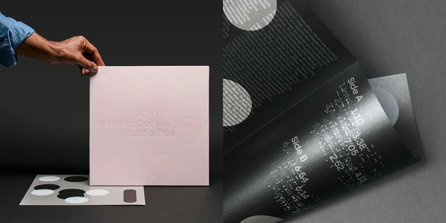
A striking feature of the project was the choice of materials and printing techniques, which reflect the layered, ethereal nature of SO:LO’s music. Hugh experimented with metallics, foils, and debossing to mirror the layered, ethereal quality of the music. This approach not only enhances the visual appeal but also creates a sensory experience where natural light interacts with the design, making the text shimmer and fade in and out of focus. Hugh explained, “The metallics create an interesting contrast against the vivid colors, and the text reads differently when you hold it up to the light. The reflection gives it a shimmer, so the text fades in and out of focus.”
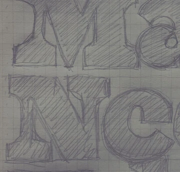
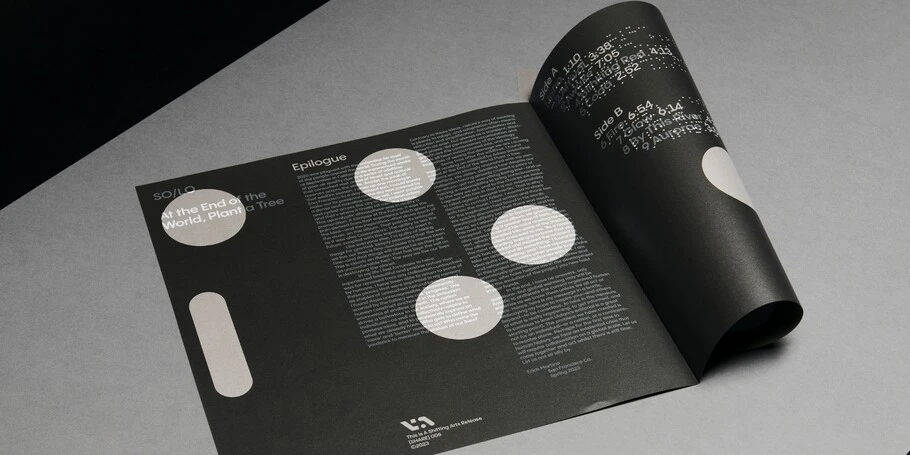
Type plays a crucial role in this project, serving up function and artistic expression. Hugh used MuirMcNeil’s Two Bit typeface after testing an experimental design from the same foundry. Hugh manipulated and abstracted the typeface to fit the design and echo the systematic yet organic essence of the music, resulting in an almost coded language. That approach carried to the tracklisting, building upon the design language while sprinkling in hidden references and points of inspiration.
“The way we used type in the tracklisting was a reference to when you blow a dandelion. It was as though it’s moving, and so it’s back to that reference of nature and the mix of digitization, against the silver.”
Throughout our discussion, Hugh underscored the importance of intuition and authenticity in his creative work. He likened the design process to painting, saying, “It’s a mix of intuition, feelings, and mood.” He also highlighted type as a rich resource for inspiration and a powerful tool for storytelling. The ability to adapt and experiment with type allows designers to craft unique visual languages that resonate with audiences.
Through his thoughtful approach, Hugh offers valuable insights into the creative process: trust the process, trust your intuition, and treat collaborations with care. His work serves as a guide for creatives striving to create meaningful and impactful designs. Keep up with Hugh’s work on Instagram.
The ISTD Awards recognize and promote typographic excellence in design work. Held every three years, the awards showcase the best examples of contemporary design practice. The awards are judged by a diverse group of design industry experts. The 2024 awards were chaired by ISTD President Astrid Stavro, and sponsored by Monotype, among other design leaders. Astrid was a guest on our podcast, Creative Characters, listen to her episode here.
