Why creativity matters during times of uncertainty
Gilda Radner
“May you live in interesting times.”
This old adage may sound like a blessing, but it is actually intended as a curse. And while its origin has been vigorously debated, the meaning is generally agreed upon: interesting times are uncomfortable, tragic, often defined by political upheaval, civil unrest, war, famine, and yes, even pandemics.
Like it or not, we are certainly living in interesting times.
And yet, these periods of human history are also responsible for sparking incredible acts of creative expression. Think of the “British Invasion” and the rock music that came from Laurel Canyon, Los Angeles in the 60s and 70s during the height of the Vietnam War, or the free-spirited writers of the “roaring 20s” like F. Scott Fitzgerald, Ernest Hemingway, and Gertrude Stein, who created while experiencing the end of World War I, the women’s suffrage movement, and the beginning of Prohibition.
We don’t yet know what creative movements will be inspired by this most recent challenge to humanity, but creatives have a way of finding their voice through uncertainty, and there is no reason for us to expect that to change now.
In the present, however, brand and creative leaders are finding it difficult to strike a balance between being sensitive to reality and continuing to operate. AdAge has put together a growing list of brand responses which demonstrate it is possible to market authentically during this crisis. Some brands have even shifted their actual production toward supplies like ventilators, masks, and hand sanitizer to help medical professionals and the common good.
In addition, designers have stepped up in creative ways to visualize messages of hope, community, and caring for all. Following are just a few of our favorite activations that we’ve seen over the past couple of weeks.
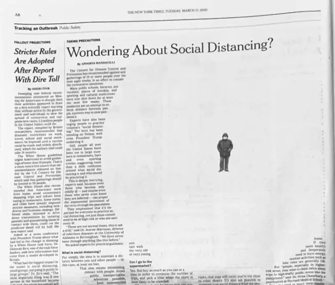
The New York Times: “Wondering About Social Distancing.”
The news on COVID-19 seems to change dramatically on a daily basis, and people are turning to news sources they trust to stay updated and for guidance on how they can help limit the spread of the illness.
The New York Times asked a panel of experts to help define the “dos and don’ts” of social distancing in an article on March 16th, entitled “Wondering About Social Distancing.” It’s worth a read online for those who may still be wondering how to manage their day-to-day activity. In the print version of the article a day later, the team used a unique typographic layout to emphasize the importance of leaving distance between one another to “flatten the curve.”
Source: The New York Times via theinspiration.com.
Luke O’Reilly with Guinness: “Stay at Home”
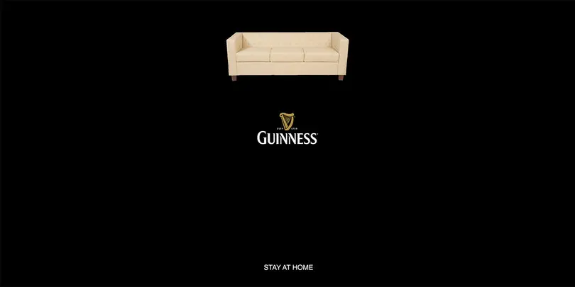
When Irish copywriter Luke O’Reilly released his spec ad for Guinness as part of a One Minute Briefs challenge, it quickly became a viral sensation with many people (inaccurately) praising the brand itself for the symbolic, minimalist treatment and authentic message.
The image featured the iconic Guinness logo against a black background, with a couch set above and the short phrase “STAY AT HOME” set beneath. As a full image, it appears to be a pint of beer, simple, well-made, and true to the brand’s value and offering.
While it wasn’t an official advertisement, to its credit, Guinness also executed an inspiring ad alongside what was a very different Saint Patrick’s Day.
Source: Luke O’Reilly via Adweek.
Snapchat’s Zenly: “Stay at Home” app
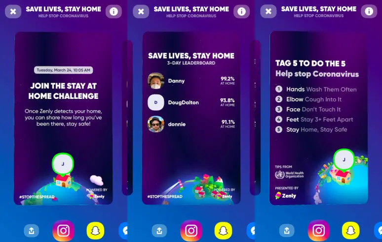
Zenly is a location-sharing application that was acquired by Snapchat in 2018. Like other location-based technology, “stay at home” orders across the world have rendered the traditional functionality temporarily less useful. And so, the team at Zenly took a creative approach to help gamify the task of isolation, launching a Stay At Home challenge which includes a leaderboard showing which of a user’s friends have spent the most time doing their part at home.
While the quick product development is impressive enough, the app also features a visual design that overlays information on where the outbreak is growing across an interactive map, providing access to direct links with recommendations from the World Health Organization.
Source: Zenly via Techcrunch.com.
KNOWN_UNKNOWN: #HelpByDesign
James Sommerville has had a varied design career. In his early days, Sommerville co-founded an agency called ATTIK out of an attic bedroom in Huddersfield, UK. After 25 years, the agency joined Dentsu and he then relocated to Atlanta, Georgia and became the VP of Global Design for The Coca-Cola Company. And in 2018, he founded a new venture, KNOWN_UNKNOWN, based on a distributed talent model and the belief (and experience) that great design can come from anywhere.
When the world changed a few weeks ago, Sommerville and his team knew that while they couldn’t produce ventilators and PPE, they could help in other ways. Working alongside Talenthouse and the UN, his team initiated its own call to creatives to #HelpByDesign, submitting posters that promote awareness of how to stop the spread of COVID-19, alongside messages of hope. To date, the response has been incredible, with just a few of the impactful designs featured below.
“Designers have the power to make people stop, think, smile and share,” Sommerville said. “This body of work is being created everyday by illustrators, typographers, animators and designers from all over the world. A global community coming together under the idea of #HelpByDesign.”
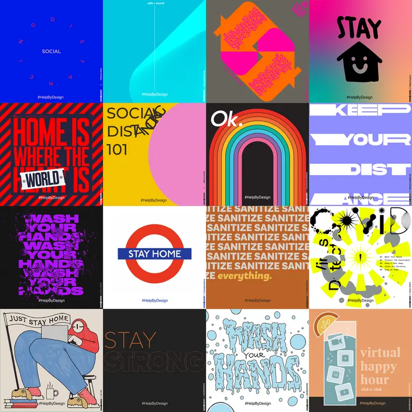
Source: KNOWN_UNKNOWN #HelpByDesign campaign. Visit @KNOWN_UNKNOWN on IG for more.
Pablo London: “Stay Home” Posters
Relative to other European nations, the United Kingdom took longer to lockdown the population to combat the spread of COVID-19. Upset at the level of public gathering that was still occurring, three creative leaders at the agency Pablo London took it upon themselves to spread the message.
Using colorful designs, and clear messaging, Nathalie Gordon, Amy Fasey, and Jacob Hellström designed four posters telling people to “Stay Home.”
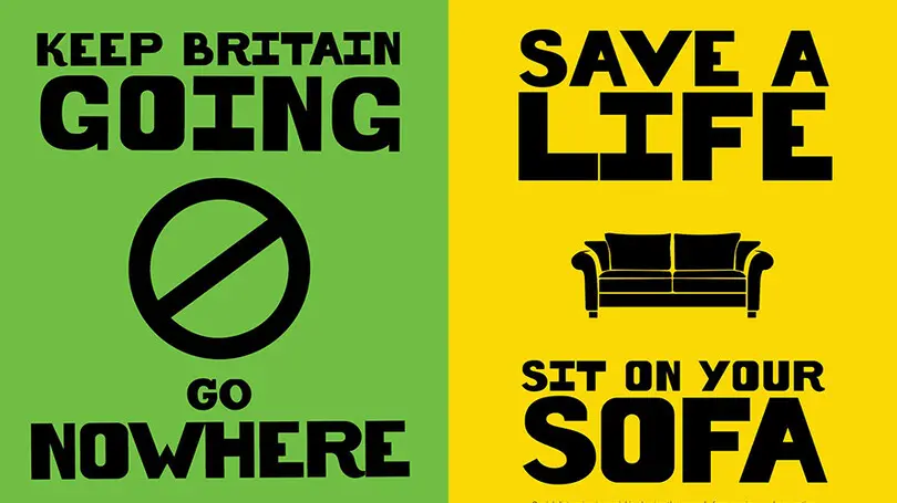
Source: Pablo London via Adweek.
Mucinex: “Spread Facts, Not Fear”
In a world where misinformation continues to be a dangerous byproduct of fear, Mucinex, a leading brand in the fight against viruses and illness, along with McCann, developed a set of concise activations called “Spread Facts, Not Fear,” which encourages safe, proven habits that consumers can take to fight the spread of coronavirus.
Accompanying clear iconography is copy like “Nods and waves are cool again. Avoid handshakes,” and “one way to avoid coronavirus is simply by washing your hands.” Every activation directs to covid-19facts.com – a source of up-to-date information compiled from the WHO, Johns Hopkins and other international experts.
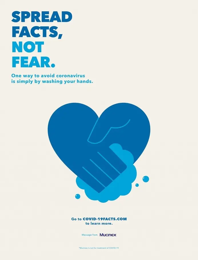
Source: Mucinex via thedrum.com.
Social Distancing Logos
Many brands have jumped in over the past week to temporarily augment their logos to help visualize the importance of social distancing. As one example, Audi pulled apart its famously interlocked circles to provide more space across the lockup, while McDonald’s separated its golden arches in Brazil with a new tagline: “Separated for a moment so that we are always together.”
Slovenia-based creative director Jure Tovrljan shared a reimagination of 12 additional brands such as Mastercard and the National Basketball Association, and many others are starting to follow the lead.
Source: Audi via Car and Driver.
FontAwesome: Covid-19 Icons
Certainly, not everyone has been as keen to follow the CDC guidelines to practice social-distancing and avoid public gatherings, with some states as of the time of this writing needing to implement more stringent “shelter in place” orders.
Part of the challenge in compliance is trying to simplify the message, and educate people quickly on what is and is not acceptable during this opportunity to flatten the curve. The team at FontAwesome has released a set of free, useable iconography for designers to communicate across various forms of media, including icons for “handshake-slash” indicating the importance of avoiding handshakes, and “stopwatch-20” to promote the need to fully wash one’s hands for 20 seconds with soap and water.
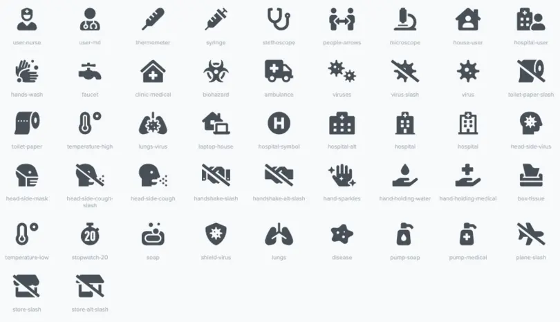
Source: FontAwesome.com.
Brewery-made Sanitizer:
Given the access to sanitizing alcohol and existing production facilities, several alcoholic beverage brands have pivoted to producing hand sanitizer to help with a global shortage, including category leaders like Diageo and Anheuser-Busch as well as regional distilleries like Bendt Distilling Co., Koval Distillery, and Titos Vodka.
Jesse Alkire, a freelance creative director and founder of the Denver Ad School, turned the trend into a fun creative challenge, sharing concept designs for other beer brands that could shift to sanitizer production, like Fat Tire and summer hit White Claw.
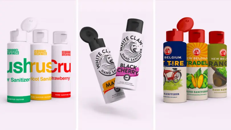
Source: Jesse Alkire via Adweek.
Olivia Konys: “Rona Font”
This one is particularly close to our typographic-heart. When Olivia Konys, a layout artist, production artist, and graphic designer from New York City, found herself in quarantine during the COVID-19 outbreak, she used design to help raise money for various organizations.
Konys wrote, designed, and formatted a typeface called “Rona” into a working opentype, and made it available to anyone who emails her proof of donation to any healthcare service/nonprofit, hospital, or local business. The hand-drawn type is fun and includes the english alphabet, numbers, symbols, punctuation and accent glyphs.

Source: Olivia Konys.
This is just a small subset of the inspirational design that has been generated from the creative community, and the list will undoubtedly continue to grow in the coming weeks. The United Nations even issued a global call to creatives to help spread the word on coronavirus.
We’ve been inspired by folks like the team at Pablo London, Jesse Alkire, and Luke O’Reilly, and others, to try and help creativity thrive in this moment. Over the next several weeks we will be doing #creativematters challenges on Instagram, giving the community a free font or two with a brief to create art that inspires. Check out our IG page to learn more!
Creativity matters always, yet in times of uncertainty the creative community serves an even more critical role, helping to visualize information, convey knowledge, and bring people together.
For further reading, here is a great recap by Fast Company of the story behind the now famous “flatten the curve” chart, another (rightfully) popular design in recent weeks.
