A guide to type styles.

A guide to type styles.
When it comes to commonly known type categories, you might be able to think of sans, serif, script and maybe slab. Four categories would be simple and easy, but it would also make design boring. Thankfully there are many more categories and subcategories to explore.
Historically we’ve seen many different classification systems, some based on their era, others entirely on the visual features of typefaces, and some a combination of both. Some notable classification systems include Official Vox/ATypI, a mix between historical terms and visual attributes; British Standard, a simplified version of Vox; and Gerrit Noordzij Theory, the idea that every typeface can be traced back to the handwriting tool that it’s based on. This eliminates all the difficulties of historical classifications, but falls apart for anything outside the given parameters.
Most of the existing classification systems are considered outdated, subjective and confusing. Indeed, type design is a complicated discipline with many variables. A lot of contemporary typefaces do not fit in any of these historical categories, so it’s considered impossible to come up with a system that includes every type design possibility.
Type is constantly evolving, and one system doesn’t fit all. However, an understanding of type design history will help make a designer make better choices, such as in pairing fonts, or finding the right type style for a logo or piece of lettering work. Knowing the historical connotations of certain styles, or simply their visual features, can be invaluable in these situations.
Understanding classification also enables you to start noticing more subtle differences between typefaces. It helps you when describing a chosen font to a client, or commissioning a custom one; and enriches your design palette more holistically.
Instead of focusing on the existing systems or trying to come up with a new system, our guide looks to demystify some useful terminology to help you recognise the most common Latin type styles.
Serifs
Humanist
The first Roman type was derived from calligraphy, so the shape of letterforms is based on formal writing with a flat brush or a broad nib pen. The term Humanist has traditionally been used for serif typefaces, but nowadays there is also Humanist Sans.
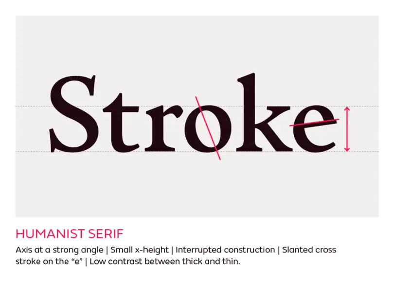
Examples: Centaur, Adobe Jenson, Cloister, Guardi, Lutetia, Lynton, Stempel Schneidler
Garalde
Named after the two most notable type designers of the period between the late 1400s until the 1700s, French punchcutter Claude Garamond and Venetian printer Aldus Manutius. Garaldes are a step forward from Humanist, and are still influenced by formal calligraphy. Many technical improvements in printing and punchcutting during that period gave opportunities for refinement and production of many typefaces, revivals of which are still widely used for setting books or long texts. Also known as Aldine after Aldus Manutius; and sometimes Old-style, but this term is occasionally used for all Humanist, Garalde and Transitional typefaces.
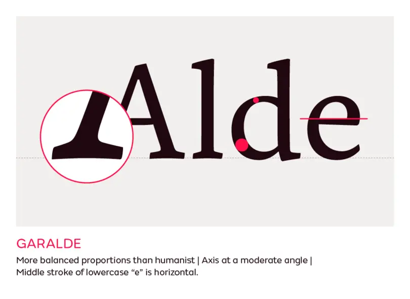
Characteristics: Refined proportions, a stronger contrast between thick and thins but at a more moderate angle, serifs have better defined shape, the middle stroke of lowercase “e” is horizontal.
Examples: Garamond, Bembo, Janson, Palatino, Galliard, Caslon, FS Brabo
Transitional
At the end of 17th century, Louis XIV wanted to renovate the French government’s printing press (the Imprimerie Royale) to find a replacement for Garamond type styles and to compete with the development and quality of printing everywhere in Europe at that time. He commissioned the French Academy of Sciences to create a new typeface for him, and the result was the Roman du Roi – 86 typefaces designed on a strict system of grids, mathematics and engineering. Notable type designers from this period are John Baskerville, Simon Fourner and Christophe Plantin. Another name for Transitional is “realist”, which comes from the Spanish term for “royal” (it has nothing to do with realism), thanks to the typeface made for the Spanish King Phillip II by Plantin.
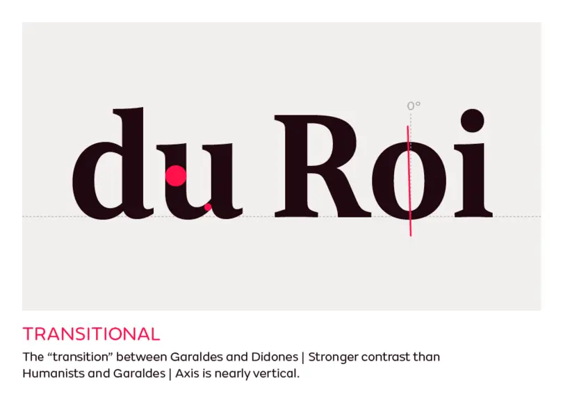
Characteristics: The contrast is even stronger than in the first two groups. The distribution of weight is slowly moving away from the strong calligraphic angle and is now nearly vertical. Serifs are flatter, and details are very refined. It’s easy to recognise Transitional typefaces if you think of them as the ‘transition’ between old-style and the moderns.
Examples: Baskerville, Fournier, FS Neruda, FS Sally, Joanna, Melior, Times
Didone
The term Didone is derived from the names of type founders Firmin Didot and Giambattista Bodoni. They were both incredible craftsmen, and through their professional rivalry pushed the limits of type design, punchcutting and printing. Also known as “Modern” – not a hugely helpful name, thanks to the confusion with adjectives like “modern” and “contemporary.”
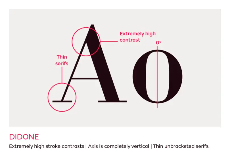
Characteristics: These typefaces bear extremely high stroke contrasts. Unlike the serif typefaces from the previous groups, which are influenced by writing with a broad nib, the Didones are influenced by writing with a pointed nib held at a 90 degree angle, which produces very thin horizontal strokes. The contrast is completely vertical, with thin unbracketed serifs. This could be seen to be super fashionable and contemporary in 2017, but it in fact dates from the mid-18th century.
Examples: Ambroise, Arepo, Bodoni, Didot, FS Ostro, Walbaum, Scotch Roman
Slab
There are many different terms for Slab: Mechanical/Mechanistic, Antique or Egyptian. Associated with blocky thick rectangular serifs, they were originally created to attract attention in advertising, posters and large-scale media. They embody the spirit of the Industrial Revolution at the beginning of the 19th century, and were specifically designed for large display use. This category includes the typefaces with square unbracketed serifs (often called Egyptians) as well as bracketed ones (called Clarendons or Ionics).
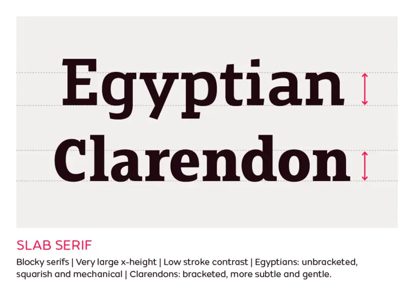
Characteristics: A very large x-height and low stroke contrast, to fill up the space as much as possible. Besides the obvious difference in the bracketing, Egyptians are usually more squarish and mechanical, while Clarendons are more subtle and gentle in appearance.
Examples: Memphis, Rockwell, Clarendon, Sentinel, FS Silas Slab, FS Clerkenwell, FS Rufus
Sans
Grotesque
A form of Sans Serifs that originated in the 19th century.
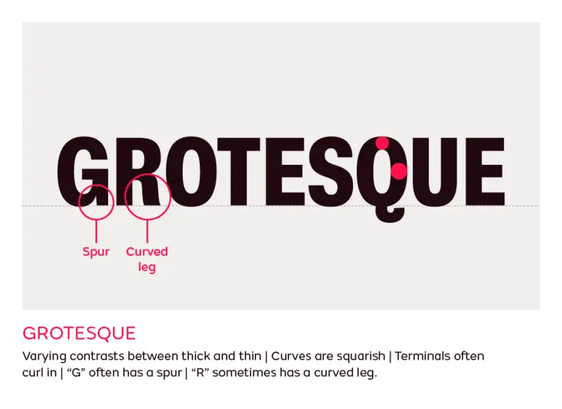
Characteristics: Since they are essentially among the early developments of the sans serif more generally, they tend to have a lot of peculiar characteristics. These include varying contrasts between thick and thin, often applied or exaggerated in weird places and unrelated to calligraphic contrast logic. The round shapes and curves are squarish, terminals are often horizontal or curling in. The “G” often has a spur, and sometimes the “R” has a curved leg.
Examples: Bureau Grot, Franklin Gothic, FS Meridian, Ideal Grotesk, Knockout, Schelter Grotesk, Venus
Neo-grotesque
The successors of the later Grotesque typefaces, This is the category that includes some of the most popular sans serif typefaces to date: Helvetica and Univers (though the many different digital versions might not be as close to the originals as you might think.) They are designed with simplicity in mind, and are also the first typeface family with many variations of weights and widths, designed for different means of production.
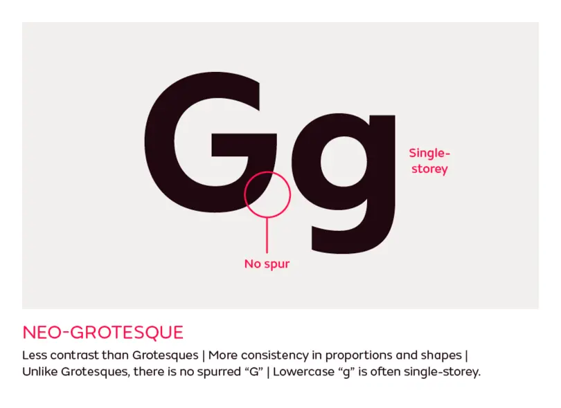
Characteristics: Less contrast and more regularity and consistency in proportions and shapes. Unlike the Grotesques, they don’t have a spurred “G”, and the lowercase “g” is often single-storey.
Examples: Helvetica, Univers, DIN, Bell Centennial, FS Elliot, FS Industrie, Folio
Geometric
Sans serifs constructed from simple geometric shapes. Geometric fonts might seem simple and easy to design, but in reality there are lots of subtle optical adjustments to make the shapes look pure and monolinear.
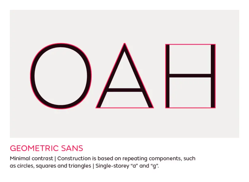
Characteristics: They usually have minimal contrast and their construction is based on repeating components, such as circles, squares and triangles. Most commonly, they have a single storey “a” and “g” to complement the geometric simplicity.
Examples: Bank Gothic, Erbar, Eurostyle, FS Lucas, FS Dillon, Futura, Kabel
Humanist sans
As discussed above, Humanist serif typefaces are strongly influenced by broad nib calligraphy, and Humanist sans is similar in many ways.
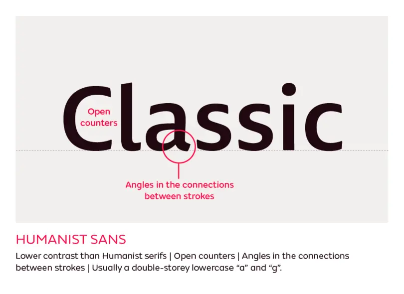
Characteristics: Humanist sans share almost the same characteristics as Humanist serif, without the serifs of course. Their contrast is also often much lower, but it is still visible and often at an angle, just not as prominently as with the classical Humanist serifs. The proportions are often based on the classical Romans. The calligraphic influence is also visible in the construction of letterforms, the open counters, the angles in the connections between strokes, and the common choice of double storey lowercase “a” and “g”. This makes the Humanist sans a better choice for reading than the Grotesques and Geometric sans serifs. Humanist sans typefaces often have a true cursive italic, instead of just a slanted Roman.
Examples: FS Millbank, FS Irwin, FS Siena, Gill Sans, Johnston, Optia, Scala Sans
Everything else
Script
Scripts are based on handwriting styles, and can often be differentiated based on different tools, such as brushes, markers or pointed nibs.
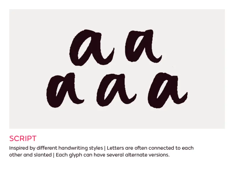
Characteristics: The letters are often connected to each other and slanted, like in cursive writing. They can be very formal, based on classical penmanship, or very casual. A lot of script typefaces require the type designer to draw several versions of each letter in order to replicate the dynamic and versatile look of handwriting or hand-lettering.
Examples: Bello, Bickham Script, FS Shepton, FS Sammy, Mistral, Snell Roundhand, Zapfino
Graphic
Pretty much everything else that doesn’t fit any other label: display, ornamented, decorative, layered, textured, stencil, shadow.
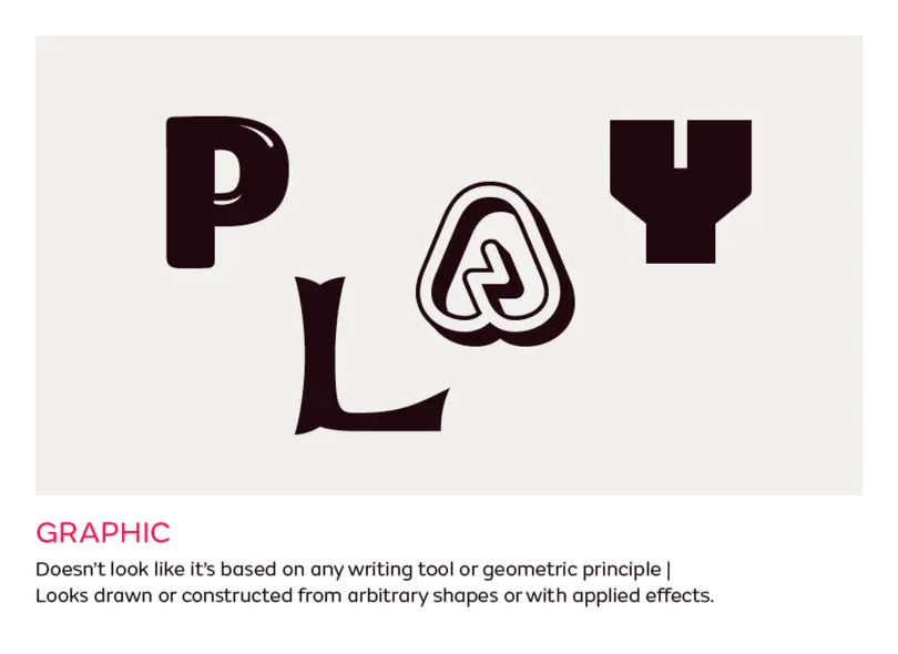
Characteristics: If you’re not sure what it is, or it doesn’t look like it’s based on any writing tool or geometric principle, but it looks drawn or constructed from arbitrary shapes or with applied effects, then it’s a Graphic typeface. They are generally designed for use for display purposes and in large sizes for emphasis.
Examples: Banco, Calypso, Fournier Le Jeune, FS Kitty, FS Pele, FS Pimlico Glow, FS Conrad
Blackletter
This style originated with 15th century German printer Johannes Gutenberg, and the first Blackletter type styles are directly based on these manuscript forms. Gutenberg’s printing success increased the popularity and usage of Blackletter, but eventually it was replaced by more readable serif types. Nowadays, you might only ever see it in use on beer labels, or on metal and hip hop music ephemera. Also sometimes known as Gothic or Textura.
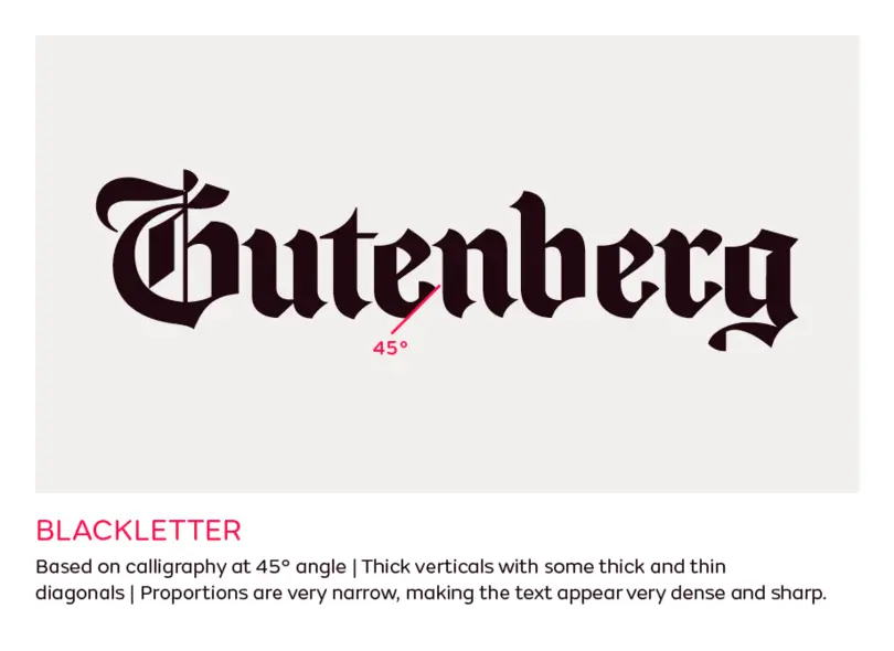
Characteristics: You may think that the distinct characteristics of Blackletter belong to the Graphic or Script category. However, Blackletter is also based on writing with a broad nib pen, but with a very different technique: the pen was held at a steep 45 degree angle. As such, it’s mostly constructed of thick straight lines with some thick and thin diagonals. The proportions are very narrow, making the text appear very dense and sharp.
Examples: Canterbury, Fette Fraktur, Goudy Text, Linotype Textur, Notre Dame, Old English
Incised
Also called Glyphic, these are typefaces which are influenced by the engraving or chiseling of characters in stone, as opposed to calligraphic handwriting. A lot of these Incised types are based on Roman inscriptions and might only contain capitals, such as Trajan, which is based on the lettering from the Trajan column. Others include lowercase as well.
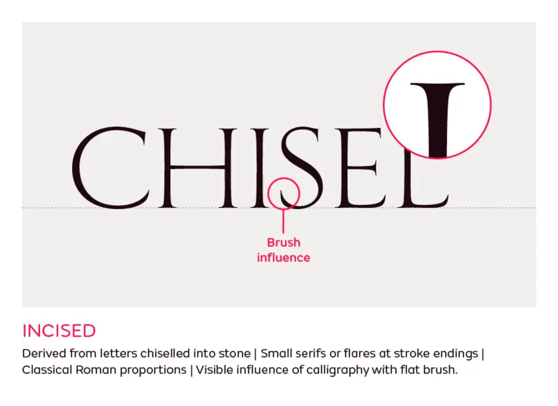
Characteristics: They might be confused with some of the calligraphic based serif fonts, but the shapes of the Incised typefaces are derived from using a chisel to cut the letterforms into stone. In this case, the serifs are a result of the production process, not a design feature, and they are usually much smaller, or even just flares at the stroke endings.
Examples: Trajan, FS Rome, Fritz Quadrata, Albertus, FS Benjamin, Lithos, Exocet

