Special Aphex — The Aphex Twin logo.
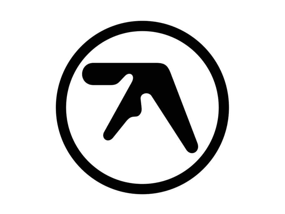
For as long as I can remember, I’ve been drawn to strange abstract symbols, marks simplified down from more complex expressions, shapes that look like they might be alphabetical. As a type designer, my day to day is a bubble of black-and-white shapes, lines, stems, curves and bowls, white space and the all-round balance of form. Exploring this bubble is where I get my kicks, and that’s why I have an enduring curiosity for the Aphex Twin logo.
As a pure symbol, the Aphex monogram is a mark of authenticity, a mark defining a masterly understanding of electronic bleeps, bops and noodles. It’s as alluring a symbol to me as any letter shape has ever been. I mean OK, yes, it is the letter ‘A’, but viewed in isolation, it’s not really, but rather a mysterious symbol, an otherworldly and organic space thing. It is simple yet nuanced, clear yet confusing, it’s a multi-faceted mark perfectly symbolic of the Aphex synth soundscape.

A for alluring: a mark of authenticity, defining a masterly understanding of electronic bleeps, bops and noodles.
Designed by graphic and type designer Paul Nicholson (www.number3.co), the story goes that the Aphex ‘A’ was actually conceived for a different project. Paul’s client Anarchic Adjustment, a skatewear label based in San Francisco, was interested in an early Nineties ’alien’ vibe logo. Paul duly pitched them some ‘alien’ vibe ‘A’ concepts, which were rejected. Richard D James (AKA Aphex Twin), then a fellow student at Kingston University, caught sight of these ‘A’s, and liked where they were going.
The amorphic shape was drawn by hand using circle templates and rulers, making its first appearance on the ‘Xylem Tube’ sleeve in 1992. Since its inception, the Aphex ‘A’ has dipped in and out of Aphex’s sleeve artwork. It was the primary focus on the covers of ‘Selected Ambient Works 85–92’ and ‘Ambient Works Vol. II’, then there was a 10-year hiatus on LP covers from 1996—2006, before it re-emerged on the compilation ‘Chosen Lords’. And then it bounced back fresh in the form of a fluoro-green sticker for 2014’s Grammy-winning ‘Syro’.
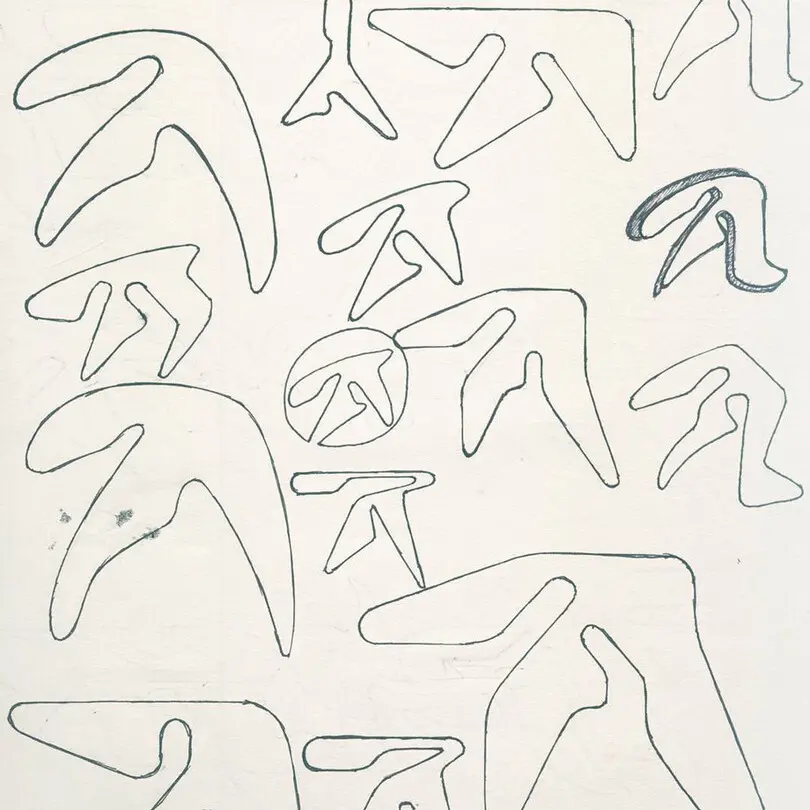
Taking shape: Paul Nicholson’s original sketches were intended for a US skatewear label.
Over the years, I’ve come across some bizarre stories and recollections. Online speculation about the logo’s origins, and its semiotic ‘true’ meaning are still rife: “If you measure the angles of it and divide it by the circumference of a 12”, you get the secret formula of unlocking the powers of … ”, wrote one forum user. More noble efforts extend to it being an image of a SAW, inline with the ‘S’elected ‘A’mbient ‘W’orks LP titles, or that it’s related to λ (lambda), the symbol for wavelength. Others say “it’s a dick with balls and a boomerang”. Ehem …
As a letterform, the Aphex ‘A’ is the antithesis of everything a type designer is taught a good letter should be. It’s unbalanced, it has dark spots, it’s blobby and it’s illegible … yet there’s something infectious about it. It reminds me of a time when design could be ‘experimental’ and push aesthetic boundaries in unconventional ways. It feels ‘new wave’, digital, static, yet moving like a lava lamp. It’s a wonder to behold! It’s arrival with the sinister and emotive soundscape of ‘Ambient Sound Works’ conjures up feelings of late Nineties and early Noughties nostalgia, yet Richard’s music remains current and challenging, retaining a strange parallel relevance to the symbol itself.
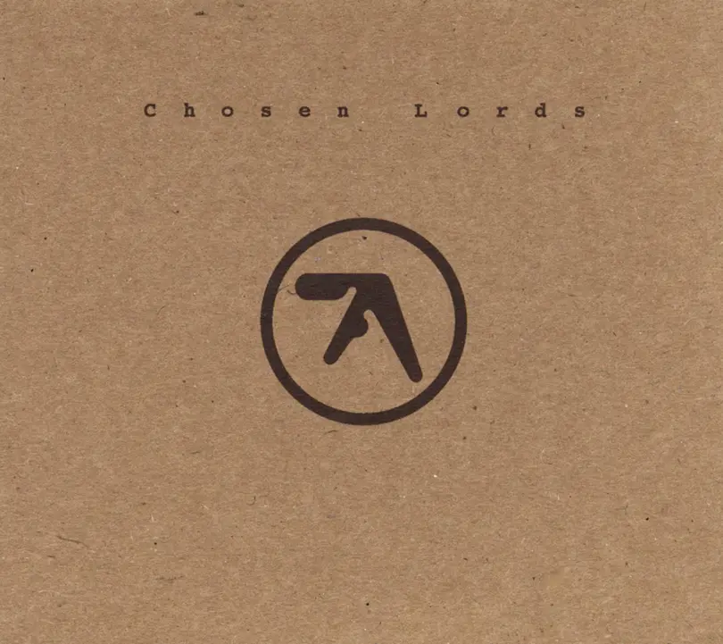
Cover star: the 2006 compilation album ‘Chosen Lords’ featured the abstract, alien ‘A’ monogram.
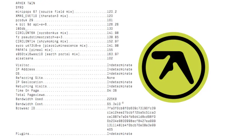
Detail is retail: the Grammy Award-winning ‘Syro’ also featured the return of the ‘A’ monogram.

Aphex to Z: the less successful full workmark version.
Of course, Nicholson had to explore the possibilities for a typeface. Longer-form iterations of the logo appeared on earlier sleeves, but personally, I think the full wordmark is less successful. Most of the forms lack the intricacies and graphic punch of the singular ‘A’, the beguiling nature and strength of the symbol is only brought to life when viewed in isolation. The legendary type designer Adrian Frutiger once said he had “a fascination about abstract symbols”. The Aphex Twin ‘A’ is certainly one of the finest abstract letterforms in the music industry today.
Sources
Paul Nicholson:
www.number3.co
On origins:
http://pictograms.blogspot.co.uk/2007/11/logo-111-aphex-twin.html
Instagram Revelas:
https://www.instagram.com/p/BRLRXoIhaSx/
https://www.instagram.com/p/BQnDZQ1BN3S/
https://www.instagram.com/p/BQxgCboBSAz/
Sketches:
https://www.residentadvisor.net/news.aspx?id=38344
This blog post first appeared on BrandLogoJukeBox.
