Fonts.
Tag: Fonts
18 articles
Makers of smart watches, wearables, medical devices, automotive dashboards and other resource-constrained devices no longer have to use low-quality bitmap fonts for their displays. The Monotype Spark Solution brings the benefits of scalable type and high-quality multilingual font display to the embedded environment - and it just got a major upgrade.

Helvetica Now Variable, new from the Monotype Studio, offers more than a million new Helvetica styles in one state-of-the-art font file, allowing you to create infinite shades of expression, incredible typographic animations, and ultra-refined typography.

Monotype Fonts is the only on-demand font service designed by creatives, for creatives—making it easier than ever to find, manage, and share the world’s best typography.

These days, designers have more fonts to choose from than ever before. When you’re starting a new project for your brand or receive a client brief, it’s easy to lose valuable time in a cycle of browsing, testing and second-guessing. In this tutorial, Monotype’s Content Manager, Carl Unger, will share helpful tips for choosing the right font.

Charles Nix, Monotype Creative Type Director, demonstrates how new variable font technology will enable designers to create with exciting, engaging, and effective typography.

Monotype’s Futura Now family is a revival and expansion of the famous typeface we all know so well. But do we know it, really?

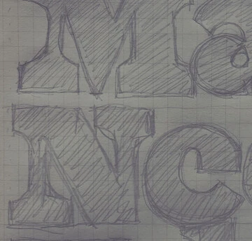
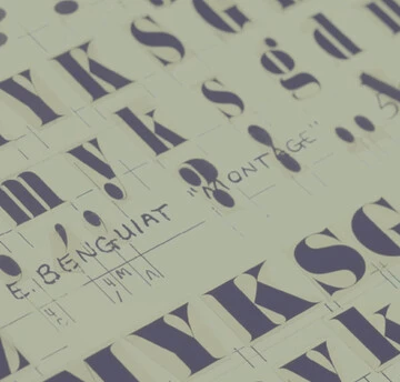
Ed Benguiat loved to draw letters. It’s what he did best. When he was not creating a new typeface, he could usually be found working on a piece of hand lettering or logo design for one of his many clients.

It’s difficult to imagine the 20th century without Futura. Released by the Bauer Type Foundry in 1927, Paul Renner’s Futura was a near-instant hit that quickly established itself as an iconic, immovable piece of our shared culture.

Futura Now is the definitive version of the definitive geometric sans, re-digitized based on Paul Renner’s original designs and updated to provide a more contemporary typographic palette.

Learn how you can develop a simple, more secure approach to font licensing that puts the focus where it belongs: on the creative work itself.

Serif typefaces are sometimes seen as serious and overtly intellectual, a more somber sister to their laid-back counterpart, the sans serif. But FS Rosa breaks away from these conventions by combining the classic elegance of a serif with warmth and frivolity, created by its round letterforms and curves.

FS Renaissance is a handcrafted display font where each letter stands alone as a piece of art. Craig and Pedro recently shared their perspective on the concepts and creative process behind FS Renaissance.

Tom Rickner delivers a presentation on the now and tomorrow of variable fonts.

Get to a glimpse inside the Monotype Studio—the people, the process, and the problems they can solve for brands.

We’re very excited to share that Monotype has agreed to acquire URW Type Foundry, a subsidiary of Global Graphics PLC. Based in Hamburg, Germany, URW is an innovative font and software provider, with extensive experience in designing and engineering fonts to service the needs of global brands. We’re proud to welcome the team to the Monotype family.

Font superfamilies are vast collections of type that can meet a multitude of needs without compromising on consistency. But what defines a superfamily, exactly?

TypeNotes is a love letter to letterforms, a journal dedicated to typography and graphic design.

Malou Verlomme’s Macklin superfamily is a gently irreverent take on the display type of the late 19th century, with an elegant twist that updates these letterforms for modern use. Choose one style, or use the entire variable family as a type toolbox.
