


Good Type part 4: Good type can fly solo.
Fonts sit at an interesting intersection, somewhere between utility and beauty. They’re part of the designer’s toolbox, but go far beyond practicality—they have the power to provoke a powerful response.
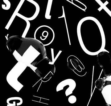
This is particularly true of display fonts which, unlike body text, have the ability to push at the boundaries of legibility, attract attention and fascinate the user. Often, their sense of identity and place can have a powerful effect, immediately transporting someone to a specific decade or evoking a particular emotion or memory.
Part of this is because display fonts are more accepting of distortion and texture. Paragraphs of text have to work under certain constraints, always prioritizing readability above all else. But when it comes to the display fonts, there’s more freedom to experiment and play—not just with the type itself, but with people’s expectations and interpretation.
“There’s something about the puzzle of working it out that I think is very attractive in small amounts—even if that means pushing it to the far extremes of legibility or just making some impact,” says Monotype Director of Product Design Jamie Neely. Whether it’s letters wrapped in line art, type with unexpected parts missing, or fonts made from unconventional forms, part of the reward is the process of interpreting it.
But while designers can be more expressive with display type, there are still practical considerations. Condensed or compressed typefaces are a good choice when working in editorial or advertising environments where space is at a premium, but finding the right tone of voice can be a challenge. Considering all dimensions is essential when choosing fonts, which means thinking horizontally as well as vertically. Bear in mind that descenders may clash with ascenders, so multi-line testing can reveal places where type could potentially overlap. Many display typefaces have shorter ascenders and descenders to avoid these awkward meetings. Another good test is putting words in capitals and adding diacritic marks, such as acutes or umlauts, that will add to the height and show where lines may run into one another.
Some display typefaces, particularly those that play with legibility, pose more of a challenge than others. It’s key to understand the boundaries between letterforms that ask the user to work a little harder, and those that are unreadable. Consider how much text is being set in the typeface, the size it’s being shown at and the environment it’s appearing in.
While display fonts require some extra attention, the rewards far outstrip the hard work. The right design can amplify or completely transform the message, having instant influence over the reader. What’s more, its ability to do so doesn’t rely on anything else—this is type distilled into its most powerful form.
Stay tuned for more from the Good Type series. Video recorded live at Adobe Max 2017.
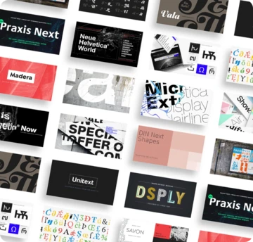
Related content.

Fonts to fit your augmented and virtual reality designs.
Setting text in augmented and virtual reality presents new design challenges. Learn about six fonts that can enhance your AR/VR creations.

The challenging game of designing for sports.
The World Cup is back, and all eyes are zeroed in on the best football … jersey fonts? We examine the tall task of designing for the world of sport.

Meet Walbaum.
Monotype’s Walbaum typeface is the modern serif font to beat all modern serifs. Freshly restored by Monotype, this updated family oozes charm.