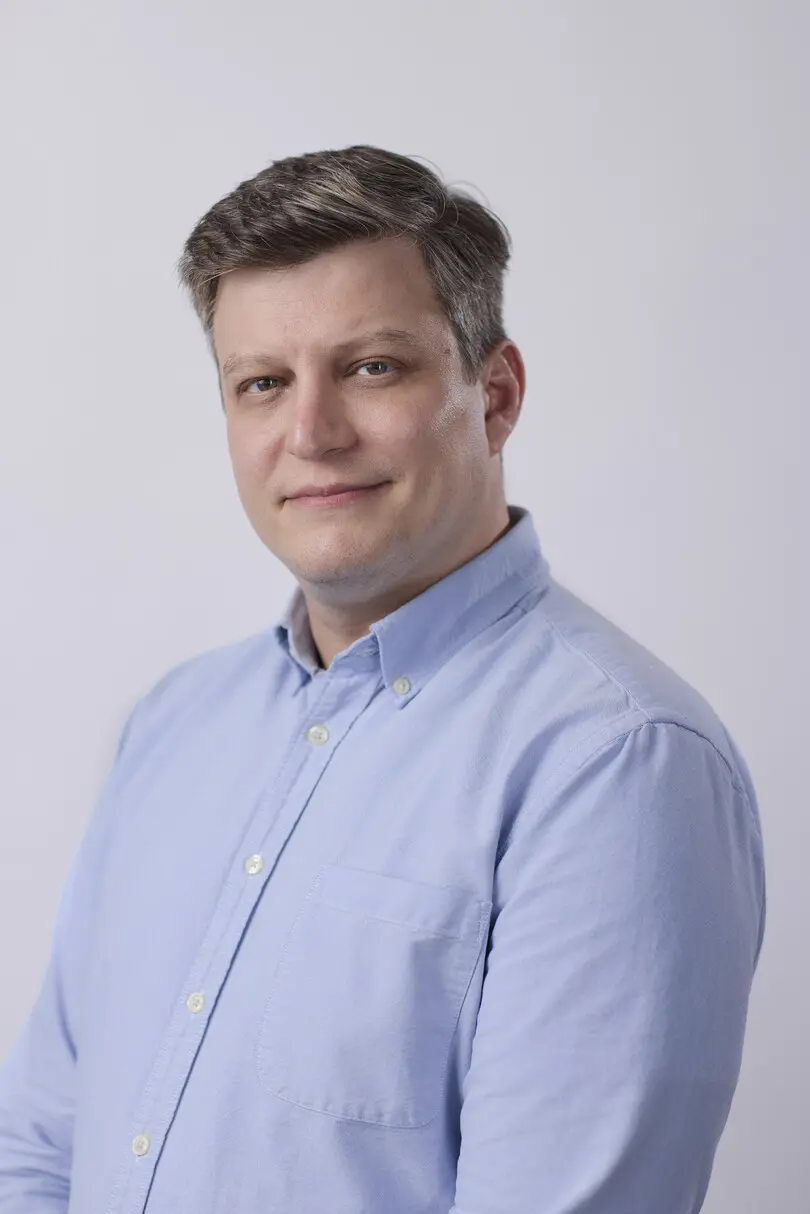
Terrance Weinzierl.
Executive Creative Type Director.
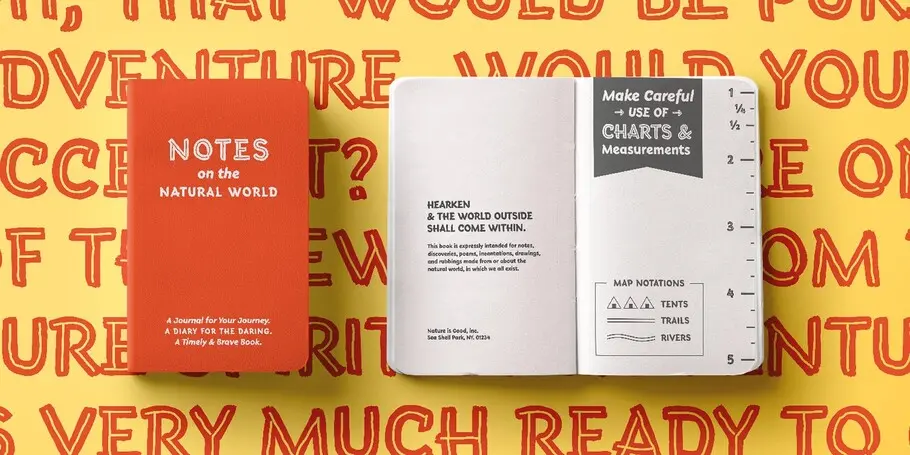

Terrance Weinzierl’s Terry Junior typeface is a perfectly imperfect design – one that retains the marks of the brush used to create it and harks back to the craft required to hand make letterforms.
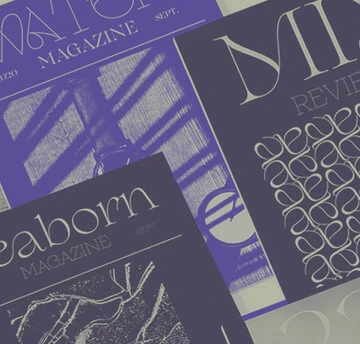
Monarda™ is Terrance Weinzierl’s take on the loud and splashy brush scripts of the 1950s. It’s energetic, playful, and equally at home in hardcopy headlines as it is in interactive banners.
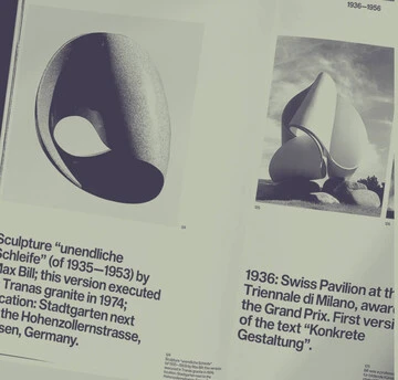
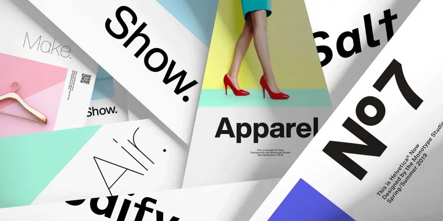
Helvetica Now preserves the typeface’s Swiss mantra of clarity, simplicity and neutrality, while updating it for the demands of contemporary design and branding.
In his words.
As an Executive Creative Type Director in the Monotype Studio, Terrance Weinzierl has been creating and modifying typefaces for the Monotype Library and a wide range of brands since 2008. In addition to working on custom projects for PBS, Microsoft, Google, Barnes & Noble, Domino’s and SAP, he’s designed type for video games, professional sports teams and auto manufacturers.
After completing a BFA at Grand Valley State University in Michigan, Terrance continued his typographic education at Ascender in Chicago, where he joined as an intern before being hired as a type designer. As part of Monotype, he’s been involved in an array of client projects, designing bespoke type for well-known brands as well as contributing type releases, such as Kairos Sans and Monarda, to the library. Terrance designed Joanna Sans Nova, which is part of the Eric Gill Series superfamily, and maintains a keen interest in hand-lettering and calligraphy.
Terrance’s Pizza Press typeface for Domino’s won a Certificate of Excellence in Typeface Design from the Type Directors Club in 2014. Expanding the typographic palette for Domino’s in 2017 and 2018 included broadening the sans into a larger family called One Dot and a brand new serif design called Two Dots—an homage to the logo. He curated the 2023 Type Trends report along with his colleague Emilios Theofanous and is a frequent host of our podcast, Creative Characters.
Terrance is a regular speaker at events, including TypeCon, AIGA, Creative Mornings and the Game Developers Conference.
Studio releases.
Tellumo

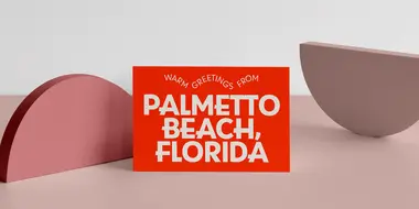
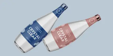
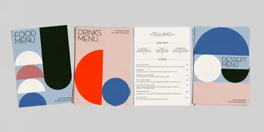
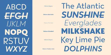
Tellumo, an elegant humanist geometric sans serif, radiates warmth, charm, and joyfulness from its geometric foundation.
The swash caps add magnitude and sparkle to short headlines and packaging. Tellumo has a balance of clarity and personality, suitable for branding and advertising of all kinds, print & digital design alike.
Futura Now
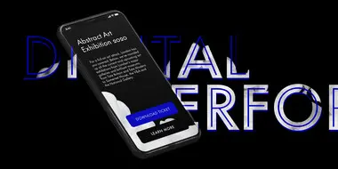
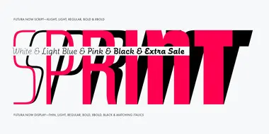
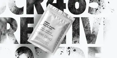
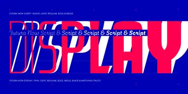
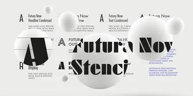
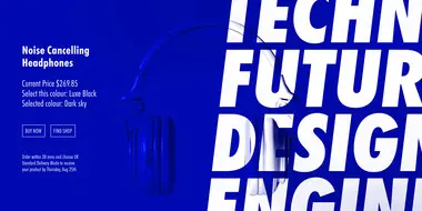
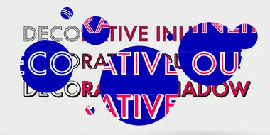
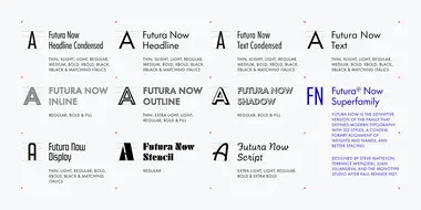
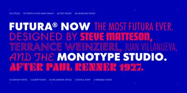
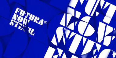
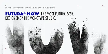
Futura Now Variable, with billions of weights and styles, is different than any Futura ever created. It expands the design range of the family exponentially, while shrinking its digital footprint.
Futura Now’s language coverage makes it more useful to more of the planet. With Latin, Greek, and Cyrillic characters, Futura Now covers 89 languages.
Helvetica Now
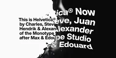
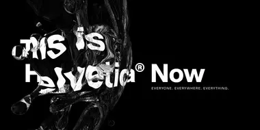
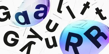

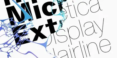
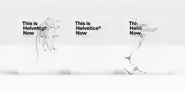
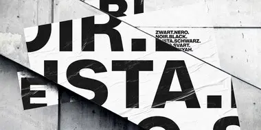
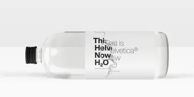
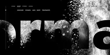
Helvetica® Now is a new chapter in the story of perhaps the best-known typeface of all time. Available in three optical sizes—Micro, Text, and Display—every character in Helvetica Now has been redrawn and refit; with a variety of useful alternates added.
Monarda™
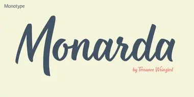
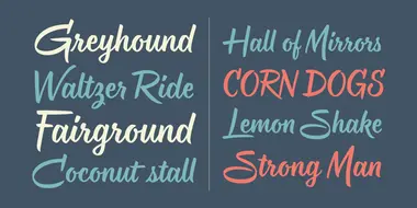
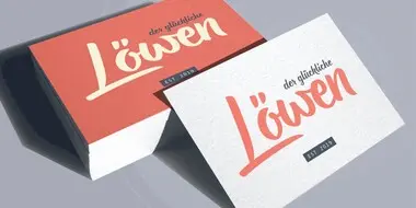
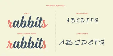
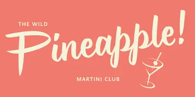
Monarda™ is Terrance Weinzierl’s take on the loud and splashy brush scripts of the 1950s. It’s energetic, playful, and equally at home in hardcopy headlines as it is in interactive banners. In addition to the basic alphabet, OpenType® fonts of Monarda are also awash in super-sized swash caps, contextual alternate characters and ligatures.
Terry Junior™
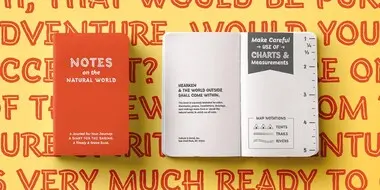
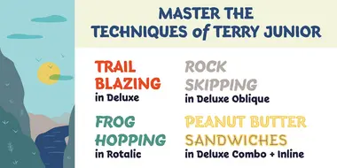


Terrance Weinzierl’s Terry Junior typeface is a perfectly imperfect design – one that retains the marks of the brush used to create it and harks back to the craft required to hand make letterforms. Originally drawn during a Monotype Font Marathon, Weinzierl later refined the typeface digitally – adding an Inline version and designing alternates that replicate the irregularity of real-life brush scripts.
Related content.
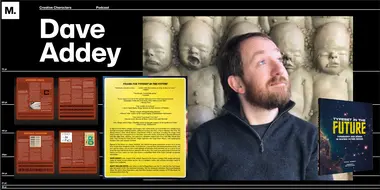
Creative Characters S1 E18: Dave Addey: Classic sci-fi films and the typography that brought them to life.
In our eighteenth episode, Terrance Weinzierl, Creative Type Director at Monotype, talks with Dave Addey, author of Typeset in the Future. Dave work explores type and design choices in sci-fi movies, a fun crossover that has drawn a remarkably big audience.
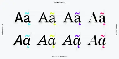
What are font superfamilies and why do we need them?
Font superfamilies are vast collections of type that can meet a multitude of needs without compromising on consistency. But what defines a superfamily, exactly?
Creative Characters S1 E20. Adam Weiler: Rethinking design thinking for a changed world.
In this week’s episode, Monotype Type Director, Terrance Weinzierl has an inspiring conversation with designer, educator, and design thinker, Adam Weiler, who currently leads the social innovation program at Steelcase, a furniture company founded in Grand Rapids, Michigan.
